 Carter Horsley
Oct 17, 2014
Carter's Review
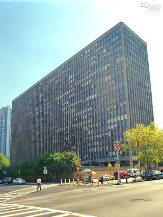
To the north and west of "Hospital Alley" along First Avenue, the Kips Bay Plaza complex of two 21-story, slab residential towers is one of the first major projects designed by famous architect I. M. Pei in New York City.
Pei, then an architect with the Webb & Knapp development company headed by William Zeckendorf, collaborated with the architectural firm S. J. Kessler & Sons on the development.
The south tower was completed in 1960 and the north tower in 1966.
Their strict geometry is typical of much of his work: good, solid, clean-cut modernity with no frills. His firm's greatest fame lies in its later work such as the great East Wing of the National Gallery of Art in Washington, the new glass pyramid entrance to the Louvre Museum in Paris and the Bank of China tower in Hong Kong.
These two long buildings are parallel to, but offset from, one another and are placed horizontally, east-to-west, on the large, landscaped site. An earlier plan for the site, developed by the architectural firm of Skidmore, Owings & Merrill had called for six buildings, but Pei wanted fewer to create more open space.
Kip's Bay Plaza, as it was originally known, was a significant advance in residential planning in the city, however, as it was the first exposed concrete residential project. Its very high degree of fenestration is notable for providing apartments with very large picture windows. Moreover, Pei recessed the windows sufficiently from the façade to have the recesses qualify as balconies and thus eligible for subsidies from the Federal Housing Administration (FHA), which was critical for the project's economics.
The bold but repetitive façade patterning is more subtle than one would at first suspect as the columns become narrower at two levels as they have smaller loads to carry. The overall look is distinctly Miesian in its rectilinearity and sparseness, but the texture of the concrete adds an urban grittiness that has borne up well over the years.
Their look also bears the stamp, probably not intended, of Brutalism, a short-lived architectural style of the period that focused on "strength" and was typified by the strong indentations and roughness of the former Pan Am Building straddling Park Avenue and also Marcel Breuer's Whitney Museum and, much closer, the huge, boxy "New" Building of the NYU-Bellevue Medical Center (designed by Pomerance & Breines, Katz, Waisman, Weber, Strauss, Joseph Blumenkranz and Feld & Timoney) overlooking the FDR Drive.
A few years after Kips Bay, Pei would design a similar project south of Washington Square known as University Towers that is a better, and "softer," design that more closely resembles Le Corbusier's famous urban scheme of "towers in a park."
Pei initially was not interested in the project, but was "ordered" to do it by Zeckendorf, the legendary developer who eventually lost most of his great real estate empire. This project was subsequently taken over by Alcoa Properties.
These two towers, each 410 feet long, were converted to condominium use in 1981. The project originally had 1,136 apartments, but over the years some were combined and it now totals more than 800.
In their excellent book, "New York 1960, Architecture and Urbanism between the Second World War and the Bicentennial" (The Monacelli Press, 1995), Robert A. M. Stern, Thomas Mellins and David Fishman observed that Pei originally wanted to place a large sculpture by Pablo Picasso in the complex's park, but Zeckendorf gave him a choice of landscaping or the sculpture and Pei chose the former. He later got the Picasso sculpture at the University Towers project.
The complex is a bit sterile and bereft of art, yet it is a stark modernism that is relatively rare in the city. While its proportions are not perfect and it makes no gesture to relate contextually to its surroundings, it remains a handsome project whose neighborhood has subsequently become much more desirable.
The project followed by a few years in the wake of the also large "slab tower" project known as Washington Square Village, to the southeast of Washington Square Park, a development that is noted for its abundant use of bright colors on its long, balconied façades.

- Condo built in 1961
- Converted in 1981
- 2 apartments currently for sale ($950K to $1.795M)
- Located in Gramercy Park
- 538 total apartments 538 total apartments
- 10 recent sales ($600K to $2.7M)
- Doorman
 6sqft delivers the latest on real estate, architecture, and design, straight from New York City.
