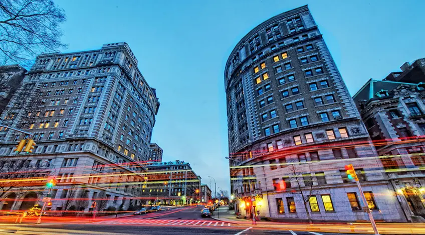
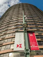
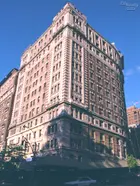
Two of the city's grandest, curved, pre-war apartment buildings are at the foot of 116th Street and Riverside Drive at the intersection with Claremont Avenue.
They form an impressive pre-"gateway" to Columbia University from the west up the hill to Broadway at 116th Street.
The university's actual "gateway" is very handsome and quite conventional, like the gateway to Rockefeller University on York Avenue.
The neighborhood's gateway, however, is elegant but discombobulating: two great curved buildings face away from one another rather than open together. It's a bit weird and confusing. It's akin to doing the tango. You know, the high-stepping, cross-over, drama and since the intersection here is quite sloped, there is the danger of accelerating, or tripping.
The pedestrian is so accustomed to eye-level architecture in this city that scant notice is often taken of buildings that don't conform to the street grid and therefore are radical and non-conforming. The regimented regularity of the grid, which celebrated its bicentennial last year in Manhattan, lulls many pedestrians into comfort zones. A veteran pedestrian knows just how long it takes to cross the street, or avenue, almost blind-folded.
Would you like to tour any of these properties?
Just complete the info below.
Or call us at (212) 755-5544
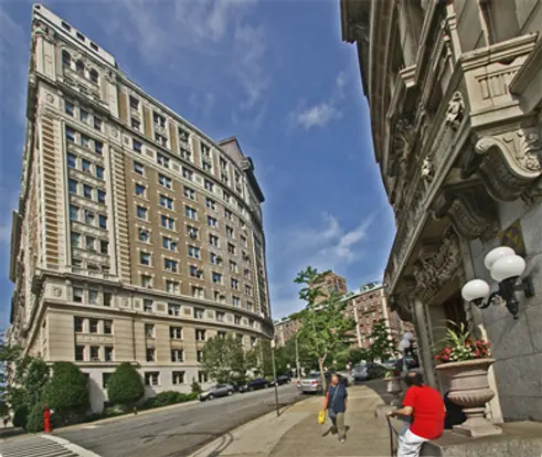
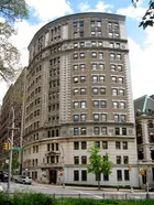
The two great curved buildings are quite similar but definitely not identical. The 98-unit one on the northeast corner at Riverside Drive and 116th Street is known as The Paterno with two courtyards at 440 Riverside Drive has a grand porte-corchere. The smaller, but equally handsome, 14-unit one on the southeast corner at Riverside Drive and 116th Street is known as The Colosseum at 435 Riverside Drive.
Both buildings were designed by Schwartz & Gross for the Paterno family that was one of the major developers of luxury apartment buildings in Manhattan in the early years of the 20th Century.
These are not typically pre-war buildings. They have very broad curved facades, but in different directions.
In this article:
The equilibrium of the grid is here further unbalanced despite the fact that the two buildings are stylistically about the same style and size.
The advantage of a curved facade is that it opens up wide vistas to the residents. At the same time, however, it diminishes the perception of mass from some angles. At this intersection, it is really not possible to fully appreciate the curves of each building at the same time. There are sort of helter-skelter, a situation compounded by the steep slope of 116th Street towards Riverside Drive.
One descends to Riverside Drive on 116th Street passing Claremont Avenue that curves around the Paterno and extends north for several blocks without another full intersection. The northside of 116th Street and Claremont Avenue is occupied by a very impressive and elegant, red-brick Barnard University building that is not curved.
The buildings along the south side of Claremont Avenue and north of 116th Street on Riverside Drive for several blocks are very handsome, but almost were not built as plans were advanced, unsuccessfully, in 1906 to extend Riverside Park up to Claremont Avenue.
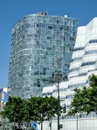
It is not clear why the buildings at 116th Street and Riverside Drive were curved and they were a century or so ahead of the city's next major curved apartment building, The Monterey on the northwest corner of Third Avenue and 96th street, and in recent years, the more dramatic and fractured 100 Eleventh Avenue by Jean Nouvel, located across from Frank Gehry's billowy but smaller office building for I.A.C. on 19th Street.
One would not want strange buildings sprouting up everywhere, but at major intersections a little drama can go a long way in nurturing civic pride—or at least curiosity. Say hey for distinguished/unusual architecture, even if it's cock-eyed!
The question is why were they not both curved in a more complimentary fashion.
In his wonderful book, "Morningside Heights: A History of its Architecture & Development," Andrew S. Dolkart notes that "their curved facades follow the undulating route of the old Bloomingdale Road."
The rectilinear street grid of midtown Manhattan is one of New York City's glories for it simplifies navigation and creates impressive vistas, especially in Manhattan's relatively flat environment.
Jean Paul Sartre once remarked that the city's grid permits citizens to sense the heavens.
The grid was created in an 1811 master plan that left out much of Lower Manhattan below Washington Square Park and permitted Broadway to slice diagonally from Union Square to Madison Square to Times Square to Columbus Circle to Verdi Square.
Cities shouldn't be completely perfect after all.
One could argue, perhaps, that we need more non-conforming intersections, places where the pedestrian can look up and say this is my corner, my patch of eccentric urbanity, my stand. You know Ratso's creed: "I'm walking here!"
Map view
StreetView
{
"key" : "",
"lat": 40.8088661,
"lng": -73.9658871 ,
"marker": {
"icon": ""
},
"pov": {
"heading": 0,
"pitch": 0,
"zoom": 1 }
}
Would you like to tour any of these properties?
Just complete the info below.
Or call us at (212) 755-5544
Would you like to tour any of these properties?

Architecture Critic
Carter Horsley
Since 1997, Carter B. Horsley has been the editorial director of CityRealty. He began his journalistic career at The New York Times in 1961 where he spent 26 years as a reporter specializing in real estate & architectural news. In 1987, he became the architecture critic and real estate editor of The New York Post.

 6sqft delivers the latest on real estate, architecture, and design, straight from New York City.
