The top ten buildings of the decade should possibly include two top ten buildings that were mostly finished in 2019, but is scheduled for occupany in 2020: Jean Nouvel's 53 West 53rd Street and Robert A. M. Stern's 220 Central Park South.
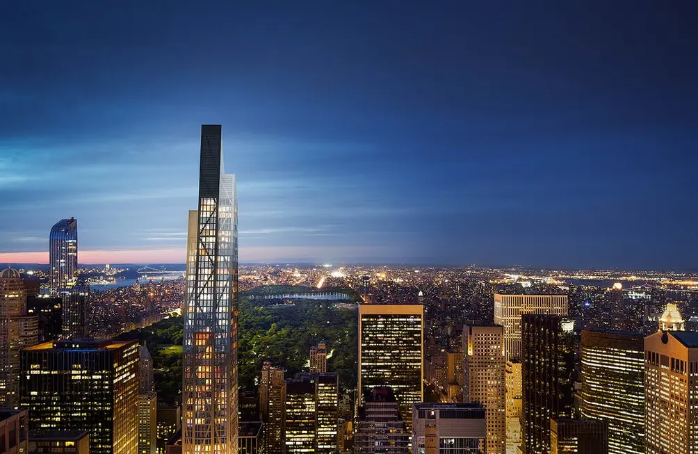
The former replaced the charming and petite American Folk Art Museum by Tod Williams Billie Tsien on 53rd Street with an asymmetrical, hulking, jagged thorn that includes an expansion of the Museum of Modern Art.
The former replaced the charming and petite American Folk Art Museum by Tod Williams Billie Tsien on 53rd Street with an asymmetrical, hulking, jagged thorn that includes an expansion of the Museum of Modern Art.
 53W53 (Credit: Hayes Davidson for Hines)
In this article:
Although stunted when the City Planning Commission incredulously reduced its height by 200 feet to 1,050 feet as an homage to the Empire State Building, a mile or so south, this mid-block tower has been left behind in the tallest building races in the city in recent years. Its thrusting form and detailing, however, are the essence of this upward city.
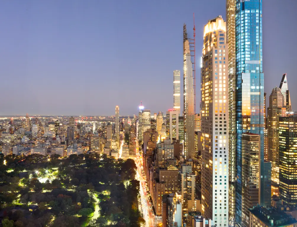
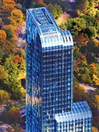
The latter is the quintessential "Post-Modern" building by Mr. Stern who also designed smaller variants of its elan at 30 Park Place and 520 Park Avenue from his bag of architectural brilliance. Like his older 15 Central Park West nearby, 220 Central Park South is a two-building complex with more refined proportions.
The latter is the quintessential "Post-Modern" building by Mr. Stern who also designed smaller variants of its elan at 30 Park Place and 520 Park Avenue from his bag of architectural brilliance. Like his older 15 Central Park West nearby, 220 Central Park South is a two-building complex with more refined proportions.
 View of 220 Central Park South and 'Billionaires' Row' from the Residences at the Mandarin Oriental (Compass)
#1. One World Trade Center
Architects: Skidmore, Owings & MerrillDevelopers: Port Authority of New York and New Jersey | Durst Organization
94 floors (104 stories) | 1,776 feet tall
Office | 3,501,274 square feet
Finished in 2014
Although maligned by some critics, 1 World Trade Center
by David Childs of Skidmore, Owings & Merrill deserves accolades for all the turmoil it suffered during its long design gestation. Less flamboyant than some earlier designs, this is a simple, symmetrical slanted, reflective-glass tower with a tall antenna and a base designed to withstand a major truck attack.
Its proportions, however, are superb and while its large antenna soars to 1,776 feet, it has long since been surpassed in the global sweepstakes for the world's tallest supertall.
When it finally opened in 2014, its site was an open sore in the city's history where the gleaming twin towers of the former World Trade Center stood, designed by Minoru Yamasaki were destroyed in the September 11, 2001 terrorist attack.
The two large sunken square waterfalls on the actual site of the Twin Towers are impressive but the rest of the site is not as awesome, and the soaring columns of light that shine from a site south of the Trade Center are only lit one night a year, sadly. They might have sufficed as a permanent tribute.
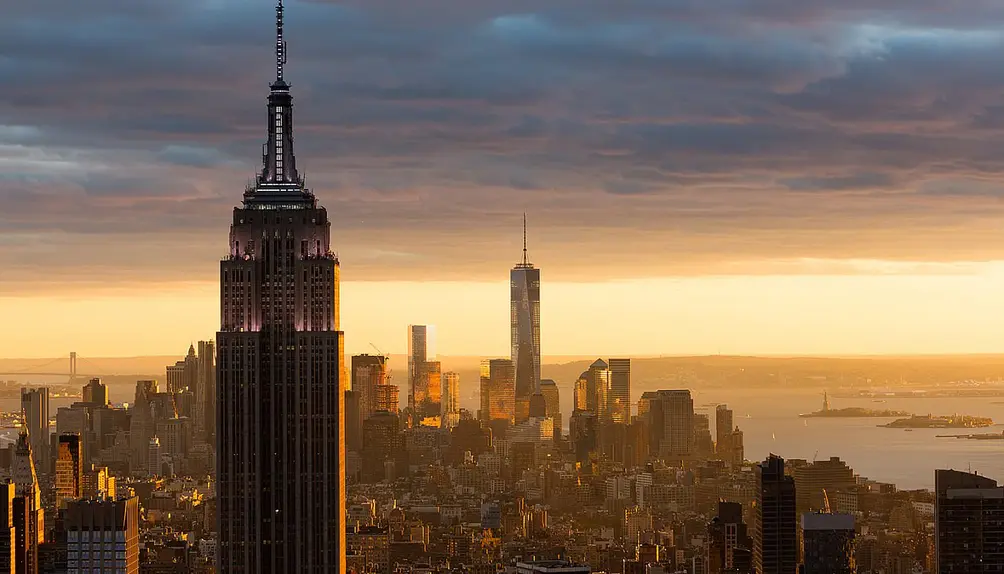 Photo by James Ewing for Skidmore, Owings & Merrill
#2. World Trade Center Transportation Hub
Architects: Santiago CalatravaDeveloper: Port Authority of New York and New Jersey
Transit hub and retail
Finished in 2016
 WTC Transportation Hub via Wikimedia
After years of praise and commendation, in 2013 some of Calatrava's projects began to draw criticism as very expensive follies. Many of these criticisms were packaged together in an article by Suzanne Daley in The New York Times on September 13, 2013, entitled "Santiago Calatrava collects critics as well as fans." Daley wrote: "...in numerous interviews, other architects, academics and builders say that Mr. Calatrava is amassing an unusually long list of projects marred by cost overruns, delays, and litigation. It is hard to find a Calatrava project that has not been significantly over budget. And complaints abound that he is indifferent to the needs of his clients."
Some of the problems with Calatrava's projects have been caused by an excess of innovation and insufficient testing. The glass tiles on the floor of his bridge in Bilbao became slippery in the rain, causing an increased number of claims for injuries and forcing the installation of a black anti-slip carpet on the decking, which blocked the view of the river through the walkway. The metal arches he put over some landscaped gardens sometimes overheated in the sunshine, baking the vines that were supposed to grow on them...
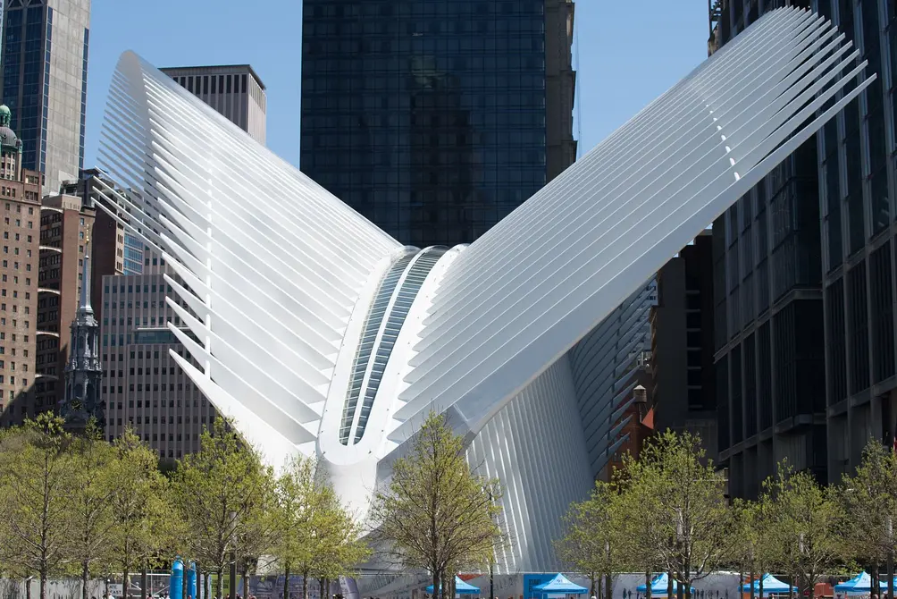
Much of the criticism focused on Calatrava's WTC Hub, which was completed in 2016 for a cost of $4 billion, twice what was expected and seven years behind schedule. Calatrava was paid a fee of $80 million dollars. Some of the additional cost and delay was due to additions and modifications to the original plan by the project owners, the Port Authority of New York and New Jersey, rather than the architect.
Even before it opened the station was a target of criticism: The New York Post described the station in 2014 as it was being built as "a self-indulgent monstrosity" and "a hideous waste of public money."
Michael Kimmelman, the architecture critic for The New York Times, referred to the structure as "a kitsch stegosaurus." New York magazine referred to it in 2015 as it neared completion as a "Glorious Boondoggle." The New York Post editorial board also described the station as the "world's most obscenely overpriced commuter rail station — and possibly its ugliest," comparing the Oculus to a "giant gray-white space insect."
The Hub also had its defenders. Jimmy Stamp of The Guardian wrote: "I despised the new World Trade Center transportation hub before I even saw it. It’s $2 billion over budget, has suffered from construction problems and design compromises, it’s seven years late and still incomplete, and its architect, Santiago Calatrava, has left a trail of lawsuits and angry clients around the world....But when I was standing on the marble floors in its enormous, gleaming central concourse two stories below street level, staring up at a clear blue sky between bone-white ribs vaulting 160 feet over my head, I, like Jonah in the whale, repented – at least for the moment....We deserve grand expressions of our artistic and technological capabilities. We deserve public spaces that inspire. The Oculus is deeply flawed, but I appreciate its aspiration and grandeur....The Oculus presents a more optimistic vision, one based less on present realities and more on future possibilities. Less Blade Runner, more Star Trek. By the time we get to that future, whichever one it may be, the delays and the cost and the controversies will be forgotten, but we will be left with a luminous great hall in the heart of downtown New York."
Calatrava's original entry pavilion was scaled back for security reasons and the mechanism for opening its spikey roof to the sprawling gallery below was inexcusably eliminated because of budget and space restraints. Its price then would have skyrocketed even more.
Still, it is truly spectacular and very awesome.
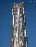
#3. New York by Gehry, 8 Spruce Street
Architect: Frank O. GehryDeveloper: Forest City Ratner
76 floors | 870 feet tall
Residential rentals (904 apartments) and an elementary school | 1 MSF
Finished in 2011
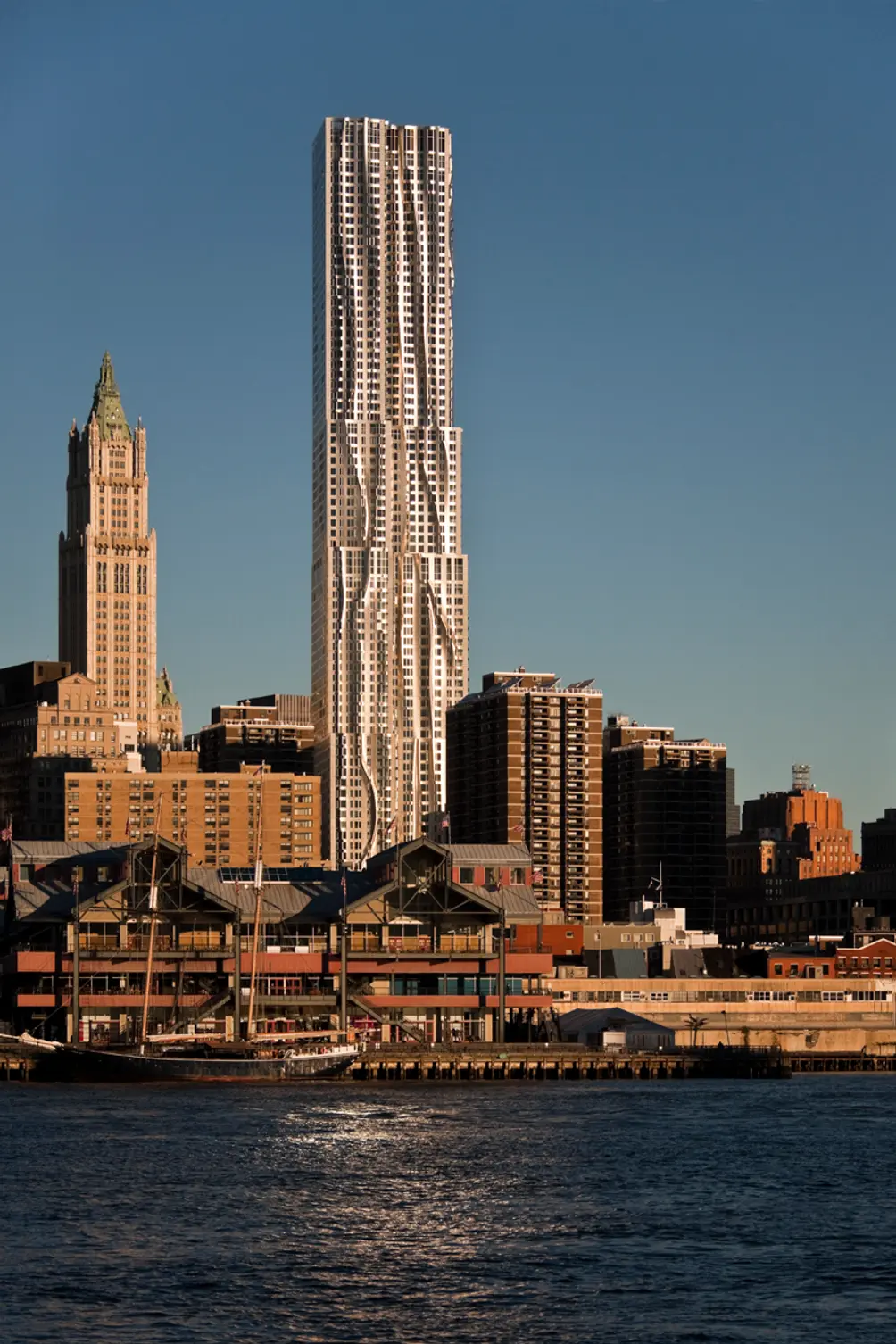 Photo Credit: DBOX
This dazzling, 870-foot-tall rental apartment tower at 8 Spruce Street just south of the Manhattan approach to the Brooklyn Bridge was designed by Frank O. Gehry.
Formerly known as the Beekman Tower, it is now known as New York by Gehry and is distinguished by its crinkling stainless-steel facades that rise with short setbacks above a five-story, red-brick, 630-seat public school at its base.
The building's complex facades conceal about 600 layouts for its 898 rental apartments.
It was developed by Forest City Ratner and opened in 2011.
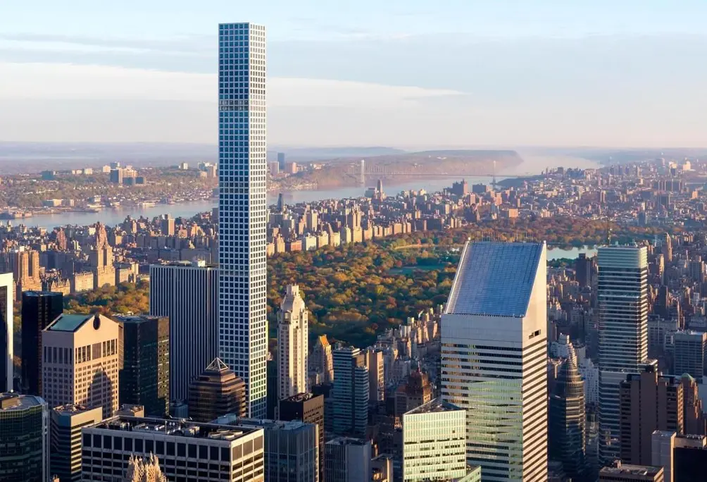
#4. 432 Park Avenue
Architects: Rafael Viñoly with SLCE Architects, LLPDeveloper: Macklowe Properties / CIM Group
85 stories | 1,432 feet tall
Residential Condos (104 apartments) | 412,637 square feet
Finished in 2015
 432 Park Avenue (Credit DBOX for Macklowe Properties)
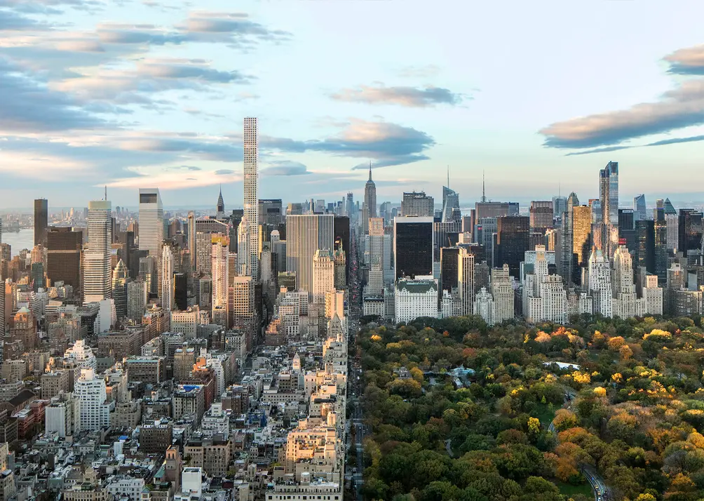
This 1,398-foot-high, perforated, flat-top, mid-block obelisk is a powerful exclamation point in Midtown East and was the city's tallest residential building when it was completed in 2015.
Designed by Rafael Vinoly for the CIM Group and Harry B. Macklowe, the building has 85 stories and 104 condominium apartments.
With a height-to-width ratio of 15:1, 432 Park has one of the greatest slenderness ratios of any tower in the world. Above a 100-foot-high base, the tower has 93-foot-foot square floors with 6 ten-foot-high windows on each facade.
The building's Wikipedia page provides the following historical commentary:
"In late 2007, Joseph Sitt, founder of Thor Equities, introduced Macklowe to an investment firm named CMZ Ventures. The letters 'CMZ' represented Arthur G. Cohen, a New York real estate developer; Paul Manafort, a former lobbyist, political consultant, and lawyer currently serving a prison sentence for federal financial crimes; and Brad Zackson, a convicted felon and frequent partner of Manafort and Fred Trump.
 via Rafael Vinoly Architects
"The partners wanted to build a 65-story building with a Bulgari-branded luxury hotel, condominiums, a private club, and a vertical mall. In late 2008, Dmytro Firtash, a Ukrainian natural gas oligarch and alleged associate of Russian organized crime, agreed to fund $112 million in equity and paid Manafort a deposit of $25 million. Manafort had met Firtash while consulting for the pro-Russia Party of Regions, at the time the ruling political party in Ukraine. French fund Inovalis also agreed to arrange another $500 million of equity for the project from various backers. Ultimately, the bid fell apart when CMZ couldn't arrange the necessary financing.
"In 2011, the former pro-European Union prime minister of Ukraine, Yulia Tymoshenko, alleged in the United States District Court for the Southern District of New York that Firtash violated the Racketeer Influenced and Corrupt Organizations Act and used CMZ as a front organization for monies that he skimmed unlawfully from RosUkrEnergo, the natural gas company that he jointly controlled with Russian state-owned enterprise Gazprom. Tymoshenko also alleged that Firtash planned to use the money for political purposes, rather than as a real-estate investment; specifically, she claimed that the money would go to help her opponent, Victor Yanukovych, a pro-Russia politician who became Ukraine's president in 2010.
"Another CMZ Ventures investor was Oleg Deripaska, a sanctioned Russian oligarch and leader of Rusal, the world's second-largest aluminum company. Deripaska agreed to invest $56 million into 432 Park Avenue through an investment fund named Pericles which was managed by Rick Gates, a Manafort partner who has since pleaded guilty to conspiracy against the United States and making false statements in the investigation into Russian interference in the 2016 United States elections.
"In January 2010, developer CIM Group agreed to pay $305 million for the complete development site including 434 Park Avenue and 38, 40, 44 and 50 East 57th Street while keeping Macklowe involved as a partner."
Would you like to tour any of these properties?
Just complete the info below.
Or call us at (212) 755-5544
 432 Park Avenue model living room (RVA)
The architect has stated that the tower's design was inspired in part by a short and elegant metal trash receptacle by Wiener Werkstätte (Vienna Workshops) designer Josef Hoffmann.
The building has six double-height "mechanical" floors that permit winds to pass through the tower and that do not count in its zoning calculations.
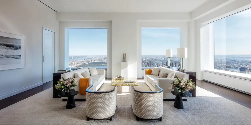
Apartments have 12-foot-six-inch ceilings; interiors were handled by Deborah Berke.
The building has six double-height "mechanical" floors that permit winds to pass through the tower and that do not count in its zoning calculations.
Apartments have 12-foot-six-inch ceilings; interiors were handled by Deborah Berke.
#5. VIA 57 WEST, 625 West 57th Street
Architects: Bjarke Ingels GroupDeveloper: Durst Organization
34 stories | 467 feet tall
Residential rentals (709 apartments) and Landmark Theatres | 830,995 square feet
Finished in 2016
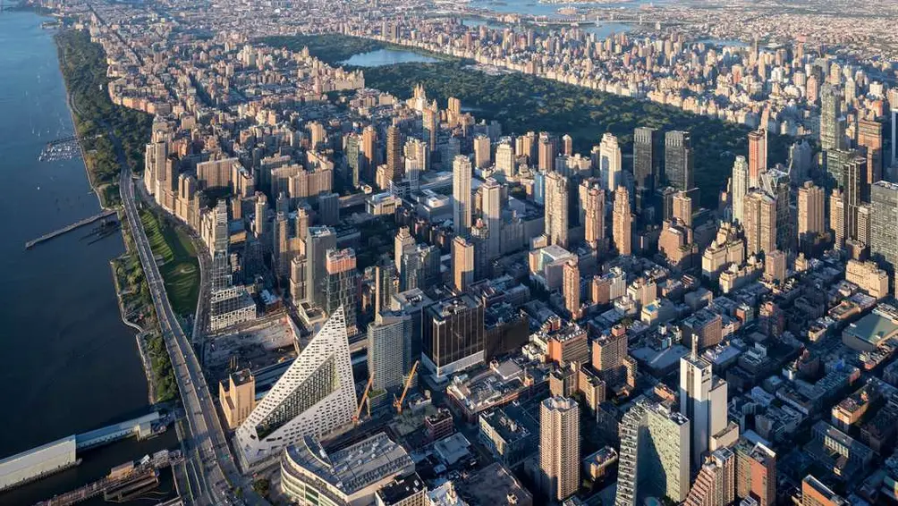
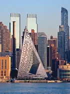
This striking, pyramidal, 35-story residential building with 709 apartments was erected in 2016 when it won the Emporis Best Skyscraper design award. It was developed by the Durst Organization at 625 West 57th Street and designed by BIG, which is headed by Bjarke Ingels.
The building stands 467 feet high and its tetrahedron form is best seen from New Jersey across the Hudson River.
"By keeping three corners of the block low and lifting the north-east portion of the building, the courtyard opens views towards the Hudson River and brings the low western sun deep into the block," according to a February 7, 2011 article at archdaily.com by Kelly Minner.
The building was named Best Tall Building Americas in 2016 by the Council on Tall Buildings and Urban Habitat.
The award stated that it "accomplishes the ambitious goal of forging an entirely new high-rise typology."
"Coined by the architect as a 'courtscraper,' the tower is a hybrid between the European perimeter block and the traditional Manhattan high-rise, while combining the advantages of both," the award continued. "It has the compactness, density, and intimacy of a classic courtyard building with the grandeur, airiness, and expansive views of a skyscraper. The building offers a unique vision for the future of the tall building; one that manages to synthesize high-quality and visually appealing architecture with the needs of the client, all without sacrificing environmental performance or residential quality."
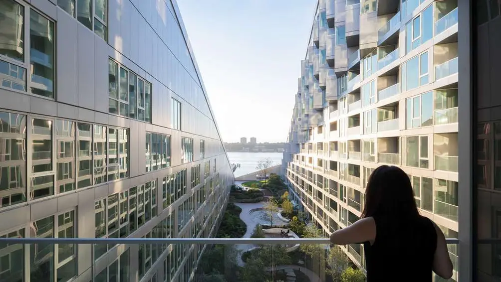 Via 57 West | Credit: Durst Organization
#6. 56 Leonard Street
Architects: Herzog & de MeuronDeveloper: Izak Senbahar of Alexico Group
57 stories | 821 feet tall
Residential condos (145 apartments) and an incoming Anish Kapoor sculpture
Finished in 2017
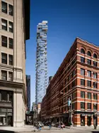
The stunning, 60-story residential condominium tower at 56 Leonard Street
in TriBeCa was designed by Herzog & de Meuron, the architects of the "Bird's Nest" stadium in Beijing and 40 Bond Street in NoHo. It was co-developed by Hines and Alexico, which is headed by Ivan Senbahar and Simon Elias, the developers of 165 Charles Street, a Richard Meier mid-rise apartment building on West Street in the West Village.
Every floor in the shimmy-shimmy-shake structure is different and rotated from the floors above and below, and every apartment has a balcony. The building has 8 full-floor penthouses and two that occupy half floors, all with 14-foot-high ceilings.
56 Leonard Street stands in the midst of TriBeCa, about five blocks south of Canal Street and four blocks north of City Hall. Alexico acquired the 12,500-square-foot site, which previously held the school's Mendik Law Library. According to the developers, the project "updates the relationship between the private tower and public streetscape with an articulated base whose cantilevers generate a sense of movement and permeability."
In November, the developers finally began installation of a large, major sidewalk sculpture at the site by Anish Kapoor.
"Fully integrated into the architecture itself as if to say that culture and the city are indivisible," their press release continued, "Kapoor's massive, reflective stainless steel piece - an enigmatic balloon-like form that appears to be combating compression from above - will be a new cultural landmark in TriBeCa...."
The artist's dazzling and very impressive "Cloud Gate" sculpture in A. T. & T. Plaza in Millennium Park in Chicago is very similar but much, much larger and free-standing.
An October 31, 2019 article at 6sqft.com called Kapoor's sculpture an "enigmatic balloon-like form, weighing 40 tons and measuring 48 feet long by 19 feet high...[that] will seemingly both prop up the building and be squashed by it."
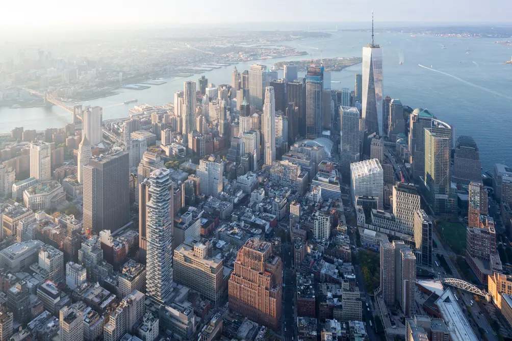 56 Leonard and the downtown skyline | Photo credit: Iwan Baan for Alexico
#7. One57, 157 West 57th Street
Architect: Christian de PortzamparcDeveloper: Extell Development
75 stories | 1,005 feet tall
Residential condos (92 apartments) and a Park Hyatt Hotel (210 rooms)
Finished in 2014
Completed in 2014, One57 is a 1,005-foot-tall mixed-use tower developed by Extell Development and designed by Christian de Portzamparc at 157 West 57th Street, the first of the major "supertall" towers along what came to be known as "Billionaries'" Corridor south of Central Park.
When it was completed, it was, for a short time, the tallest residential building in the city.
It has 92 condominium apartments on top of a 210-room Park Hyatt Hotel.
Michael Dell, who founded a computer manufacturer, bought the penthouse in 2014 for $100.5 million, setting a record that would surpassed in 2019 by Ken Griffin's purchase of an apartment at 220 Central Park South for $238 million.
In his December 23, 2013 review of the building in The New York Times, Michael Kimmelman wrote that "This one unravels as a cascade of clunky curves descending toward ribbons billowing into canopies," adding that "The conceit is falling water. The effect: a heap of volumes, not liquid but stolid, chintzily embellished, clad in acres of eye-shadow-blue glass offset by a pox of tinted panes, like age spots. It’s anybody’s guess how the building got past the drawing board."
A little harsh, as the 57th Street entrance cascade of facade "ribbons" is pretty original and handsome as are the vertical curves at the top of the building and its large illuminated top facing Central Park. It is true that the "age spots" are less than magnificent.
#8. Via Verde, 700 Brook Avenue
Architects: Dattner Architects and GrimshawDevelopers: Phipps Houses and Jonathan Rose Companies
22 stories
Residential rentals (222 apartments)
Finished in 2012
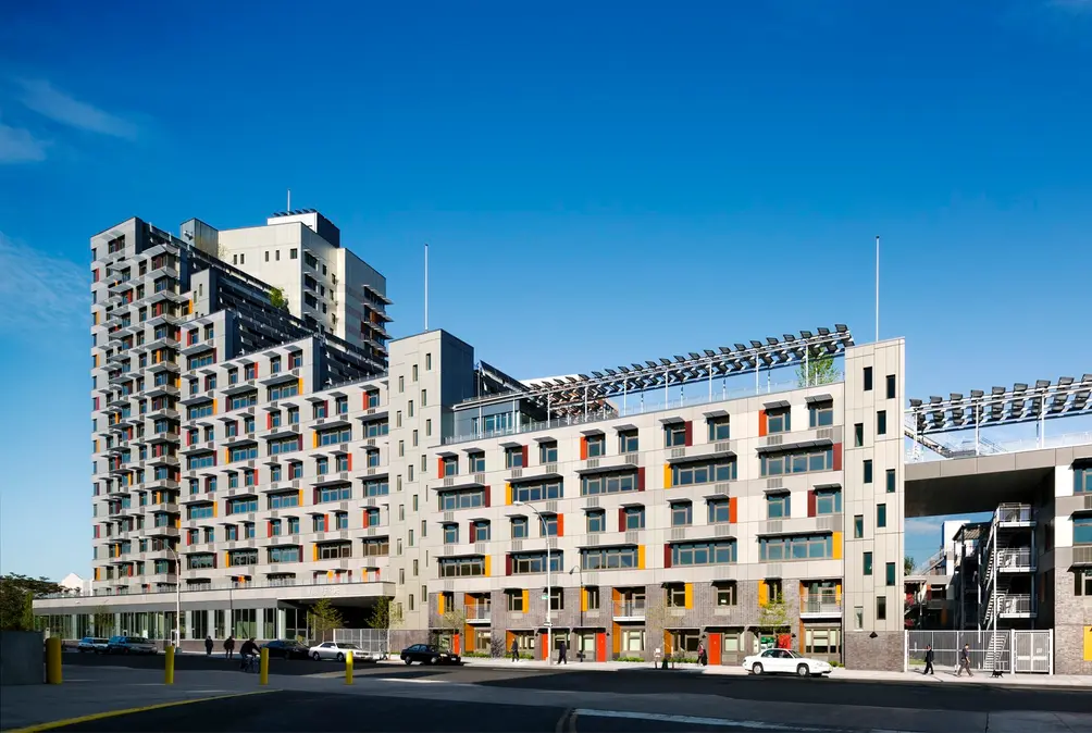 Photo: David Sunberg
Via Verde is an affordable, sustainable residential development comprising 222 apartments in three distinct building types - a 22-story tower at the north end of the site, a 6- to 13-story mid-rise duplex apartment component in the middle, and 2- to 4-story townhouses to the south. The project was the winning entry in the international New Housing New York Legacy Competition, sponsored New York City HPD, the AIA New York, NYSERDA and Enterprise Community Partners.
New Housing New York challenged designers to create an exemplary and replicable model that encourages new excellence in sustainable affordable housing. The project was designed by two firms, Dattner Architects and Grimshaw Architects, joined by Jonathan Rose Companies and The Phipps Houses Group as co-developers.It reflects a public commitment to create the next generation of social housing and seeks to provide a setting for healthy, sustainable living.
Via Verde is part of the Center for Architecture’s Helfand Spotlight Series, which features current topics in New York architecture.
The 1.5 acre site in the South Bronx is located in the Melrose neighborhood with access to mass transit and other urban amenities. The mixed-use project serves a range of income levels by providing 151 rental apartments affordable to low-income households and 71 co-ops affordable to middle-income households. The diversity of unit layouts includes simplexes, innovative duplex units, and live-work units with a first-floor‘ work' space.
Via Verde's stepped form is inspired by the integration of nature and city. At the heart of the project is a dynamic garden that serves as the organizing architectural element and spiritual identity for the community. The connected green rooftops are used to harvest rainwater, grow fruits and vegetables, and provide open space for residents. Other amenities that contribute to the project's theme of healthy living include courtyards, a health education and wellness center operated by Montefiore Medical Center, health-oriented retail space, a fitness center, and bicycle storage areas.
Projecting sunshades punctuate the street-facing elevation, which is made up of warm-toned wood, matte fiber cement, and silvery aluminum rain-screen panels.
In his review in The New York Times, Michael Kimmelman noted that the project "makes as good an argument as any new building in the city for the cultural and civic value of architecture."
#9. 400 Park Avenue South
Architect: Christian de PortzamparcDevelopers: Equity Residential and Toll Brothers Companies
40 stories | 472 feet tall
Residential rentals (269 apartments) and condos (81 apartments)
Finished in 2012
400 Park Avenue South is a stunning, bold, 40-story reflective glass shard of an apartment tower, with the bottom 22 floors containing 269 rental apartments developed by Equity Residential and the top 18 floors with 81 condominium apartments developed by Toll Brothers.
The tower, which occupies the southwest corner of Park Avenue South and 28th Street, is known as The Prism. The rental entrance is at 50 East 28th Street. The condo entrance is on Park Avenue South.
Christian de Portzamparc, the French architect of One57 and the LVHM Tower, both on 57th Street, designed the project in 2003 for A & R Kalimian Realty, which eventually sold it to Equity Residential and Toll Brothers City Living.
Like the LVMH Tower, this project is rakishly angled but while the LVMH tower is mid-block and mid-rise, this project is more than twice as high and on a corner.
In contrast, the architect’s mid-block, One57 tower for Extell Development is “softer” with a few rounded setbacks, although, of course, it is much taller and therefore more prominent as it was the first of the new generation of “supertalls” and has a highly visible location when seen from the Central Park and the north.
Extell commissioned another project from the architect, Riverside Center, which consists of several angled towers centered about a plaza between 59th and 61st Streets on Riverside Boulevard. Based on renderings, those buildings did not have the sharpness of this project and their angularity is a bit compromised by their complex form and mixed façades. Extell subsequently sold off this cluster of towers to other developers who decided to use different architects for the buildings.
Gary Edward Handel was the “executive” architect on this project and designed the rental units and Stephen Alton Architect designed the condo units.
This faceted tower, whose highest peak is 472 feet high, is a pure and very bold work of art that boasts some of the most dramatic and spectacular architecture in the city.
Sculpted asymmetrically, the building has a slightly chamfered and cantilevered corner that extends upward about 15 stories where it becomes the sharp edge of the building’s tallest component that is set back somewhat from Park Avenue South and angled considerably inward next to the non-setbacked 28th Street façade.
The most complicated part of the building is its narrow southern wing that is angled inward and downward but also seems to have been split asunder from the main body of the building. It also has a slanting roofline like the main tower, whose roof sports a hefty top “feather” in the form of a very large window-washing “rig.”
The façades are a pleasant deep blue glass.
There is an angled opening for the entrance to the downtown Lexington Avenue subway station.
On his website, de Portzamparc states that he “de-massed the building by breaking it into shards, and simply inclined the leading edges of the prisms to open a path for sunlight,” and adds that “averaging the push and pull of the façade’s fragments achieves the same degree of slope as terraced setbacks.”
“The result is not only light on the street, but a breath of fresh air.”
In his review of the building at www.architectmagazine.com, critic Joseph Giovannini noted that “the crystalline forms establish a zone of their own, opening up the street wall of right-angled, brick-faced buildings with an exceptional – and exceptionally beautiful – surprise: a tall, sheer rock crystal of glass. The entire shaft of the elegant new landmark, not just the crown, is iconic. It contributes to the skyline and to the bodyline of buildings. Yosemite’s West Face transposed to Manhattan.”
“For all the eclat on its corner,” Giovanni's article continued, “de Portzamparc says the $400 million building grew from the inside out….Portzamparc configured an L-shaped building to match the shape of the site, but kept the ends clear of the adjoining buildings, where he extruded pavilions with windows oblique to the street….The architect configured the two legs of the L as intersecting volumes, and he joined them and the adjacent pavilions with deep reveals whose shadows separate, and profile, the adjacent prisms….The eye looks to the knife-like corners and finds that the blades are crisp and sharp.”
“De Portzamparc designed the tower in 2003, building on the critical and popular success of his previous work, the LVMH tower, completed in 1999 in Manhattan, where he first fragmented a street façade as a way of satisfying code setback requirements,” Mr. Giovannini wrote.
“During planning commission hearings about zoning changes for the project,” he continued, “a former city council member, Margarita Lopez, said she happened to be reading Dante, and in unexpected paean to the building, she said she liked the way the sunlight would follow the architectural lines into the Stygian depths of the subway station at the foot of the tower. Conversely, in the upward direction, the oblique lines, some converging, force perspective, creating the perceptual illusion of accelerated form; the building is visually dynamic because it plays perspectival tricks as old as the Renaissance, but in a vertical rather than horizontal direction.”
The building has 5,200 square feet of retail space and entrance marquees, including one for its subway entrance.
#10. Whitney Museum of American Art
Architect: Renzo Piano Building Workshop (RPBW Architects)Developer: The Whitney Museum of American Art Companies
8 stories
Museum
Finished in 2015
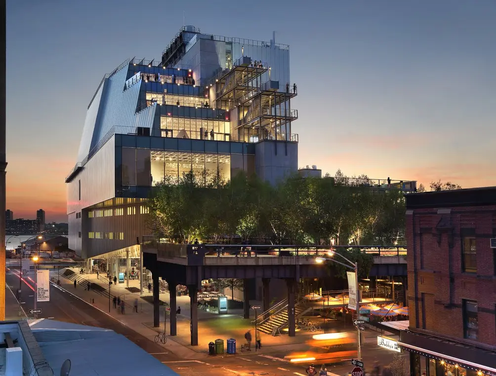 The Whitney Museum of American Art (Ed Lederman)
The Whitney Museum's new main building, designed by Renzo Piano, rises across from the High Line's southern entrance in the Meatpacking District, at the intersection of Gansevoort and Washington Streets, built on a previously city-owned site. Construction began in 2010 and was completed in 2015, at a cost $422 million.
The new structure, much more expansive than the museum's previous facilities, rises 8 stories, spans 200,000 square feet, and houses the city's largest column-free art gallery spaces, an education center, theater, a conservation lab and a library and reading rooms.
Two floors are fully devoted to the museum's permanent collection that comprises over 600 works by over 400 artists, with approximately 50,000 square feet of indoor galleries and 13,000 square feet of outdoor exhibition space and observation terraces facing the High Line. The only permanent artwork commissioned for the site—its four main elevators—were conceived by Richard Artschwager. Additional exhibition space includes a lobby gallery (accessible free of charge), two floors for the permanent collection, and an 18,000-square-foot special exhibitions gallery on the top floor.
The dramatically cantilevered entrance along Gansevoort Street shelters an 8,500-square-foot outdoor plaza or “largo,” a public gathering space steps away from the southern entrance to the High Line. The building also includes an education center offering state-of-the-art classrooms; a multi-use black box theater for film, video, and performance with an adjacent outdoor gallery; a 170-seat theater with stunning views of the Hudson River; and a Works on Paper Study Center, Conservation Lab, and Library Reading Room.
A retail shop on the ground-floor level contributes to the busy street life of the area. A ground-floor restaurant, Untitled, and the top-floor Studio Cafe are operated by renowned restaurateur Danny Meyer and his Union Square Hospitality Group.
Architect Renzo Piano was born in Genoa, Italy, in 1937, into a family of builders. In 1971, he founded the studio Piano & Rogers with Richard Rogers, and together they won the competition for the Centre Pompidou in Paris, the city where he now lives. From the early 70s until the 90s, he collaborated with the engineer Peter Rice, forming Atelier Piano & Rice, between 1977 and 1981. Finally, in 1981, he established Renzo Piano Building Workshop, with a hundred people working in Paris, Genoa, and New York.
Mr. Piano’s design takes a strong and strikingly asymmetrical form—one that responds to the industrial character of the neighboring loft buildings and overhead railway while asserting a contemporary, sculptural presence. The upper stories of the building overlook the Hudson River on its west, and step back gracefully from the elevated High Line Park to its east.
Piano remarked in 2011, “The design for the new museum emerges equally from a close study of the Whitney’s needs and from a response to this remarkable site. We wanted to draw on its vitality and at the same time enhance its rich character. The first big gesture, then, is the cantilevered entrance, which transforms the area outside the building into a large, sheltered public space. At this gathering place beneath the High Line, visitors will see through the building entrance and the large windows on the west side to the Hudson River beyond. Here, all at once, you have the water, the park, the powerful industrial structures and the exciting mix of people, brought together and focused by this new building and the experience of art.”
Would you like to tour any of these properties?
Just complete the info below.
Or call us at (212) 755-5544
Would you like to tour any of these properties?

Architecture Critic
Carter Horsley
Since 1997, Carter B. Horsley has been the editorial director of CityRealty. He began his journalistic career at The New York Times in 1961 where he spent 26 years as a reporter specializing in real estate & architectural news. In 1987, he became the architecture critic and real estate editor of The New York Post.

 6sqft delivers the latest on real estate, architecture, and design, straight from New York City.
