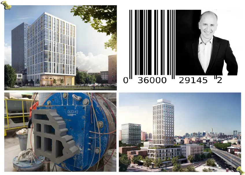
 Chris Fogarty and his inspirations for 321 Warren in Jersey City and The Dime in Williamsburg
Chris Fogarty is a co-founding Principal of Fogarty Finger Architecture and previously a Senior Designer at Skidmore Owings & Merrill Architects. His current projects include the mixed-use, 22-story tower The Dime located at the foot of the Williamsburg Bridge and adjoining the existing historic Dime Bank Building and The Lively, at 321 Warren a mixed-use 18-story tower in the heart of Jersey City’s Powerhouse Arts District featuring a residential mass above a retail and public arts podium.
CityRealty recently spoke to Fogarty and asked about his design inspirations for those two projects. We found he had amazingly varied and interesting influences ranging from his youth, barcodes to flower pots.
CityRealty recently spoke to Fogarty and asked about his design inspirations for those two projects. We found he had amazingly varied and interesting influences ranging from his youth, barcodes to flower pots.
Inspirations
Chris Fogarty: As architects, we all have memories of buildings we love and wish we could get a chance to do something with those memories. I have buildings in my subconscious, from when I was a student in London, that inspire decisions I make today.
Now with cameras in our phones we take photos of everything that inspires us. This is both good and not so good. What is really good is when you see something and think, “I can do that,” you can take a photo and immediately send it to anyone. Recently I was walking on the Upper East Side and I passed a building that was being renovated with these beautiful sliding doors. Instead of using heavy doors or revolving doors, both of which can be a pain with strollers, they had sliding doors, which you typically only see in grocery stores and airports. Those beautiful doors inspired the sliding doors in the Lively.
The not so great part of having cameras on our phones is that we no longer feel the need to sketch, which I used to do all of the time. We all used to walk around with notepads and sketch. But architects are always looking and always being inspired. We take the inspiration and language we see in the world and reuse it in new ways.
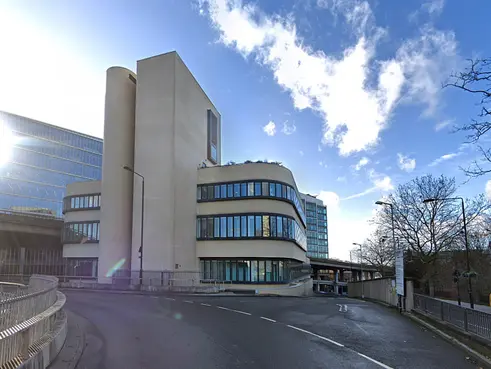
There is this amazing building that is just squeezed into a little triangle in central London and immediately popped into my mind when I saw the site for the Dime. The BQE flyover comes straight past the Dime site in Williamsburg quite closely, just as Westway flyover passes the Battleship building in London. It’s an extraordinary building and you’re always driving 40-50 miles per hour as you pass the Battleship building and the way it curves feels completely appropriate. Every time I drove past this I always thought, “This is great!"
The Dime’s facade is all terra cotta. The beautiful white terra cotta used at the 475 10th Avenue was an inspiration. It is one of the greatest examples of using terra cotta in the city, and, not surprisingly, it is filled with architect offices.
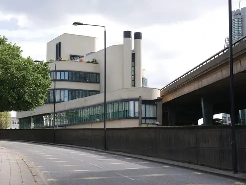 The design of London's Battleship Building partly inspired the design of The Dime(Credit: Fogarty FInger Architects)
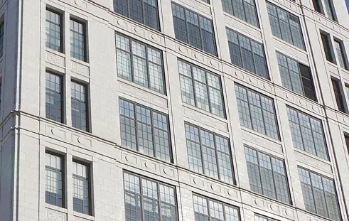 475 Tenth Avenue (captured by Fogarty Finger)
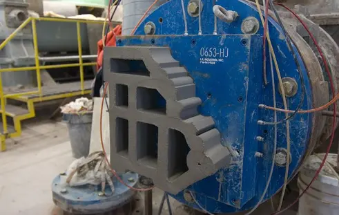 Terra cotta extrusion method via Boston Valley Terra Cotta
There’s a great story behind the company who made the terra cotta for the Dime. The company, Boston Valley Terra Cotta, was started by a father who was a Wall Street guy. He had three sons, all of whom did pottery. The father considered them layabouts and decided to buy a pottery company so they would have a business. They were busy making flower pots when someone from the Louis Sullivan Guaranty building in Buffalo stumbled on their work and asked if they would be able to repair pieces of terra cotta. So the flowerpot guys repaired the building and now have a very successful firm.
Terra cotta is a wonderful product. It is very durable, very New York-y and it went perfectly with the Dime’s curves and its fresh, white and modern look. Terra cotta is basically like clay in a toothpaste tube that gets squeezed out the end. In order to make terra cotta affordable, it must be extruded. You can also use molds but that is more expensive but the secret to doing the Dime was to make sure every piece of terra cotta was an extruded piece. Amazingly, one of the reasons terra cotta has come back in fashion is because of the energy code. The way the energy code reads, insulation has to be so complete on a building nowadays, you kind of have to cover the whole building in insulation and waterproofing. So you might as well put a rain screen facade that clips on the front. It is much faster to build than if you build with brick. So, the energy codes have made an old product much more viable than it used to be.
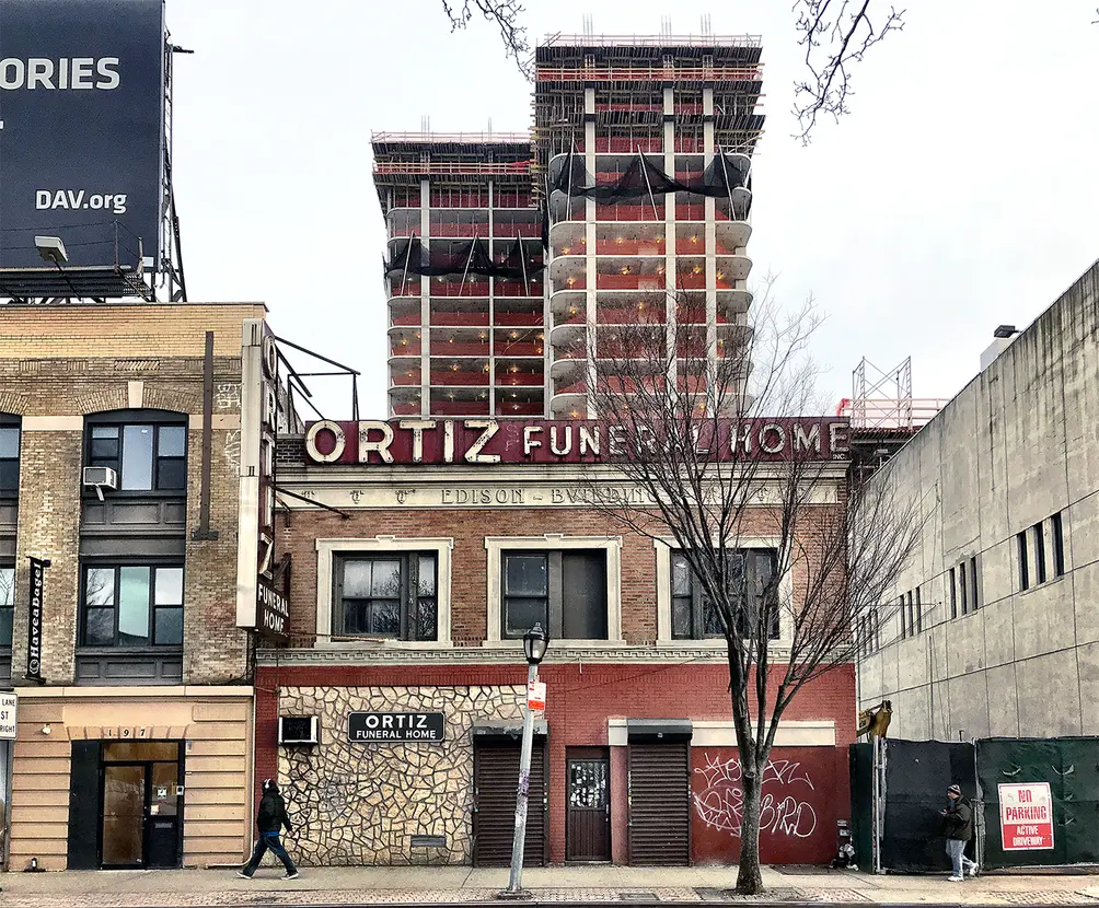 The Dime rising above South Williamsburg andnearly topped out. The bare frame awaits its terra cotta skin. (CityRealty)
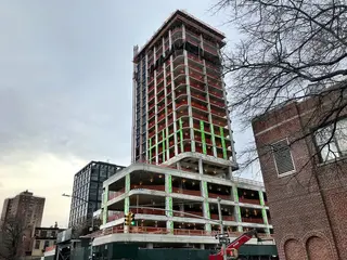 Construction at The Dime as of late January 2019 (CityRealty)
Effectively, The Lively is quite simple, it is a big square box. There is the base and above that we have a barcode-like grid above it. All of the living room windows are highlighted with big gold frames on the facade. The gold frame is like a gallery wall. We wanted to make special moments on the facade.
There is a beautiful rhythm about barcodes. People see them so often but don’t really think about them. They are actually quite exquisite. So much so that many artists love to paint barcodes. But in addition to their artistic quality, they also have a digital, mathematical quality to them.
The windows on the facade of the Lively represent what is behind them. Bedroom and living rooms have different sized windows. The use behind the windows is expressed out in front. All of the living rooms have either really big eight-foot windows or a six-foot window and two-foot skinny window. There is a whole hidden language to the facade. Together, the barcode and frames make a whole language no else knows. So the white brick facade with gold frames and big glass base really make an impact.
With both the Dime and the Lively, we combined the windows vertically. When a building is not super tall, combing vertical windows makes it seem taller and more elegant, like wearing stripes. It’s an old trick you can see all over New York.
Both buildings are currently under construction - the Lively is currently up to the 14th floor and the Dime is up to the 18th floor.

Contributing Writer
Michelle Sinclair Colman
Michelle writes children's books and also writes articles about architecture, design and real estate. Those two passions came together in Michelle's first children's book, "Urban Babies Wear Black." Michelle has a Master's degree in Sociology from the University of Minnesota and a Master's degree in the Cities Program from the London School of Economics.

 6sqft delivers the latest on real estate, architecture, and design, straight from New York City.
