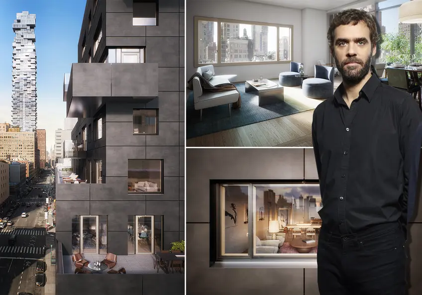
 Architect Francois Leininger and images of 30 Warren Street in Tribeca
Francois Leininger, one of the three founders of Post-Office Architectes (POA) — who befriended one another while working at Atelier Jean Nouvel's office, loves building in New York City. His Parisian roots give Leininger a respect for place and history but, he says, New York City offers such a blank slate for contemporary architecture, he is beyond thrilled to build here.
In this article:
"Being in Tribeca is incredible for contemporary architects because there are so many old cast irons that are so iconic to speak to. Tribeca allows for a French architect’s dream to come true."
The building POA designed at 30 Warren considers the historical roots of bustling Tribeca and reinterprets them in a modern, poetic and strong way. The architects and their client wanted a modern building that was contextual, which is exactly what they've designed. One of the most striking features of this building is the custom, one-of-a-kind, precast concrete facade made from a cast of corrugated cardboard. Set at opposing 45-degree angles, the skin will reflect the sun in different ways throughout the day.
Inside, there will be 23 residences ranging from one- to three-bedrooms. All will have open floor plans, high ceilings that start at 9’6” and bespoke cabinet details hand finished and fabricated locally in the Hudson Valley. The robust amenities package includes a fitness center, children’s playroom, bicycle storage, laundry room, and a full-time attended lobby. Current availabilities show one-bedrooms are priced from $2.005 million, two-bedrooms from $2.665 million and three-bedrooms from $4.395 million.
Recently, CityRealty spoke with Leininger about designing 30 Warren, the minerality found in Tribeca and what not to miss the next time you’re in Paris.
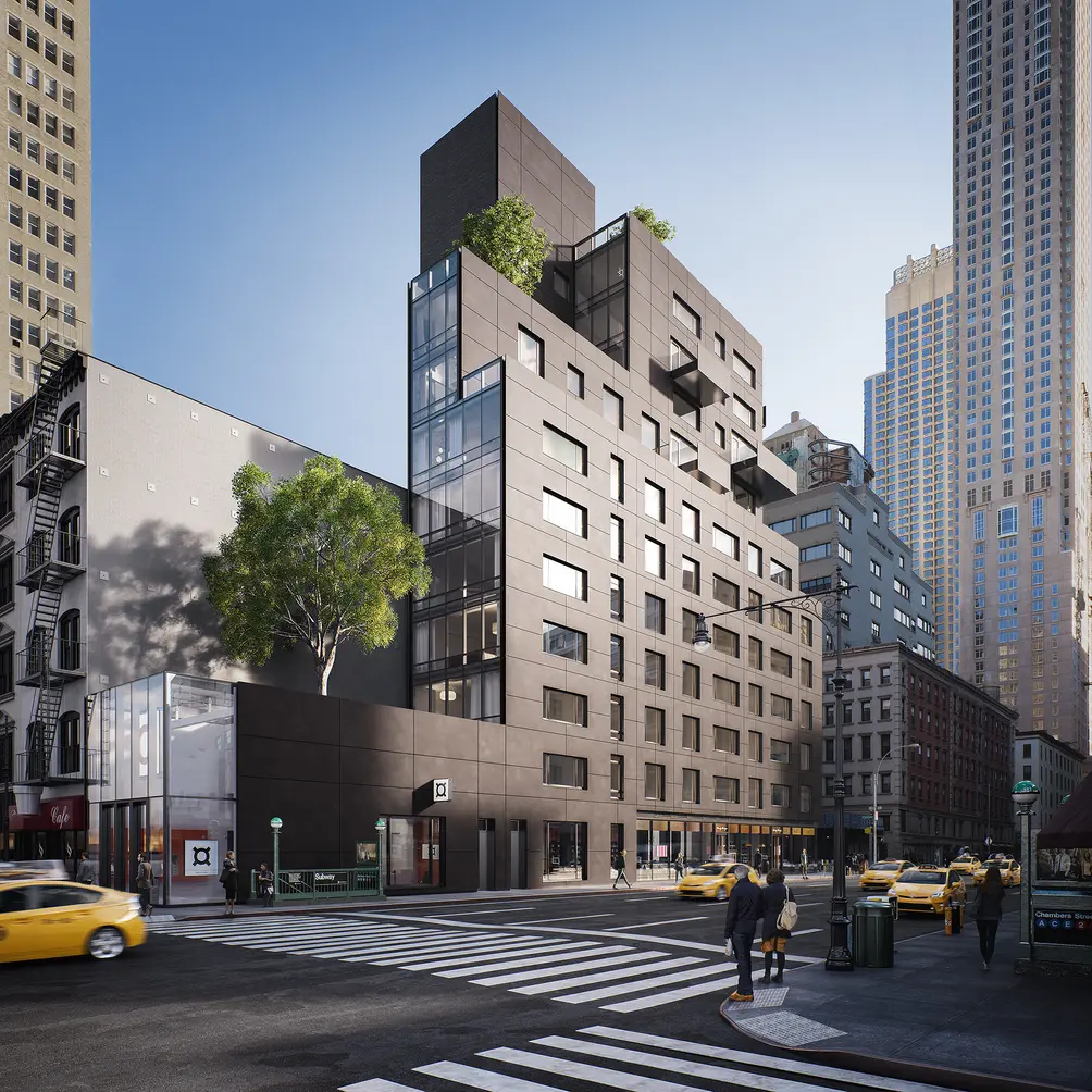 POA-designed 30 Warren from the northwest corner of Warren and Church streets (POA)
You have said that your goals for 30 Warren were “protection, privacy, and transparency.” Those seem a little contradictory, can you explain them?
Since I’m French, and English is not my first language, I have to be careful about choosing my words. Protection and transparency were at the heart of the project. But when I say protection, it is not in the sense of security, it is protecting the intimacy of the residential building as a domestic space. When you are in the middle of the city, you want to provide transparency so people living in these apartments find balance. But you also want to guarantee some level of domesticity and intimacy in heart of Tribeca where much of the contemporary architecture is very transparent. This is what is at the heart of this building.
We have this incredible viewpoint looking at all of these icons from below and they are looking back at us. This is common in the city but what is interesting is from the physical setting, we are almost at the center, surrounded by all these buildings we admire. Our client wanted a modern building and both we and our client were very conscious that we didn’t want to do a glass box here. There are a lot of glass boxes all over the city. We wanted to find the right balance.
"Our client wanted a modern building and both we and our client were very conscious that we didn’t want to do a glass box here." -Francois Leininger, POA
Conceptually, our design started with a glass box but then we partially clad that glass box with a skin that would have the set of qualities we wanted: it had to be domestic, it had to be strong, it had to be protective in a sense you don’t want to feel like you’re entering a museum or office building because it had to feel like a home. We wanted the skin that partially covers this glass box to be poetic. This is downtown Manhattan, not just some neighborhood in some city. You have a responsibility to give something to the city, you have to be interesting. This is Tribeca, there are a lot of mineral facades, a lot of stone and some precasting here. We wanted to create a new precast concrete that could have all of the qualities we were looking for. It needed to be light, yet strong, we wanted it to have a mineral quality, to be protective and domestic but also it must allow for very large openings.
That became our proposal: two sides of the building are clad with this concrete precast skin, the third facade we left fully glazed and the fourth facade, which is the shared facade with the neighbor, is much more opaque because of zoning. We surveyed all the colors in neighborhood and neighboring buildings and decided our addition would have to be warm grey. The precast concrete technology allowed us to define a very specific color to give the skin the poetic quality and level of interest we wanted. We needed to have the material allow for texture. We also wanted the facade to have a crafty aspect, to balance the fact that all of the buildings in the area are very designed and very precise. We wanted our concrete to have the texture to balance that precision and feel almost homemade. So we created these molds with corrugated cardboard that gave it the things we were looking for.
We wanted a 45 degree ribbed texture that we would deploy throughout the entire face to give it a feel of a big piece of fabric and not just a strong concrete wall. The corrugation is uneven at the micro level, there are little imperfections here and there. We used 70 or so different molds so we could create pieces are that almost all different. That was the process. We had to have a series of setbacks from zoning so the way we laid out the concrete panels with their texture on the same facade alternating their direction. So on the same western facade of the building, the western sun at any given time of the day will look different at the set back because of the way we changed the direction of the ribs. If you add all these little things together, we think it will be poetic and transparent but also a very domestic building that looks very crafty and modern. That is our response to Tribeca. Being in Tribeca is incredible for contemporary architects because there are so many old cast irons that are so iconic to speak to. Tribeca allows for a French architect’s dream come true.
Have you ever made a facade like this before?
This was the first time and we don’t intend to do it again. It was a very specific response to a specific situation. We put together the concrete facade that would be very unique and still needs to be modest and calm. This a residential condominium building in Tribeca. We are not famous architects so we had to find the right tone and be able to blend with the environment and at the same time make a small statement so people will be proud and interested to live there.
"We think it will be poetic and transparent but also a very domestic building that looks very crafty and modern. That is our response to Tribeca."
Tell me about the windows. The windows and the facade really define the building.
The windows were the only things on this building not locally produced, they were made in Italy. We defined four different window types that would all be very big. Then, we started to apply these shapes to different types of rooms. The living rooms would have long rectangular windows, the master bedrooms would have large squares, etc. We mapped the building with all the different windows. Because the windows are so large, there are these great geometric openings that frame the amazing views of the city.
Then, on the interior of the windows, we have these very nice anodized champagne colored frames that are going to protrude from the wall and soften the transition from the outside to the inside. We wanted to add that touch of champagne for color but we didn’t want it to be too strong. We wanted something people could embrace without having the impression that we were defining how they would live in their own space. The champagne has a sort of yellowish tone, so just when the sun it is going to hit the frames and send these slightly yellow sparkles through the windows.
We know how we want to live— we all want the liberty to define how we want to decorate our living spaces. When we created the palette for the interior, the champagne was the touch of color, then we added wood. The grey stone was just the right balance with wood and the brown leather in the kitchen played off the very white glossy and matte cabinets. The kitchen cabinets also have corrugated transparent glass that connects with the facade of the building. It is as if one belongs to the other.
You mentioned zoning influencing the design. How did it do that?
Zoning in New York City produces very unexpected and interesting shapes. There are so many rules and so many possibilities. When we started to study this site, we understood there were different ways to create a zoning envelope. The one we became really interested in was this zoning envelope on the north side of the site. We would have a very low building and we would reveal the wall of the neighboring building. We have this two-story building to start and then have a very progressive building with all kinds of different setbacks creating all kinds of different moments, like the terraces.
On the south side, there is a much more traditional zoning envelope with the base building being six stories, one set back and tower building with 7 stories. If you look at the building by walking along Church Street going to Midtown, you will discover the zoning made the building have a more traditional New York shape. If you walk toward downtown, you’ll have a completely different experience with the fully-glazed curtain wall and all of these different setbacks, two- to five- to ten-stories and then a big setback and another extension to the top of the bulkhead making it a total of 14 stories high. The building cascades.
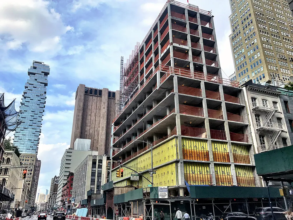 30 Warren as of mid-June 2018 (Ondel/CityRealty)
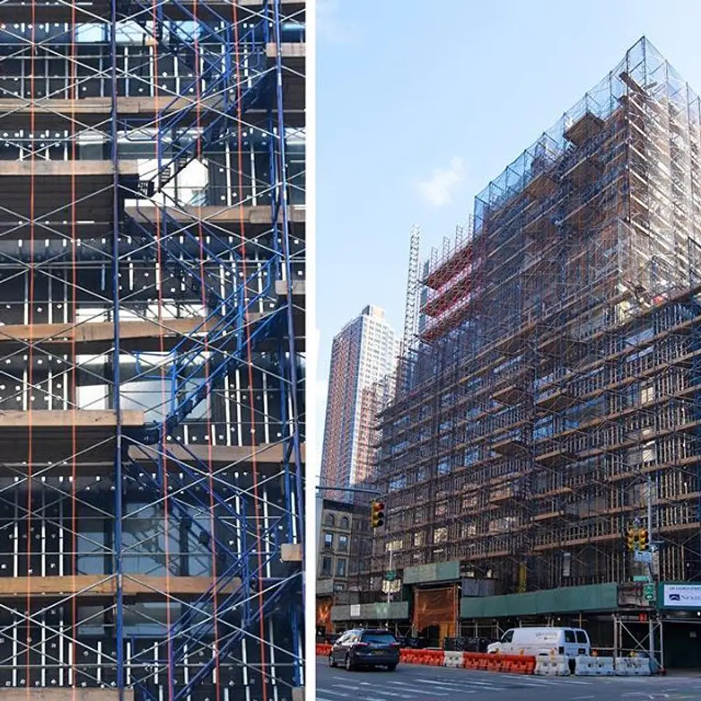 Recent construction from January 2019 via T.G. Nickel Insagram: https://www.instagram.com/tgnickel/
How is building in New York different than building in Paris?
[Big sigh] New York is this collection of individual buildings that form blocks. A given block in New York City has buildings with all different shapes, materials, styles, and colors. Paris is defined by the pursuit of some kind of unity, which is good and bad. As architects, we are now struggling with the idea of Paris as a modern city. It is a city that needs to densify and bring more people in, it would benefit to have taller buildings on appropriate sites.
Paris is defined by the pursuit of some kind of unity, which is good and bad. As architects, we are now struggling with the idea of Paris as a modern city.
Contemporary architecture gets a lot of pushback in Paris, which is a very conservative city in terms of zoning and protecting its identity. It has to protect what makes Paris, Paris. New York is more free run. It’s amazing that you can buy a small building, tear it down and build a 100-story tower in its place. We’re incredibly excited about being a part of this but also we have this sort of approach that most European architects often have in that we look at what is there, what is around us and try to react to the history of the neighborhood. That is why we put together this project this way, being conscious of its surroundings. I think it’s really important to relate to the history.
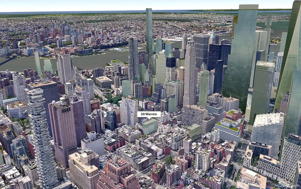 Google Earth aerial showing the low-rise Tribeca oasis the 30 Warren rises in (CItyRealty)
Like many other New Yorkers, I am headed to Paris this summer. What hidden architectural gem should I visit?
I have something in mind but its very specific. There’s this place in northern part of Paris, an arts center called Le cent quartre, literally the number 104, which is its address. It is the transformation of an old Paris building that was originally the public funeral home of Paris. Just imagine two very big, long warehouses, over 100 years old, that used to have this wild function and then became an empty building for years. The two long warehouse buildings are separated by a glass and steel covered courtyard. There is some really interesting programming including a theater, an exhibit space, a bookstore, restaurants and a children’s facility, where the kids can play while the parents go see an exhibit or eat at a restaurant.
It is in the north of Paris which is very popular with all kinds of different socio-economic populations. There are a lot of families who don’t have a lot of money in that area so the director of this public institution wanted the place to be not just for the artsy population who go to the theater etc, he wanted to open the place to the neighborhood. That atrium is covered in winter and summer. Before there was not a lot of stuff happening in it, so he invited all the dance companies and associations who do things with kids to use it as they wanted to. Now when you go there, what you see in the center is hundreds of kids dancing and playing in this space. That is one of the most interesting experiences in recent years in Paris of trying to open culture and arts to the widest possible range of people. If you and I go there, we will have very different kinds of experiences. When I am in Paris, I love to go there with my daughter, we enjoy it so much.
 L to R: Francois Leininger, David Fagart and Lina Fontana
Would you like to tour any of these properties?

Contributing Writer
Michelle Sinclair Colman
Michelle writes children's books and also writes articles about architecture, design and real estate. Those two passions came together in Michelle's first children's book, "Urban Babies Wear Black." Michelle has a Master's degree in Sociology from the University of Minnesota and a Master's degree in the Cities Program from the London School of Economics.

 6sqft delivers the latest on real estate, architecture, and design, straight from New York City.
