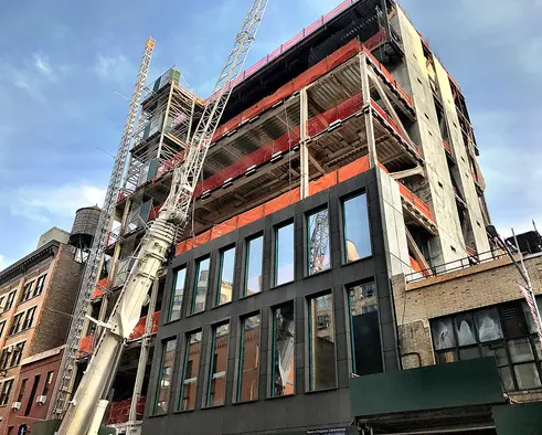
Early last year, construction began on Pace Gallery's new black, volcanic stone-clad headquarters and gallery space in West Chelsea’s ever-growing art district. According to the architect's, Bonetti/Kozerski, website, the 75,000 square foot, eight-story, metal-clad building will more than double the footprint of Pace’s current space. The architects designed the gallery to both fit into the historical context of the neighborhood and to reinterpret the gallery concept to focus on engagement and participation versus disengaged, one-way viewing.
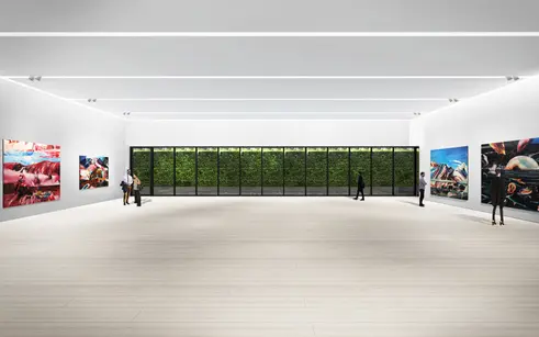
The building’s design features expansive column-free galleries with 20-foot ceilings to maximize exhibition space and allow for rotating exhibits, a unique lighting concept, developed with lighting designer Arnold Chan, that automatically adjusts the ambient light to complement specific the works on display, a public library of Pace’s extensive collection of more than 10,000+ catalogued volumes on the ground floor and 10,000 square feet of outdoor exhibition space that will visually connect the building to the High Line. To top it all off, there will be a dramatic double-story penthouse gallery that floats on top of the building.
CityRealty asked Matteo Fraticelli, the project director of the Pace Gallery Headquarters, more about how the design will engage viewers, how the custom lighting works and what will happen in the floating penthouse.
How do you create more viewer engagement through design?
The typology of the building is a hybrid of a museum and an art gallery. With a typical art gallery, people come in, they look at the art exhibition and leave with no real direct engagement. This building was designed with spaces where you can see the behind the scenes of the art gallery. You can see the storage, you can see the library with its 10,000+ books which can be open, read and seen. The public can travel through the building and get more in-depth into the process of the art exhibit. They can also get engagement with all of the different art shows in the building, like moving through a museum with multiple art shows at the same time. There is also a big, open terrace, with over 5,000 square feet of exhibition space. We wanted to create the possibility of not only showing different art on different floors but also outdoors and indoors- this was a key element to creating a more unique experience which is more similar to a museum but free to the public and they can purchase anything.
"We wanted to create the possibility of not only showing different art on different floors but also outdoors and indoors." -Matteo Fraticelli
 Second floor gallery
Tell me about the custom lighting system you created to control the ambient light. How does it work?
The building has two types of gallery spaces, some with access to the exterior, natural light and others that don’t. The light system we created is really unique and sophisticated. It is ambient lighting that can be customized to different temperatures. It can go from warm light to colder light, from 2700K to 4500K. Usually, gallery lighting is pretty set, they don’t have the flexibility to control ambient lighting. Depending on which art is showing, the gallery environment can be customizable with a more suitable light color based on the arts’ preferences and needs. Some of the galleries will have access to natural lighting, so depending on where you are in that space, the art may need more or less lighting and we can coordinate that with our system.
What is the function of the penthouse?
That is gallery space on the seventh floor, we call it the Sky Gallery. It has the capability to not only support the regular art exhibits but it was designed with a platform and stepped seating for conferences, video performances, etc. There are really no limitations, especially with the 19-foot ceilings. It has a beautiful northern exposure with a full glass north wall that lets in an indirect natural light. On top of that, there is a private viewing room on the south side of that space. It really is very unique.
 Construction progress as of late June 2018 (CItyRealty)

Contributing Writer
Michelle Sinclair Colman
Michelle writes children's books and also writes articles about architecture, design and real estate. Those two passions came together in Michelle's first children's book, "Urban Babies Wear Black." Michelle has a Master's degree in Sociology from the University of Minnesota and a Master's degree in the Cities Program from the London School of Economics.

 6sqft delivers the latest on real estate, architecture, and design, straight from New York City.
