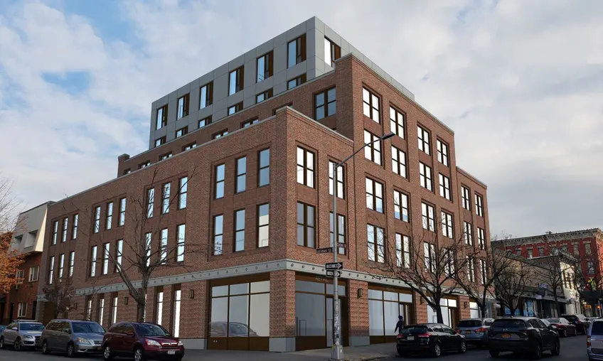
 171 Calyer Street. Credit: PKSB Architects
On February 11th, the Landmarks Preservation Commission will witness the developer’s presentation [PDF] for a 7-story, 39-unit condo proposed at 171 Calyer Street at the corner of Calyer and Lorimer streets. The point of contention is not the non-historic, single-story supermarket that it replaces, but rather how it relates to the context of the Greenpoint Historic District [PDF], established in 1982 and added to the National Register of Historic Places in 1983.
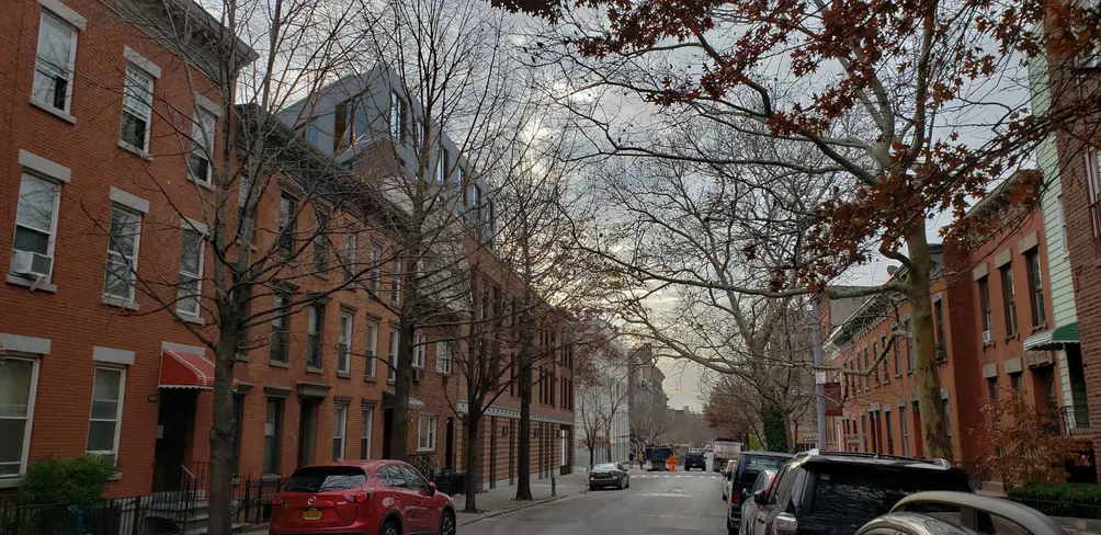
The developer presented the original proposal to Brooklyn’s Community Board 1 in October of last year. The roughly 30-minute session revealed a design by PKSB Architects with a two-tone red brick facade and artful setbacks, including one at three-story level along Lorimer Street that matches the cornice line of adjacent townhouses.
 171 Calyer Street. Credit: PKSB Architects
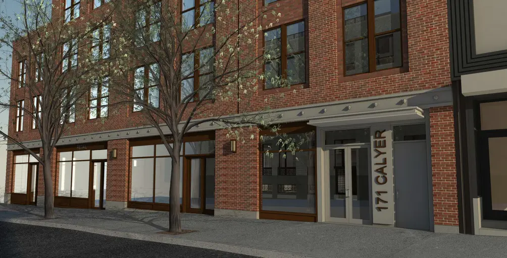 171 Calyer Street. Credit: PKSB Architects
The design that will be presented to the LPC shows slight yet notable improvement. The brick appears more muted and finely-textured, more closely matching the palette of the historic neighborhood. More extensive use of tall sash windows also harmonizes with traditional townhouses. The choice of larger windows and light-colored metal panels at the top two floors is somewhat surprising, though its light sandstone hue is likely a reference to the saucer dome at the historic Williamsburg Savings Bank across Calyer Street. The ground-level treatment is particularly pleasant, with broad, dark-framed storefronts alternate with brick piers adorned with classically-styled sconces and a cast stone ornamented course running above. The composition will fit well with the ornate, pointed lanterns across the street by the bank.
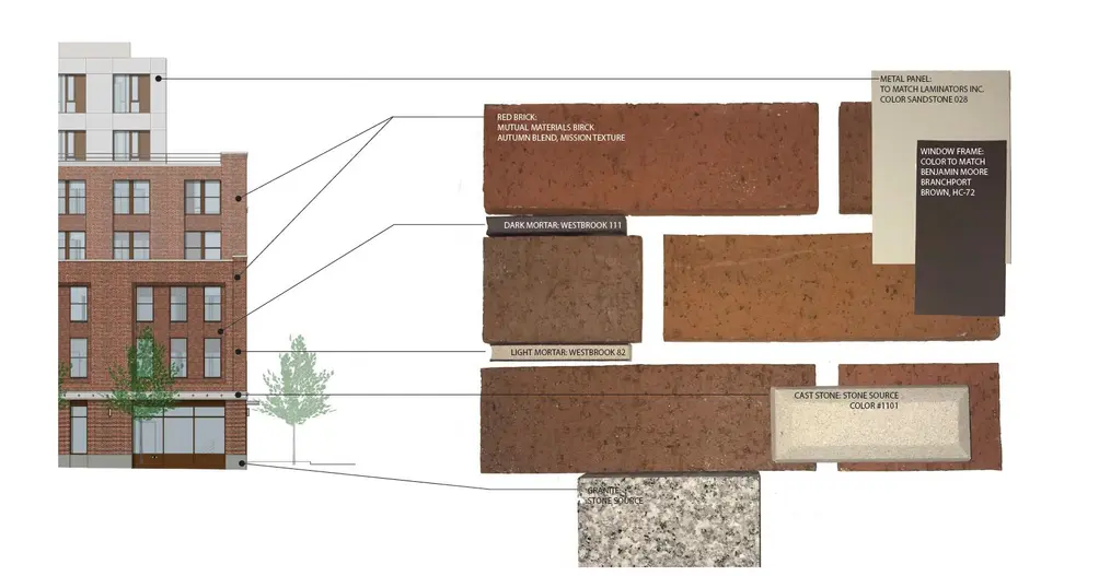 171 Calyer Street. Credit: PKSB Architects
Facade selection often makes or breaks a building, but the massing is just as important. The presentation emphasizes that the proposal accounts for only around half of the “historic bulk” of the RKO Theater that once stood at the site, before it was replaced by the supermarket, and compares the building scale to the nearby similarly-sized apartment building at 1125 Lorimer Street (referred to in the presentation as "Noble Street Apartments"). It also shows an alternate massing with a non-setbacked “box” that is shorter than the actual proposal yet is more bulky, boring, and disrespectful to the townhouse scale (which is yet more evidence that height is not everything when it comes to historic context).
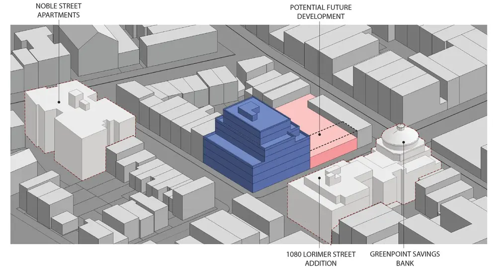 171 Calyer Street. Credit: PKSB Architects
For an unsightly example of a “box” building, look no further than across the street at 1080 Lorimer Street, a post-war addition to the majestic Williamsburg Savings Bank. The white brick box not only clashes with the neighborhood’s fine-grained aesthetic, but it has also aged very poorly, with dark rain stains running beneath the windows. Thankfully the proposed condo makeover, also designed by PKSB Architects, will improve the composition.
Like 1080 Lorimer, the proposal at 171 Calyer Street is a marked improvement over the pedestrian-unfriendly supermarket eyesore that currently stands at the site, and will go a long way to improve local street ambiance.


 6sqft delivers the latest on real estate, architecture, and design, straight from New York City.
