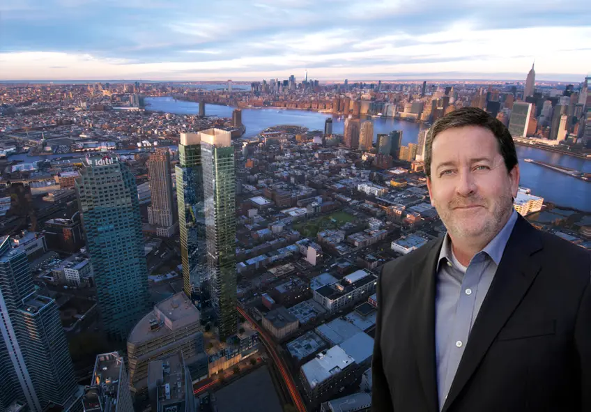
 Skyline Tower and Hill West's Stephen Hill
Founded in 2008, Hill West is a leading architectural firm in New York City behind many of the most salient residential developments to grace the city skyline in recent years. With a focus on multi-family and hospitality high-rise design, the 120-person firm aspires to create bold and pragmatic solutions that respond to our city's rich urban context as well as its competitive marketplace. We sat down with Hill West founding partner L. Stephen Hill to discuss the ins and outs of Skyline Tower, a nearly-finished condominium development in Long Island City that is now the tallest structure in New York City outside of Manhattan.
As a former partner at Costas Kondylis & Partners, the city's most prolific residential high-rise firm of recent times, Hill brings to the table more than 30 years of experience in regards to the design and technical development of high-rise residential buildings. Prior to co-founding the firm with partner David West and now retired partner Alan Goldstein, Hill's housing portfolio includes steering the realization of several Riverside South buildings such as The Rushmore and The Aldyn for Extell Development, and the 2007 conversion of the Plaza Hotel.
As a former partner at Costas Kondylis & Partners, the city's most prolific residential high-rise firm of recent times, Hill brings to the table more than 30 years of experience in regards to the design and technical development of high-rise residential buildings. Prior to co-founding the firm with partner David West and now retired partner Alan Goldstein, Hill's housing portfolio includes steering the realization of several Riverside South buildings such as The Rushmore and The Aldyn for Extell Development, and the 2007 conversion of the Plaza Hotel.
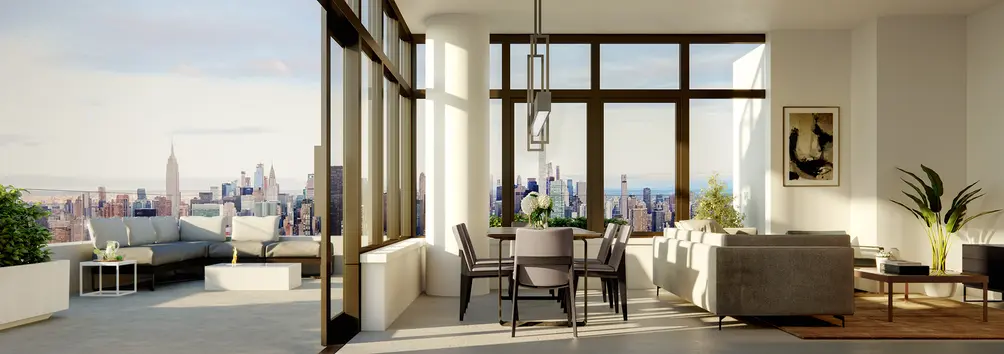 Skyline Tower. Credit: Binyan Studios
In this article:
Available homes in Skyline Tower have an asking price of just over $1,600 per square foot with studios priced from $680,805, one-bedrooms from $927,651, two-bedrooms from $1,381,747, and three-bedrooms from $2,512,031. Visit our page for all availabilities and call us for more information regarding this building and the Long Island City-NYC residential market.
How did Hill West receive the commission for Skyline Tower? How did you acquaint yourself with the developer?
Stephen: Chris (Jia Shu Xu of C&G Empire Realty) came to us through a friend of his. He had been previously developing smaller projects in Flushing - many hotels I believe, with Brian, his partner. They came to us when they were first thinking about acquiring the site, a time when just about every developer in the city was looking at it, too. It was quite a coup for him to pull it off, especially since this was his first significant tower. They were amazing all the way through the process.
Would you be able to elaborate on how much of the design was the developer’s concept versus how much was your own input?
Stephen: We put a lot of work into every building we design, but also the developer, whether he realizes it or not, has a lot to say about the aesthetics and how the whole project comes together. Their concerns and their influences are always present in our minds, and as architects, we marry the context, the times, the client's needs to produce a design. We never design for our portfolio. That's something that I'm really proud of. We put the owner’s desires way ahead of our own personal pride and benefit. If you truly do that, you will end up with a good product regardless.
I'll give you an example. The developers came to us with the idea for a condominium but they wanted rental unit sizes. This building’s floor plans are slender, appropriate units, without super-luxurious square footage. Xu realized that he's coming to the table with a huge project and that if he missed the mark, he would be in big trouble. But fortunately for everyone involved, his thoughts were right on target. His ability to predict the desires of the market and control the maximum price point of the homes worked out brilliantly.
The development team wanted an iconic, forward-looking building. We went with a mostly-glass building and there was already an agreement with the curtain wall manufacturer. In a sense, we were given the kit of parts conceptually and we used that as our starting point.
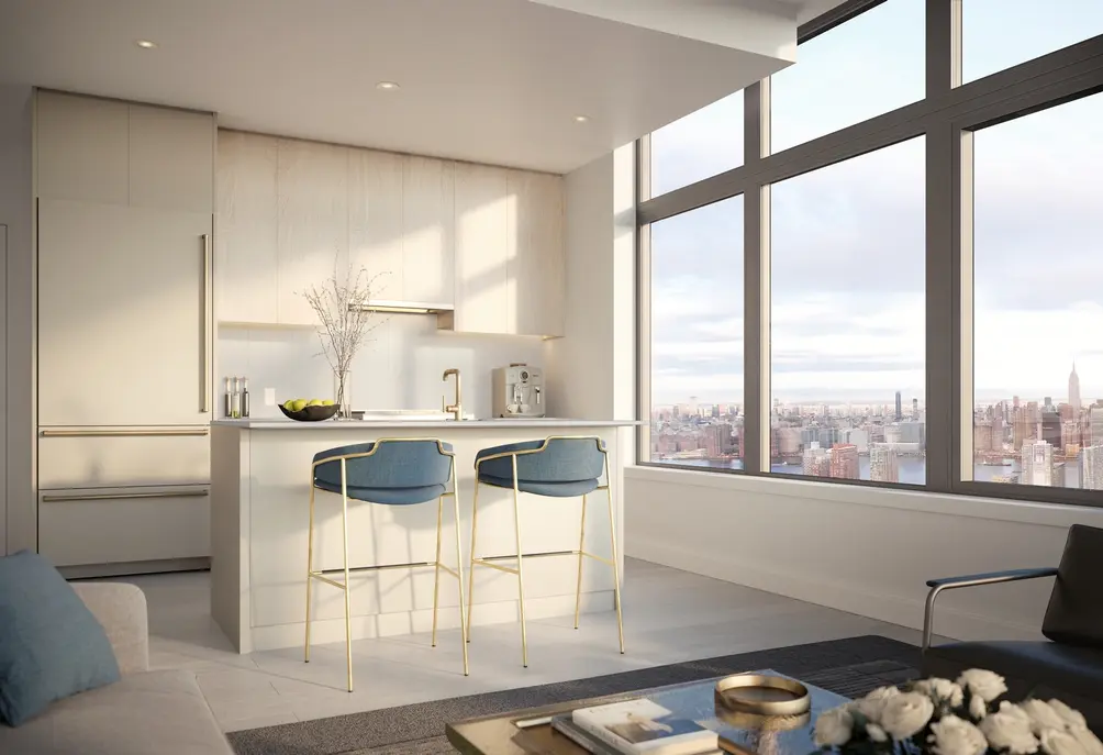 Skyline Tower. Credit: Binyan Studios
We also are the interior designers on this job. Whitehall and Hill West are under the same ownership. The interior designers obviously do different work than the architects but we sit on the same floor, we share information all the way through the design process, and that’s another reason why this building really feels very well-stitched together. As we are developing it, we’re all talking about it, we're all deciding what is the best thing for this building, for this client, for this neighborhood, so this is a tower that we are particularly proud of.
The developer’s marketing team included Modern Spaces' Eric Benaim, “the master of Long Island City,” who surely also made an impact on timing and right-sizing the layouts. Eric has a lot of experience in this neighborhood, probably more than anyone else. In the end, I think it came down to making sure that what they put on the marketplace was still going to be high-end but priced more attainable, and thus sell out quickly. Sales have been going wonderfully so far.
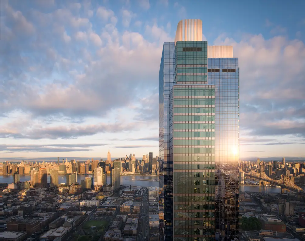 Skyline Tower. Credit: Binyan Studios
Did the design of One Court Square (former Citibank Building) influence Skyline Tower's blue-glass design?
Stephen: We haven’t spent much time on context comparisons; rather, we tried to design something that was iconic on its own. We knew it would take much scrutiny because of height, location, and the fact that it's a big condo. Context is always a concern, but that wasn't our driving concern.
The challenge that we faced in building an all-glass residential building is that how to make it look non-commercial. At Skyline Tower, there are actually two tones of glass - a more neutral blue, and green glass at the sides. Small coffered panels by the balconies add extra depth. This lends a layered look to an otherwise monolithic design.
The building has several different presences - on the skyline, on the neighborhood, on the people that walk by it, and on people that call it home. You have to delve into the details at all these different levels to make sure that the building is a success.
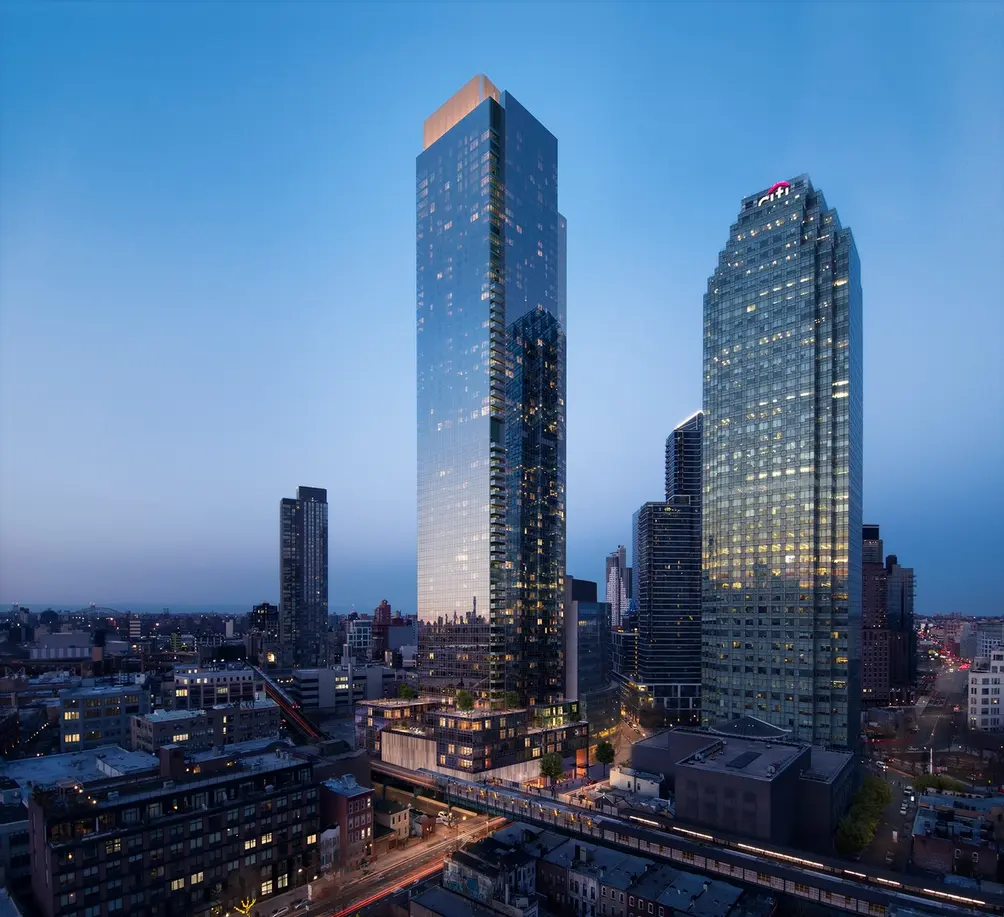 Skyline Tower and One Court Square (Credit: Binyan Studios)
We focused on creating a timeless tower. This is the amazing thing about being in the business of designing residential towers. To me, it's so much fun as I can't even calm myself down some days. The building has several different presences - on the skyline, on the neighborhood, on the people that walk by it, and on people that call it home. You have to delve into the details at all these different levels to make sure that the building is a success. The details on the base, such as colorful fins wrapping around the base and into the lobby and entrance, ensure there's no confusing it for a commercial building. It feels like home. However, design is always a balancing act.
When you pass the Empire State Building on the sidewalk, there's no mistaking that it is the Empire State Building. However, you see some other distinctive towers on the skyline but you pass them on the street and they’re almost incognito, almost a totally different building from the pedestrian experience. Different architects have their reasons for doing things a certain way, but our feeling is that we want people to see it from a distance, see it as they get closer, see it as they’re walking in the door, and make no mistake that it's all the same building. I feel that level of design continuity is really important.
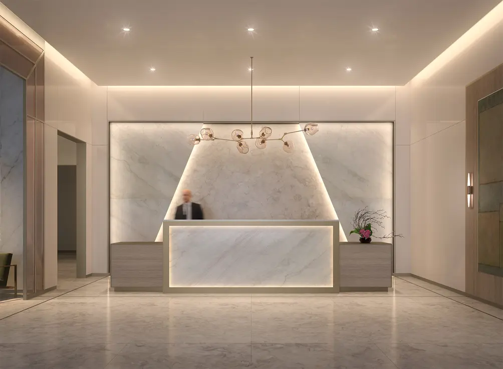 Skyline Tower lobby. Credit: Binyan Studios
Could you tell us about Skyline Tower's 20,000 SF of amenities?
Stephen: The client had a desire for a neutral toned environment. He wanted it to feel as good today as it is going to feel in 20 years - timelessness was the goal. Our designers came up with a great scheme of overlaying different tones of white and cream, with both stone and glass worked into the design.
We also wanted the lobby to have a presence on the street. We wanted people, when they come home at night, to feel like they're already in their neighborhood, they're already in their building even before they step in the door, so the transparency from lobby out to the sidewalk was important to us as well as getting more private as you came into the building. The fins at the base allow visibility from inside but not visibility from the outside.
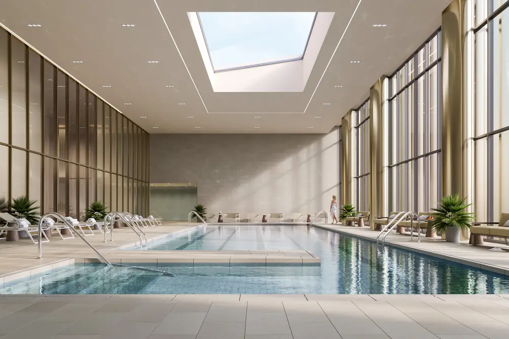 Skyline Tower. Credit: Binyan Studios
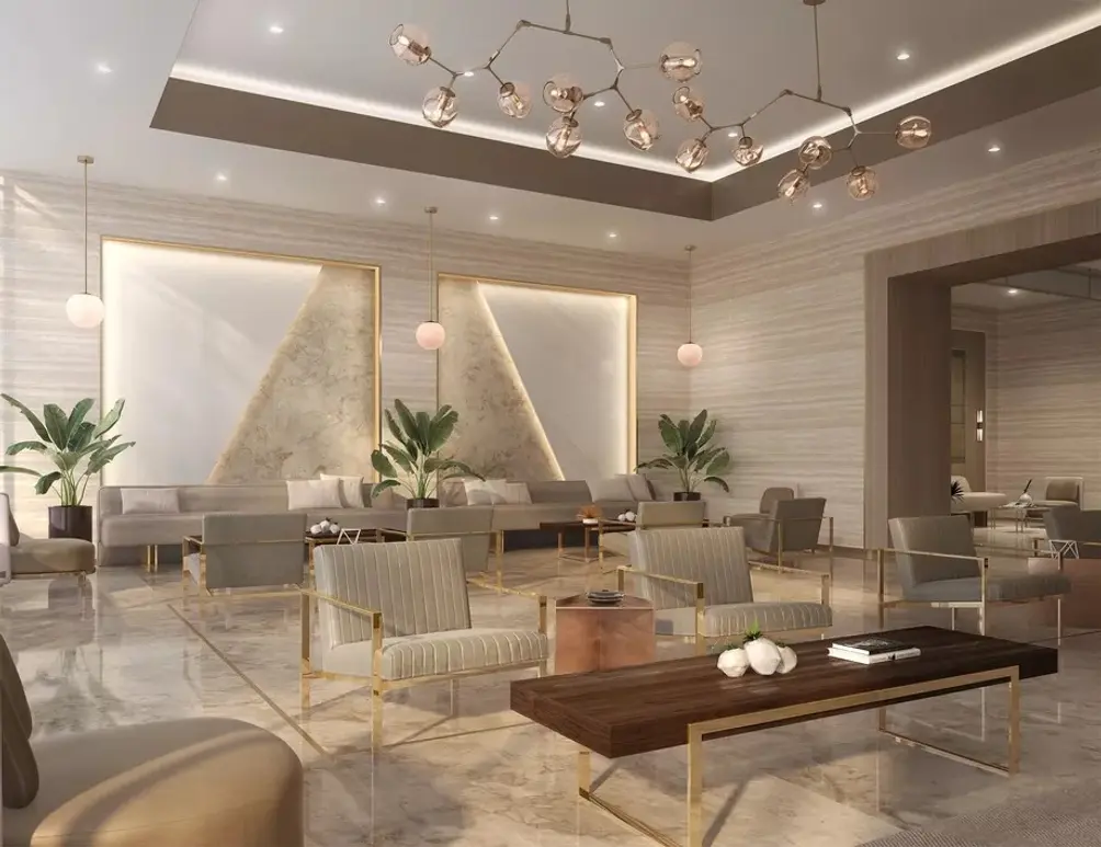 Lounge
There’s a little lounge right by the street wall, right by the windows so people are congregating inside the building and have eyes on the sidewalk helping to reinforce that neighborhood feel. There's a beautiful pool in the design and the kind of color palette carries all the way through the building.
It is important for the bike room to be as accessible from the sidewalk as possible. There are two types of bike room users: the daily rider, and the aspirational biker whose life is so busy that he doesn't get to do it as often as he wants (kind of like me!). To accommodate both types, Skyline Tower has a small, accessible bike room right near the service entrance on the first floor with a little bike repair shop. Deeper into the building there's a larger bike room that serves all other kinds of users. We like to make sure that they're both being serviced right - one really needs his bike in two seconds every day to get to work or wherever he's going, and the other thinks of using it maybe next weekend.
Skyline Tower incorporates an entrance to the 23rd Street-Ely Avenue-Court Square subway complex below. How did that idea come about?
Stephen: It was part of the deal on the land purchase, I think. It’s a very convoluted underground there and getting in that entrance was quite a feat. We worked on it as a separate little side project for quite some time to figure out all the different elevations and how we're going to be able to make it work. The entrance also features an elevator, making the lower concourse ADA accessible.
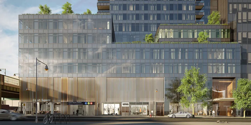 Skyline Tower. Credit: Binyan Studios
Have you incorporated any inspiration from your other projects?
Stephen: Some firms do carry a distinct concept from tower to tower but that's not really our goal. We don't carry on a certain aesthetic from building to building. We aim to design beautiful individual buildings for each situation for each client separately. We let the process evolve naturally. When we start out, there is no brilliant charcoal sketch of an idea, you know, Le Tower, and there it is and I can go back and show you the original sketch - that’s not how it happens.
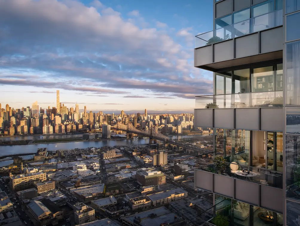 Skyline Tower. Credit: Binyan Studios
For us, it's a certain methodology that we've developed over the years. Starting with the zoning envelope, what can the zoning team put together? What are the options? And we sit down and we battle it back and forth between the design team and the zoning team to push each other to come to the ultimate best solution. We're showing our initial ideas to the developer, we’re getting his feedback and the project goes on from there. During the process, a few of our projects do start with an initial sketch that just ends up hanging until the end; Skyline Tower just wasn't one of them.
The structural engineer is going to come and he's going to give you two cents: “Well, the cantilevers don’t work.” The mechanic will say “well, I need this space here and that space there” so there goes those floors. It's a dynamic, collaborative process that depends on particular specifics of the project. As we go, we also enjoy the process, so you can imagine that the conversations and the back and forth that we have, internally between the departments of the team helps and contributes to the final design. There's no one-size-fits-all kind of mentality that we have on each project. However, you need a map to know where you’re going, and those sketches are really kind of a map, knowing that it's kind of ambiguous in a way.
Have any alternate designs been considered at any point?
Stephen: The original design for this building was 125-130 feet taller than the tower is now. We have to submit our diagrams to the Federal Aviation Authority for aircraft avoidance lights at the top of the building. This is the first time that we've ever had them not approve the initial documents because this came at the time when they were redesigning LaGuardia, looking to quadruple the number of flights in and out of the airport over ten years, so they needed more go-around space to divert flights.
There was a bit of back-and-forth between the whole team and the FAA, and we were all happy with the results. They initially wanted quite a bit more than a 130-foot reduction, but this is the number we all landed on with the help of all the consultants involved in the project. We weren't particularly happy about while it was going on, but looking back on it now, it actually improved the tower in several respects. It's the same amount of floor area, so the tower’s a little stockier now, but it also made the building less costly and more efficient with the same floor area on fewer floors.
Now the building stands 778 feet to the top of the topmost building maintenance unit (BMU), and slightly lower to parapet tip. The L shape of the tower really came into being during the redesign. The L shape helped the lateral forces, the lateral configuration - the stiffer it became, the L shape made it stiffer. The setback was much lower than where it sets back now, somewhere in the 50's floors.We worked on the details of the facade and to trim the girl and dresser as well as we could, and we're all very proud of the design.
Would you like to tour any of these properties?


 6sqft delivers the latest on real estate, architecture, and design, straight from New York City.
