Nancy Ruddy co-founded the architectural firm of CetraRuddy with her husband, John Cetra, in 1987. With a background in painting and art history, Ruddy is known as a hands-on architect with a great attention to detail, such as selecting every single block of stone for the interiors, and the confidence to allow the property to inform her design rather than imposing any signature style. Originally from New Jersey, she says that the buildings in New York City inspired her to pursue a career in architecture. The radically diverse One Madison, an innovative modern tower; 443 Greenwich, a former bookbindery; 360 Central Park West, a brick and stone beauty by the prolific Rosario Candela; and Walker Tower, a former New York Telephone Company skyscraper, are among the firm’s most lauded projects. CetraRuddy has worked on residential, hospitality, educational, and cultural projects all over the world. Ahead CityRealty talks with Nancy about some of CetraRuddy's more recent residential projects.
How did you approach working on the Candela building, 360 Central Park West?
Nancy: Rosario Candela was one of the great apartment planners of the 1920s-1940s. The floor plans have gracious proportions, but this particular building had unusually small apartments. We had to create those elements that people love about pre-war buildings and the proportions that Candela typically creates in his public areas.
When it was originally built, the residents were rarely in the kitchen. There was kitchen staff, and the kitchens were small. In modern life, everybody wants to be in the kitchen. So we joined together the smaller staff rooms to create kitchens that are not only great cooking spaces but also activity spaces for children, or entertainment space. We tried to give people everything they love about pre-war buildings and include the things we all love about the way we live today.
In the River & Warren building, how did you take a relatively unremarkable structure built in 2001 and turn it into something special?
Nancy: It was an exciting challenge because we didn't have high ceilings, and the rooms were modern and boxy. How do you make this feel like a home with graciousness and detail, which you don't usually see in Battery Park City because all the interiors are very similar? We combined apartments, and we tried to create a sense of processional quality that takes advantage of the views and the light, which are extraordinary.
From an aesthetic standpoint, we took what people love about traditional interiors but did it in a modern, fresh chic way. All of the finishes are very light. We created arches, that we call proscenium portals, between the main living spaces and the bedrooms. Everything is light but has a high level of detail that you really don't see in Battery Park.
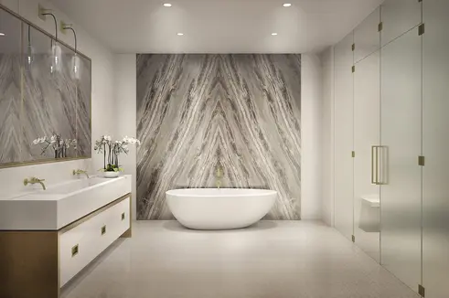
I hand selected every block of stone that you see in the building. We wanted to do something that was soft and neutral; people could add the character themselves. So while the kitchens are white with stainless steel trim, the large island has a bluish-grey stone that makes it feel like a piece of furniture.
There is some beautiful mosaic patterning that was designed for that project only, like the powder room floor. I saw a pattern in Newport years ago that I always wanted to do in stone. There all these details, like custom designed handle pulls in the kitchen and bathroom, which speak to quality in a modern vernacular. It shows that you can do beautiful, crafted detail in a building that was not built that way.

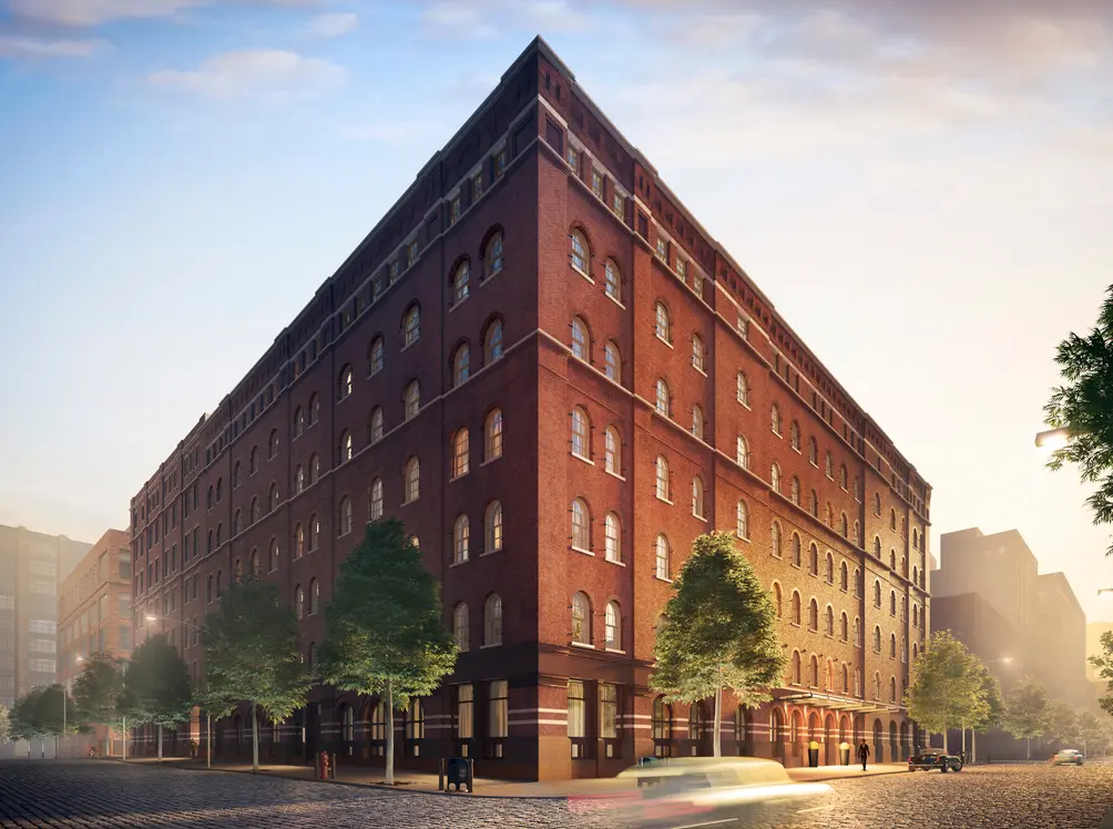
 443 Greenwich Street

In 443 Greenwich Avenue, how did you create a modern apartment building yet keep elements of the original style?
Nancy: The building, which was built in 1887, has a quiet monumentality about it. It’s a New York City landmark, and there's a courtyard inside that is also landmarked. We felt that this building deserved a preservation of the spirit of the architecture while doing something that was downtown and modern.
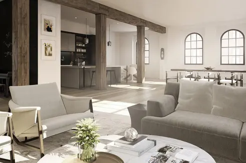
When I walked in the first time, there were these massive columns with two hundred years of paint on them. I asked the contractor to sandblast the paint off, and underneath, we found this amazing old forest pine that you can't replace. It's part of the history of New York and this building. I thought it would be amazing if every apartment had three or four freestanding columns. Some of the pewter connections of the beams and columns were in horrible shape and had to be reinforced. We put collars around the beams to connect them to the columns, and they look like they've been there forever. We uncovered the essence of this building to create an environment that is unique. There's a handcrafted quality about everything we did.
H. M. White, the landscape architect, researched and found that two hundred years ago, this whole area was swamp. The plants he chose for the courtyard were indigenous to the area a hundred years ago. It’s a natural, secret garden that refers back to what the building was like when it was conceived.
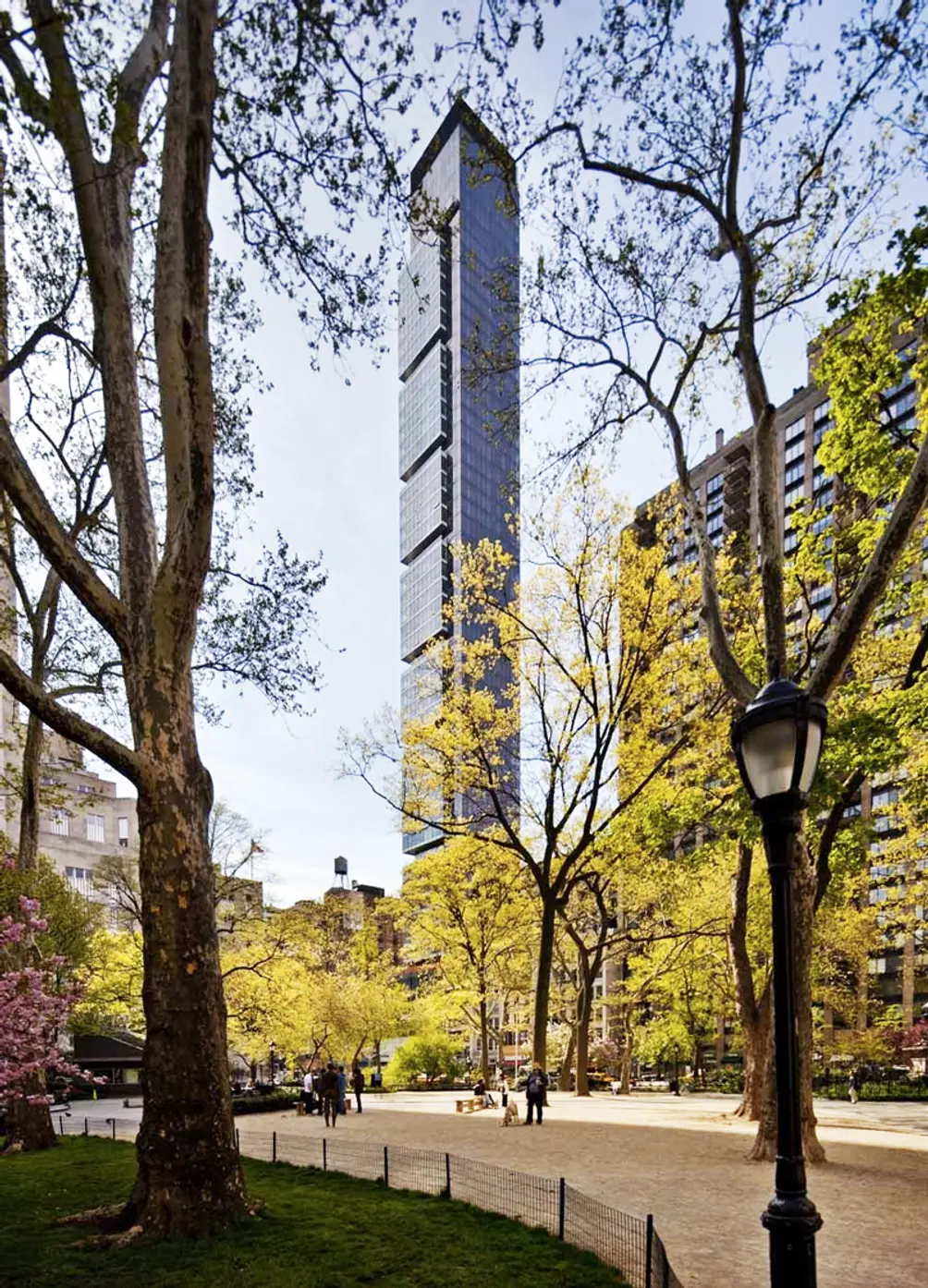
 One Madison
For One Madison, why did you decide to use a series of asymmetrical cubes? How does the modern design of the façade complement the classic architecture around it?
Nancy: One of the things that drives our firm is developing contextual buildings; we are very sensitive to the context that we work in. This assignment looked like it was going to be 50 or 60 stories, near the Flatiron and the MetLife building, on the edge of Madison Square Park. But we found that a smaller, slimmer building would cast less of a shadow on the park. It would be a narrow shadow that constantly moves instead of one massive shadow that remains in one place all the time.
The Flatiron and the MetLife building, which we now view as landmarks, were considered skyscrapers when they were built. So we felt that we needed to do a modern building because those buildings were very modern for that era. The idea of creating a form that captures and interplays with the sky led us to create the shaft with six asymmetrical pods, and we located them facing the MetLife building so that the two buildings, a hundred plus years apart, would have an architectural dialogue in the sky.
Those pods create an irregular shape that faces the MetLife building instead of a tall shaft with no relief on it. We used a bronze glass, which is really dark brown. The Flatiron area is a masonry area, so we used brown glass that’s not highly reflective. It has a suede-like quality to it instead of being polished.
The main entrance is on 22nd Street so that residents walk down a brownstone block, which is more humanizing and personal, with the commercial space on 23rd Street. We realized from an urbanistic standpoint that the building could be aligned with Madison Avenue. It’s really a beacon because you can see it all the way uptown.
All images courtesy of CetraRuddy Architects

Contributing Writer
Jillian Blume
Jillian Blume is a New York City based writer who has published articles widely in magazines, newspapers, and online. Publications include the New York Observer, Marie Claire, Self, MSN Living, Ocean Home, and Ladies Home Journal. Jillian received a master's degree in Creative Writing from New York University and teaches writing, critical reading, and literature at Berkeley College.

 6sqft delivers the latest on real estate, architecture, and design, straight from New York City.
