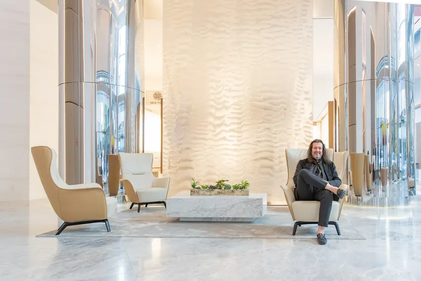
 All photos courtesy of Inessa Binenbaum
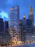
Andres Escobar of booming interior design practice Lemay + Escobar has a large personality that exudes kindness, experience, and heaps of passion for design. As a man of many talents, he has also curated Whales Ballet, a 200-foot-long whale video installation by Le3 Design Studio for the launch of Jamestown OTS L.P.’s new giant signs at One Time Square that extended nearly the full length of the 25-story building. Escobar also worked with Cirque du Soleil on their experiential design background. This designer sees art in everything he looks at, be it a car, perfume bottle, or an environmental issue, and has perfectly realized his design passion in his most recent project, the luxury rental building, Summit, located at 222 East 44th Street.
“Our clients want more than just space planning and design, they want to create a soul for their building and spaces,” says Escobar. The soul of Summit is a calm but young vibe that is sophisticated and modern without being off-putting or sterile to match the souls of the demographic Escobar and the developer, BLDG Management, envision living in the building. CityRealty spoke to Andres Escobar and discovered his passion behind this thoughtful, experiential building.
“Our clients want more than just space planning and design, they want to create a soul for their building and spaces,” says Escobar. The soul of Summit is a calm but young vibe that is sophisticated and modern without being off-putting or sterile to match the souls of the demographic Escobar and the developer, BLDG Management, envision living in the building. CityRealty spoke to Andres Escobar and discovered his passion behind this thoughtful, experiential building.
What was your design goal with Summit?
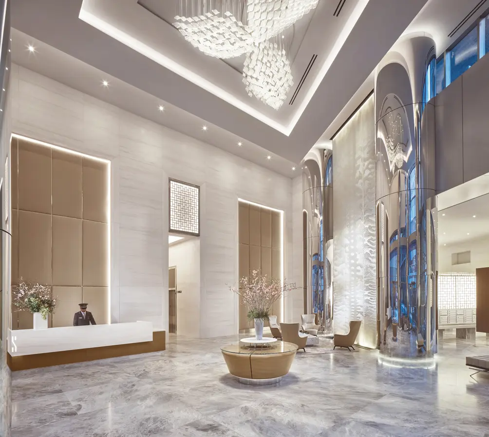
The idea was that we needed to bring this building to a different level. It started with many conversations between the developer and myself about wanting to create a peaceful enclave. From the moment you walk in the doors, we wanted to create a spa-like realm. We expect the target demographic to be younger professionals inspired to live on the Upper East or West Sides but who want close proximity to Grand Central and Penn Station. Our goal was to create a beautiful and peaceful aesthetic with contemporary lines. We didn’t want any heavy, prewar details. We wanted it to be contemporary without being sterile. When you enter the lobby, you immediately enter this stunning, double-story, tranquil space with a calming, silent water feature. The outside and inside are all part of the same space. The space is beautifully lit and centers on the reflecting pool. The moment you come in, you decompress. Instead of more active spaces, as I’ve designed for neighborhoods like Tribeca or the Meatpacking District, this is a cool, elegant, well-appointed building that is not pretentious or snooty but understated.
In this article:
 Lobby
Lobby
Tell me about how you mixed materials in your design.
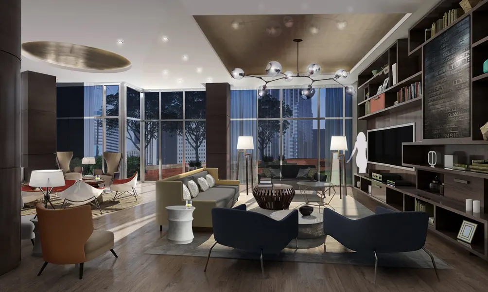
Behind the reception desk, I installed leather panels with chrome inserts that make it look more refined - think upscale retail store. Wood is a harder substance, like natural stone. Leather is so soft and beautiful. We wanted to create a tranquil pass-through space that was well appointed. Regarding the amenities, we were catering to different sort of demographic. When you’re in the lower tier of amenities, like the lounge area, the feeling is a little more hip and eclectic. We curated the space with furniture that complements each other but is not from the same collection or brand. This is an area where you can watch a game, read, or work. If you have a studio apartment, you can come down and collaborate and be surrounded by people. The whole lounge area is like a space you would find in a cool boutique hotel.
 Pool
Pool
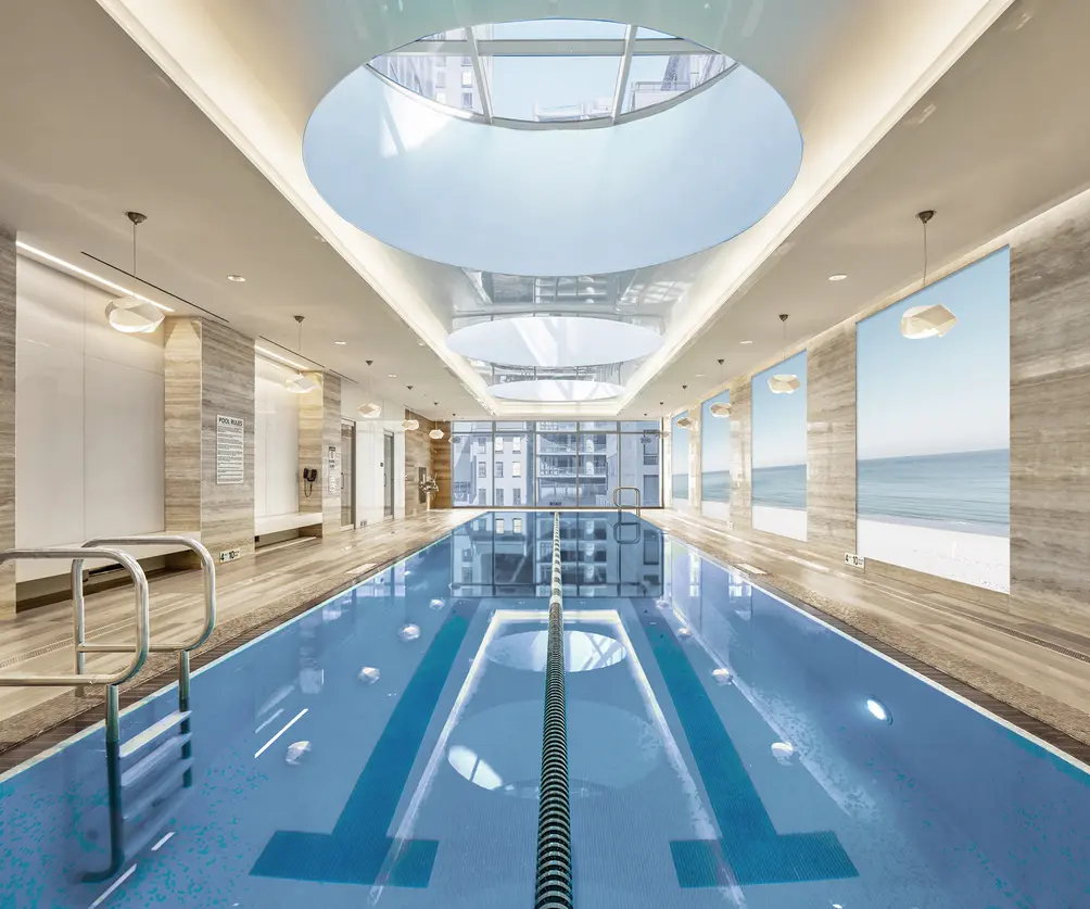
With the swimming pool, we wanted to continue that idea of the spa feeling. The residents have their own pool which is surrounded by porcelain wood tiles, the imagery on walls, beautiful skylights, a sauna and hot tub in the same area. The idea was to maximize serenity with minimal materials and a lot of light.
When it came to the gym, we wanted to build a gym that would make residents question joining Equinox when they can have an equivalent without even having to set foot outside. The developers knew it needed the latest technology like Peloton bikes, squash and basketball courts. Not even Equinox has this amount of amenities. We wanted to make this a luxury rental property and set the tempo for this neighborhood. I don’t think there are that many rental properties at this level of sophistication and curation. Thankfully, the developer allowed us to go quite far.
When it came to the gym, we wanted to build a gym that would make residents question joining Equinox when they can have an equivalent without even having to set foot outside. The developers knew it needed the latest technology like Peloton bikes, squash and basketball courts. Not even Equinox has this amount of amenities. We wanted to make this a luxury rental property and set the tempo for this neighborhood. I don’t think there are that many rental properties at this level of sophistication and curation. Thankfully, the developer allowed us to go quite far.
 Lounge
How did your approach differ from athletic to leisure amenities?
On the 41st floor, there is another level of amenities. I jokingly used to say to Lloyd Goldman, the developer, that it should feel like a Qatar or Virgin Air first-class lounge. This amenity floor is a space to have a gathering, invite people, have parties by renting the space - or even take a business meeting. It has unbelievable views of the East River and the most magnificent view of the Chrysler building and of uptown. The purpose of this amenity was to raise the possibilities. We created a space at the bar where you can keep the wine in wine coolers. It is a fully operational space which is also multipurpose so you can use it as a bar or use the communal tables as a workspace – all with unparalleled views. If you want to bring friends and do a wine tasting, you can do that. You can also enjoy private dining with a full purpose catering kitchen.
The kitchen is hidden behind wall panels that open up completely when you want to use it. Residents can have a chef come and cook or just have an event catered. We wanted to give people the opportunity to extend their lives within the whole complex. You can work, live, play, and entertain. The lower level is much more relaxed so if you have friends with teenagers visit, they can play foosball or billiards indoors or they can spill onto the terrace. On the 41st level, it is kind of like an executive level, a more sophisticated hangout.
We set the tempo of the building and then carried it throughout, from the lobby through the elevators, corridors, into the units, and through the amenities. It is the whole journey of the building where the residents feel like they are in their own resort. They don’t have to go out if they don’t want to. This building has far more to it than just a collection of apartments.
We set the tempo of the building and then carried it throughout, from the lobby through the elevators, corridors, into the units, and through the amenities. It is the whole journey of the building where the residents feel like they are in their own resort. They don’t have to go out if they don’t want to. This building has far more to it than just a collection of apartments.
Is it different designing for a rental building versus a condo?
There is a new approach on how to treat rentals. In the early 2000's, a rental building was just a rental building. If you had a concierge, that would be it. If there was a pool, great. If they didn’t have anything else, that’s all you got. The whole amenitized building is meant to be enjoyed as a whole complex so you are not just renting an apartment but rather it’s an urban resort. New York is a very sophisticated city and we know the potential of who will live in this building and designed our aesthetic to appeal to that market.
I am working on another project in Hell’s Kitchen and it is aesthetically completely and categorically different. You have to know your market, your client, and your neighborhood and design to that.
At this point in the market, rental properties are so sophisticated they are really at the condo level with amenities and finishes. Summit is a perfect example. It is at the same level as my Hell’s Kitchen condominium project and has more amenities because the larger space affords this ability.
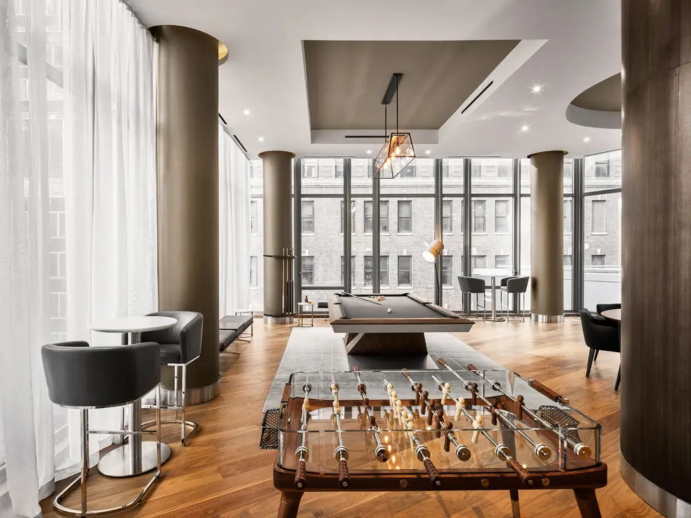 Game room
You really made the columns a beautiful design component of the common spaces. What was the thinking behind that?
The columns are present and conspicuous, so we wondered: how do we make them blend into the environment instead of sticking out? I had to talk to the developer because he wanted to make the columns in marble but I suggested we make them out of a mirrored, stainless steel. With the spaces being so open, the columns reflect their surroundings as opposed to being a fixed element that absorbs light and takes up space. By being highly reflective, they reflect the water, the chandelier, it’s kind of like a mirage. It was a lengthy discussion about how hard they would be to maintain but I knew that with the thickness of the stainless steel we needed would be substantially greater than brushed stainless or statin, in order to mitigate the fact you may see some imperfections, so the thickness had to be there and would make it easier to maintain. You see stainless steel columns in grand public spaces like the greatest airports and people don’t go around hugging columns. You may get the odd child who will go up against it but the building maintenance can easily clear that up, basta.
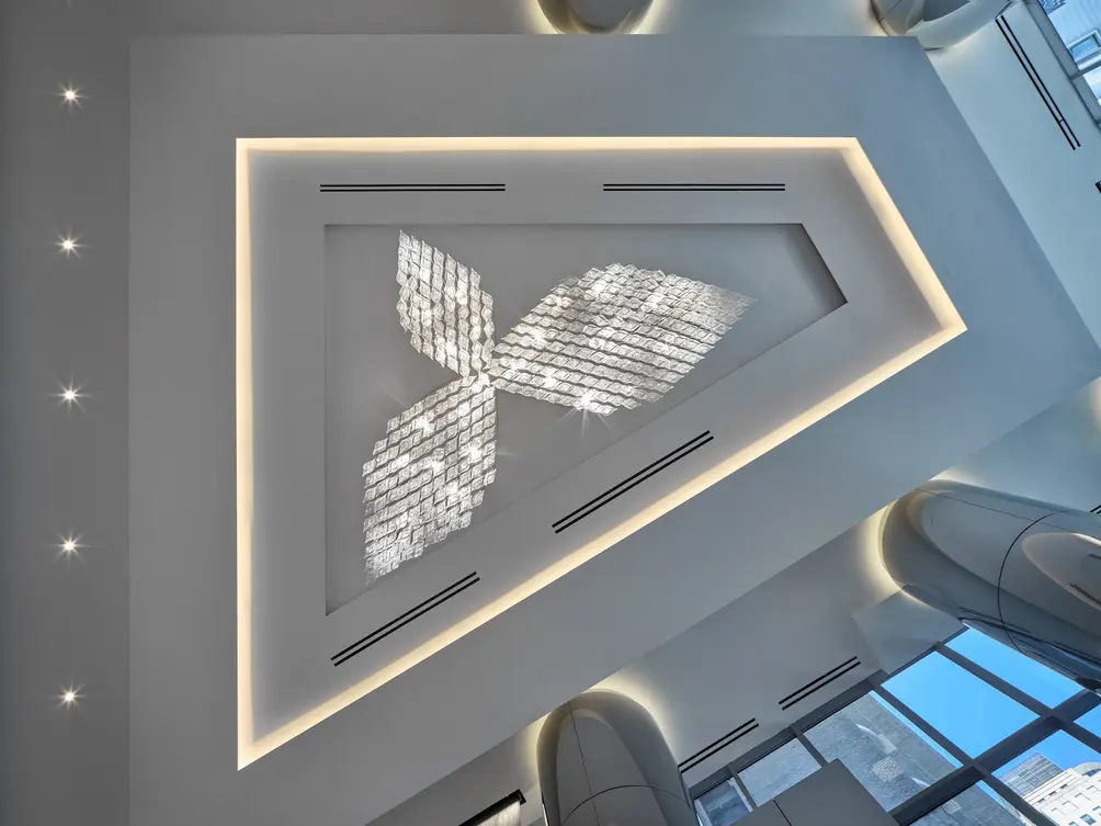 Lobby chandelier
The sculptural lights are also very striking. What is the story behind them?
We completely designed and commissioned the chandeliers. I came up with sketches which are a little different than they turned out but we kept the integrity of the idea. They are made of crystal dishes that fill the space and give it a level of sophistication without being off-putting.
Where do you draw your inspiration from?
I do a wide variety of projects, from creative thinking to curating artwork and media to designing resort hotels, branded hotels, high-end condos, private homes. In each project we do, we tackle the project based on demand and on the mission we give ourselves. It is not only design and architecture but considering the developer and the market they’re going after. Who is going to move in? What is the demographic?
I have traveled extensively my whole life. I stay in hotels and I get inspired by everything. I am inspired by the classics, neoclassical, moderns, and minimalists. I am always asking how do you curate something to make it look beautiful? There is a reason behind everything we do. Some people have said there is some sort of commonality in the spaces I design. I do like round shapes, yes, but essentially, every project is very different from one to the next. As time progresses, you find there are other ways of making the spaces look more interesting.
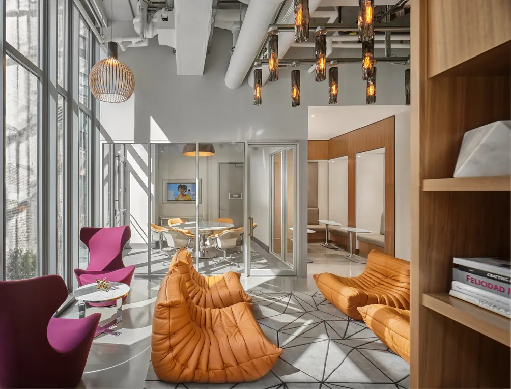 Business center
Can you offer us a preview of future projects?
We are working on some more architecturally driven projects where we look at the mass of building and consider how it looks and what makes it a landmark building. Today’s technology, media, world events, and global travel drive you to a different point. Design is unbelievable and it will never be the same. With the leather panels at the Summit, you may see these leather planes in Louis Vuitton or in Gucci stores but not normally in a building. But, why not? Everything impresses me. It’s not one realm versus another. I get inspired by perfume bottles and cars. The main point is not being timid about crossing bridges from one type of building to another.
One thing has made us successful in the residential market is that we bring a different flair to the table because of our hospitality background. Everyone wants that hospitality feel. If you see a beautiful table at a hotel you can borrow from everything and put it together in a well-orchestrated manner versus just creating a space you’ve seen before.
I challenge myself to create things I haven’t seen before. Copying isn't good, it’s better when someone copies you. I live for this, I love what I do. I eat, sleep, breath design and I love traveling. I examine everything! I’m interested in women’s fashion to understand what makes them different. Why would they use a wild print versus a simple print? Everything has a reason to be.
I want to be able to partner with developers who are visionaries so they allow me to stretch the envelope. With Jamestown in Times Square, we curated the Whale Ballet. I had a concept of it being a poetic way of saving endangered species. When you show this graceful water ballet in an unpolitical and poetic message, it doesn’t offend anyone. I was not patronizing but just simply showing the beauty in the wild as a way to explain why we should respect and embrace it. I tell my team that when we do anything, it must have poetic justice or a message. I will never shortchange anyone, so every project must be at the caliber I judge myself.
I want to be able to partner with developers who are visionaries so they allow me to stretch the envelope. With Jamestown in Times Square, we curated the Whale Ballet. I had a concept of it being a poetic way of saving endangered species. When you show this graceful water ballet in an unpolitical and poetic message, it doesn’t offend anyone. I was not patronizing but just simply showing the beauty in the wild as a way to explain why we should respect and embrace it. I tell my team that when we do anything, it must have poetic justice or a message. I will never shortchange anyone, so every project must be at the caliber I judge myself.
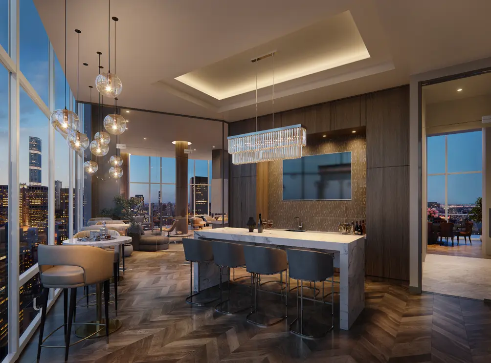 Lounge

Contributing Writer
Michelle Sinclair Colman
Michelle writes children's books and also writes articles about architecture, design and real estate. Those two passions came together in Michelle's first children's book, "Urban Babies Wear Black." Michelle has a Master's degree in Sociology from the University of Minnesota and a Master's degree in the Cities Program from the London School of Economics.

 6sqft delivers the latest on real estate, architecture, and design, straight from New York City.
