In this article:
Was there one driving force behind 130 William?
It was definitely a confluence of different factors that all came together. We knew from the beginning that we didn’t want to just go with another type of commercial glass tower. We felt a sense of responsibility to do something different with 130 William. We interviewed and met with tons of architects, but it wasn't until we met David and he talked us through his ideas and visions that we realized we were very much aligned.
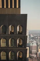
One thing that inspired us early on was that we wanted to embrace the more traditional, historic masonry architecture in the neighborhood, with the older loft spaces that used to exist here and were more prevalent downtown. We took that design inspiration and then created a contemporary interpretation of that older historic masonry typology. We knew we could build an 800-foot tower with historic architectural elements that had really never done before. The facade, the windows, and the whole thing came together quickly and we all knew it could be really special and would stand out in the skyline.
Speaking of, what was the inspiration for those unique arched windows and the volcanic rock appearance of the facade?
That was something that kind of just happened organically through early discussions. No one said, “Hey we want to do a black building.” We just started looking at details of the facade and came up with the rough texture and detailing and then developed the bronze detailing around the windows. The black facade also has a granite aggregate which shines in the light. We realized that no one had done this before. Balancing the darkness of the facade with the refinement of the bronze felt really special. There will be a bronze crown at the top that will glow at night. You really can’t appreciate that detail now but when it’s done, it will be magical.
We imagined the building units as a little respite from the city below. The facade gives you the heaviness of a protective wall. Due to texture and coloring, a lot of buildings don’t age well in the city. This building will not diminish over time, it will only improve. So, in a way, it’s like armor, but for the homeowner, the facade is like a warm blanket around their home.
The rhythmic, large-scale arched windows were also inspired by the older loft styles of downtown. You still see some scattered about, but you don’t see a lot of arched windows built today because they're much harder to execute. The top ten floors of 130 William will have upside-down arches on the loggia terraces against the arched windows. We thought of that both what you would see from the outside, knowing that the rhythmic arches would be beautiful, but then considered looking from inside the apartments to the outside, those inverted arches seen through the upright arched windows almost creates a picture frame around the city.
We really tried to focus on the experience of the homeowner from within the units, not just from the outside streetscape and skyline. I think that's what makes David special. He is the top contemporary architect of our time and a lot of that comes from his ability to not only design beautiful architecture but design architecture that can be experienced in a different way, from the inside and the outside.
Was it exciting or nerve-wracking to have this be his first skyscraper?
It was exciting to have his first skyscraper! He's probably most well known recently for his Smithsonian museum design in Washington, DC, but he's done a lot of residential architecture. We looked at the diversity of his projects, and although he hadn’t done a high rise, he has done everything in between and around. The really cool thing about David is that his aesthetic is both refined but bold at the same time. It is balanced and also provocative. The heavy facade and delicate bronze detailing finds the balance between push and pull.
What was the thinking behind your amenities program?
130 William will have over 22,000 square feet of impressive amenities, all designed by David. We will have a health club that feels like a grotto with gorgeous arches, as well as plunge pools. From the hospitality side, we take a lot of the service elements and bring them into the amenities to create a lifestyle program.
We find that in a lot of the projects being built, you can have a lot of impressive amenity spaces but residents do not fully understand them or are intimidated by them. So we provide things like lifestyle directors, concierges, chef tastings, concerts, special gym classes, comedy nights, and wine tastings. We provide a variety of different types of activities, to get residents out of their homes, get out and meet their neighbors, and creates a sense of community.
Part of the inspiration for this building is that we wanted it to be different. We don't want people to walk into their building and just spend all their time within the four walls of their home. We want people to feel the entire building is their home and appreciate the holistic vision. Enjoyment is key. Hopefully, they will live there for a long time and we want them to be happy for their entire stay. We design and build for that satisfaction. That is where the sense of responsibility comes in - to build a beautiful building and a place they enjoy. That is the fun part of our job.
How is working in New York different than other parts of the country?
Every place has different nuances in the construction process, but fundamentally, the development process is the same. New York is historically a tough place to build because it has a different dynamic and real estate market. The market is always changing, so to be successful, you must think outside box and figure out a way to differentiate yourself, which takes a lot of creativity. With respect to 130 William, that is why I believe it is so successful. We really thought outside the box, for the interior, exterior facade, and amenities package.


 6sqft delivers the latest on real estate, architecture, and design, straight from New York City.
