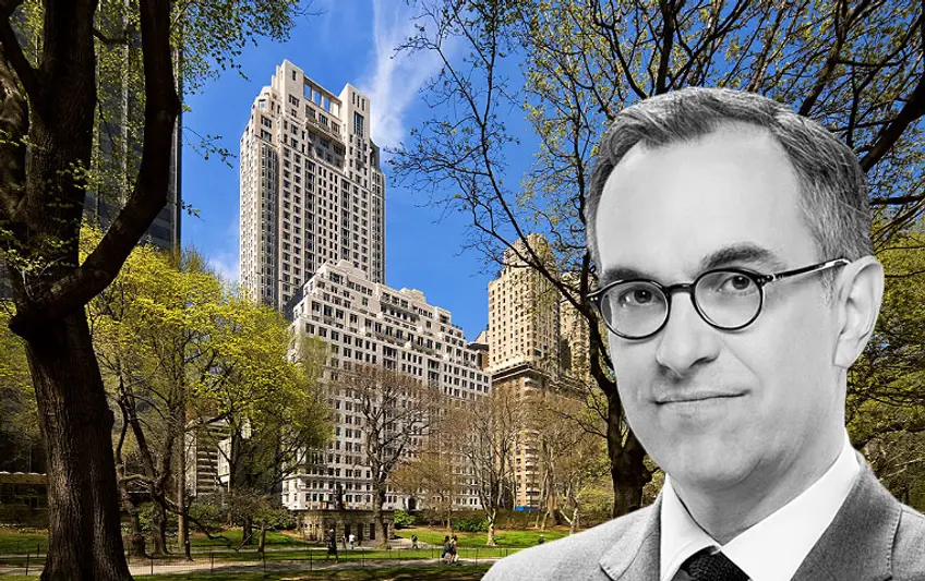
Robert A.M. Stern Architects (RAMSA) Partner, Paul Whalen says, to this day, he receives letters from 15 Central Park West residents saying, “When I first moved in, I knew it would be an amazing building but I keep discovering qualities of the building I didn’t understand or realize. It takes years to fully appreciate living here.”
The building has attracted the top of the top 1 percent around the world and now not only do developers want their own version of 15 Central Park West but RAMSA has taken the most successful parts of the building and implemented it in their work since.
The spectacular amenities of 15 Central Park West range from its private 60-seat restaurant to the paparazzi-avoiding entrance (motor court) and the sunlit 75-foot lap pool to almost 30 staff apartments.
In this article:
Paul Whalen has a hard time containing his excitement for 15 Central Park West. In addition to being proud of the buildings RAMSA designs, he is most proud of the part those buildings play as urbanists bringing people back to living in sustainable cities.
CityRealty recently interviewed Paul Whalen to try to uncover what makes 15 Central Park West so special and how their other commissions are trying to replicate it.
What one thing you would attribute the enormous success of 15 Central Park West to?
Beyond that, it’s the beauty of the design. People look at it and think it’s a beautiful building. It’s an updated classic but it also has it’s own expression, like larger windows and grander gestures. The beautiful limestone really makes this building stand out. There hadn’t been residential limestone building built in New York since before World War II. The only other limestone building was the Four Seasons Hotel. Moreover, what’s really interesting about our use of limestone on 15 Central Park West was that the entire building is covered in limestone. In most pre-war buildings, limestone was only used on the major facades. The facades facing the alleys were covered in brick.
One of our goals was to bring Upper East Side to the Upper West Side, which seems almost quaint now. I think it’s wonderful that you can live in luxury buildings in many different parts of town and a lot of it just has to do with preference. But Central Park still has such a premium, especially in the international market.
Beyond that, I think it is the design of the apartments. An extraordinary effort went into designing the apartments to make sure they worked for the way people live today and, at the same time, we wanted to recreate the classic room-making of Candela’s buildings and we wanted to replicate the grand houses the we have designed over the years for private clients.
We use room-making as a strategy for planning but we also acutely aware of importance of adjacencies, e.g. kitchens have to work perfectly with dining rooms. We wanted to make generous front halls, which are typical of pre-war buildings, that are a nice place to come home to, with a nice front hall table with a picture above where you can receive guests and hang their coats in closet. We wanted to create a sense of fine living; not necessarily luxury living, but a genteel living that was so typical of pre-war buildings and typical of very nice present day houses.
All of those things are very important but then, of course, there are the amenities. The major amenities at 15 Central Park West are the library, which was fairly unusual at a time, and a full-sized lap pool, which was not unheard of but pretty unusual in the way we worked with the skylight above it made it into an extraordinarily rich architectural space and not just a swimming pool. The gym and the pool meet at the head of the pool and is lit by natural light. All those spaces work really well. So it’s not just the facilities are in the building, it’s that they have a level of architectural quality to them that make them stand out.
There is also a small cinema and a children’s room in the building. They expanded the children’s room after we were finished because it was so popular. All of these things together in one building made such a difference.
We set up the library so it’s opposite the private dining room, across the lobby. The library could be used as a cocktail space for an event and the guests can move into the private dining room for dinner. From the start, there was an idea that we wanted to have a series of wonderful amenities in the building. What’s wonderful about placing the restaurant and library both on ground floor is that they can take advantage of beautiful ground floor courtyards. And that way, the views of those spaces are given back to the residences of the building versus having those spaces rented out as a private doctor’s office or something like that.
There are around 29 staff apartments in 15 Central Park West, plus there is superintendent’s apartment. They’re really popular. They’re located on the floors that have the most challenged views, as you would expect, but it’s interesting how many people use them as an office where they can get away from their apartment and have a place to go by just commuting in an elevator.
Most modern staff would like to have more independence from people they’re working for so it’s nice to have their own space. You can get better quality staff by giving them a little bit more independence by being on a separate floor. The apartments are really set up like little hotel rooms so you can use them if a child or in-law is visiting. Having a private hotel room in the building is an extraordinary thing.
The goal was to build them all virtually same size with slight differences in sizes, but they were essentially hotel rooms. They all have a bathroom and closet and efficiency kitchens. [According to Michael Gross’ House of Outrageous Fortune, “Servant quarters were the real bargains, selling for between $650,000 and $1.74 million. But they could only be purchased along with an apartment, as was the case with the 73 $35,000 storage units and the 30 wine cellars; they ranged from $5,000 to $80,000.”]
A lot of details go into making this a successful and extraordinary building. One of them is our wonderful mailroom that has a window onto the street and is big enough to have furniture in it. The mailroom is also used as a “real estate broker’s room.” People who live in this building don’t want to see brokers hanging around lobby. The Zeckendorfs own a real estate firm so they know this well. That was the plan, at least, I’m not sure if it worked out that way on a practical level. But that’s how we planned it and, at a minimum, it’s a lovely mailroom with a lot of light and a window of the street.
Over the years, we’ve gotten letters from people who lived in building that say, “When I first moved in, I knew it would be amazing building but we keep discovering qualities of the building I didn’t understand or realize. It takes years to fully appreciate living here.”
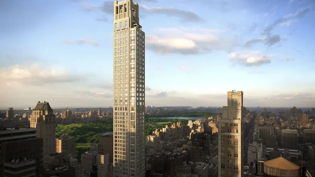
 520 Park Avenue
Do all of your clients want another 15 Central Park West?
Every project we do starts off with site specific design criteria based on the proportions of the site and massing based on air rights. It would be impossible to do anything exactly like 15 Central Park West. Nor would we want to repeat ourselves. We think we’re designing buildings within a tradition. If we are being asked to do four to five limestone buildings, there will be some similarities. We like to do masonry buildings that have punched windows.
If you imagine all the buildings people love, like Candelas, and if you put them next to each other, some of them will look similar. But they are a great family of buildings built at a similar time for a similar taste—they will have some things in common, but they are different at the same time.
We are building a lot in China. What’s interesting is that China has more similarities to the U.S. than most people realize. Shanghai is not an ancient Chinese city. It grew because of trade with the west. Just like New York or Chicago, it was really a vibrant place in the teens, twenties and thirties with many Art Deco buildings. And people in Shanghai love New York. It is a very popular city in their imaginations.
As a New Yorker going to Shanghai, you are reminded of the spirit of New York, although it’s not as expensive as New York.
On one of our projects in Shanghai, on the Pudong side of the river [the modern side of Shanghai] has five towers. We were originally asked to design these buildings for a middle market made up of young professionals. We made the buildings out of a local granite, which is beautiful and warm but harder than limestone. People have found the building so appealing and the prices have gone up enormously. Construction isn’t even finished and they’re selling at the top of market.
It is interesting how 15 Central Park West is known all over the world. We’ve got projects in China because of 15 Central Park West. We love that building.
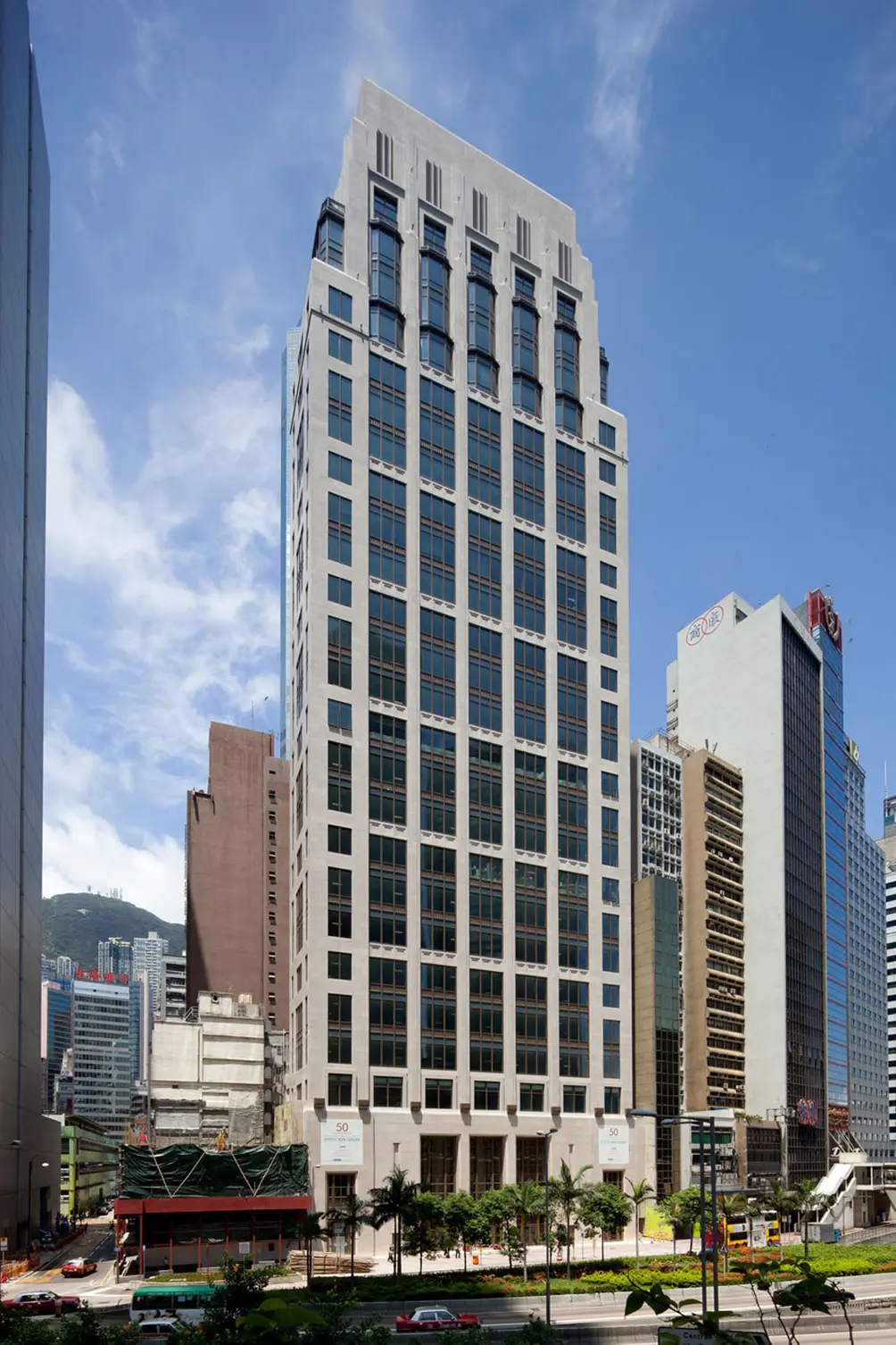
 50 Connaught Road Central, Hong Kong
We think of ourselves as urbanists. There’s a lot of talk about how the most sustainable way is to live is in dense cities. People who live in New York apartments live in a very sustainable way. We see it as a cultural phenomenon. We love the idea that we can be part of a movement where we’re helping people realize they can live in an apartment; expensive, not so expensive or a rental. It’s a good thing to have people living in the middle of the city. It’s great for culture.
All images courtesy of RAMSA unless otherwise noted


 6sqft delivers the latest on real estate, architecture, and design, straight from New York City.
