 Carter Horsley
Apr 23, 2012
Carter's Review
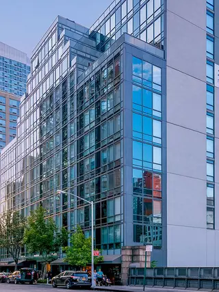
The Mantena is a handsome, 12-story rental building at 431 West 37th Street near the Hudson Yards in Hell’s Kitchen.
It has 98 apartments and was developed by West 37th LLC, of which Albert Fratoni is a managing director.
Karl Fisher was the architect and Andres Escobar was the interior designer.
The east side of the building faces Dyer Avenue, which is between Ninth and Tenth Avenues. The Lincoln Tunnel is north of the building.
The building, which was completed in 2012, is not far from the Hudson River, the Jacob K. Javits Convention Center, the High Line Park, Pennsylvania Station and Times Square. It is also convenient to Chelsea and across the street from the Baryshnikov Arts Center at 450 West 37th Street.
Bottom Line
Located in one of Manhattan’s fastest growing neighborhoods, the Mantena is an attractive “boutique” rental building.
Some major developers such as Glenwood Management, TF Cornerstone and Lalezarian Brothers have erected large rental towers nearby.
A new street, Hudson Boulevard, was established by the city running diagonally between Tenth and Eleventh avenues between 34th and 42nd Streets, and the 7 subway line is being extended to 34th Street and 11th Avenue.
Description
Despite its relatively small size, the reflective-glass façade of the Mantena conveys a sense of monumentality because its design is an interesting variation on “wedding cake” building plans that were popular in the early years after World War II.
Those plans called for buildings to have setbacks as they rose so they could conform to “sky exposure planes” in the city’s zoning regulations that were designed to provide more “light and air” at street-level.
The design by Karl Fisher for this building actually does not follow traditional “wedding cake” designs that were generally perpendicular to the street. Here, the setbacks are parallel to the street. The massing, however, is superb and is strongly reinforced by the broad cornice line elements and the vertical outlining of the center section. In addition, the stepped front of the building is deceptive as the tall rear of the building has no setbacks but visually recedes because of the setbacks in front. The rear of the building, which has a large entrance marquee, has some balconies.
Amenities
The building has a doorman, a gym, a landscaped roof deck and a recreation room. Its large lobby has stainless-steel accents.
Apartments
Apartments have individually-controlled heating and cooling systems, floor-to-ceiling windows, high-tech custom solar shades, high ceilings, solid white oak flooring, and washers and dryers.
Kitchens have high-gloss white lacquer cabinetry, Caesarstone countertops with full-height porcelain backsplashes, stainless steel appliances, built-in cooktops and wall ovens.
Some apartments have terraces and balconies at the rear of the building facing north and some have wine coolers.
The layouts of the two-bedroom southeast corner apartments are particularly attractive as the entry foyer opens onto a large dining area with an open kitchen that leads to a large living room in the corner and to a windowed home office in the other direction.
There are duplex one-bedroom apartments with broad terraces off the large living rooms with open kitchens on the lower level.
The building also has studio apartments with entry foyers leading into large living rooms adjoined by large dining areas with open kitchens and large balconies.
History
Equity Residential purchased the building in 2012.

- Rental built in 2012
- 3 apartments currently for rent ($3.9K to $5K)
- Located in Midtown West
- 98 total apartments 98 total apartments
- Doorman
- Pets Allowed
 6sqft delivers the latest on real estate, architecture, and design, straight from New York City.
