 Carter Horsley
Nov 15, 2012
Carter's Review
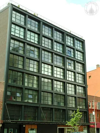
The very handsome, 8-story condominium apartment building at 250 Bowery between Houston and Prince Streets was completed in 2013. It has 24 apartments.
It was developed by The Vella Group, of which Zach Vella is a principal, and designed by Adjmi & Andreoli Architects.
The lower two floors have retail uses.
Bottom Line
A neat and very attractive, industrial-style façade with large, multi-paned windows helps to balance the “new” Bowery with several recent projects on the east side of the boulevard.
Description
The building has a façade of black metal and glass and a suspended entrance marquee that stretches the entire length of the building.
The building has 9-panel windows that are inset into the façade.
Amenities
The building has a 24-hour doorman, a concierge, a lounge, a bicycle room, storage and a roof deck.
Apartments
The building has four duplex penthouses with indoor and outdoor fireplaces and double-height living rooms.
The penthouses have gas fireplaces, operable motorized skylights, wide-plank white oak flooring, high ceilings and stacked Miele washers and direct-vent gas dryers.
The penthouse kitchens have Boffi parchment white matte lacquer cabinetry, Boffi island in Graphite Gray Oak with built-in dining counter and dramatic pendant lighting, Corian white countertops and backsplashes, Miele gas cooktops, Sub-Zero refrigerators and wine coolers.
Penthouse bathrooms have matte concrete tile floors, hone Bianco Dolomite marble wall tiles, Antonio Lupi white lacquer vanity with etched glass countertop, Hansgrohre Axor Citterio fixtures in brushed nickel finish, deep Zuma soaking tub, shower with ceiling mounted rain showerhead.
Penthouse A has a 15-foot-wide living room with a fireplace that leads to a 26-foot-wide dining/family room with an open kitchen on the lower floor with bedrooms on the upper floor.
The middle floors of the building have two-bedroom apartments.
Apartment 3A is a two-bedroom unit that has an entry foyer that leads past a 10-foot-long kitchen to a 13-foot-square living/dining room.
Apartment 3B is a two-bedroom unit that has a 27-foot-long balcony off the bedrooms and an entrance gallery that leads to a 21-foot-long living/dining room with a pass-through 12-foot-long kitchen.
Apartment 6B is a two-bedroom unit that has a 13-foot-long entrance gallery that leads to a 21-foot-long living/dining room with a pass-through 12-foot-long kitchen.
History
The building’s design is similar to the one that FLAnk Architects, of which Jon Kully and Michael Walsdorf are the principals, designed as a hotel with a corten façade for the site for developer Peter Moore.
The thin perforated bands of the façade conjure some Japanese designs and the as-of-right building promised to be a stunning counterpart to the asymmetrical New Museum for Contemporary Art designed by Sejima + Nishizawa/SANAA across the wide boulevard at 235-9 Bowery.
Location
The building is across the Bowery in Nolita from the New Museum for Contemporary Art, which was designed by Sejima + Nishizawa/SANAA, and the Sperone Westwater Gallery, which was designed by Sir Norman Foster.

- Condo built in 2008
- Converted in 2013
- 1 apartment currently for rent ($0)
- Located in NoLiTa/Little Italy
- 24 total apartments 24 total apartments
- 10 recent sales ($975K to $4.5M)
- Doorman
- Pets Allowed
 6sqft delivers the latest on real estate, architecture, and design, straight from New York City.
