 Carter Horsley
Feb 19, 2015
Carter's Review
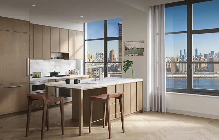
Closings have commenced at 100 Barclay, a downtown landmark and the epitome of historic loft buildings in Tribeca. Solid and graceful, the Art-Deco tower has been completely recrafted to feature sprawling loft residences with high ceilings, custom details, and the highest standards of construction. Residences begin at 170 feet above street level and rise from there, featuring ample light and views from the Hudson River to the Midtown city skyline.
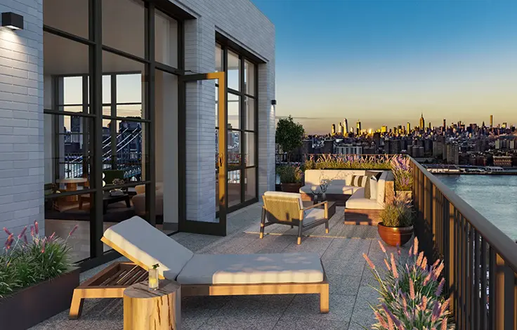
100 Barclay offers an unprecedented amenity program and over 40,000 square feet of carefully considered common spaces. Services and amenities include 24-hour doorman and concierge, a fitness center designed by The Wright Fit, an 82-foot lap pool with an adjacent children’s pool, and spa and treatment rooms. At the club level on the 18th floor, the program expands to include the perfect entertaining spaces: billiards room, a club lounge with bar and dining room, four uniquely programmed outdoor terraces, children’s playroom, teen lounge, media lounge, wine tasting room and music practice rooms. Bicycle storage and private storage are also available.
Closings have commenced on select residences with immediate occupancy.
Bottom Line
A mighty, dark mountain of an office building with significant Art Deco decoration, this building has been previously restored for $1.4 billion and then partially converted to residential condominiums.
Description
This 32-story, brown-brick, Art Deco-style tower at 100 Barclay Street is a very important early New York City skyscraper that was designed by Ralph Walker, who also designed the great fluted skyscraper at 1 Wall Street.
The building is also known as 140 West Street and the Barclay-Vesey building.
It was erected in 1926 by the New York Telephone Company as its headquarters and later was taken over by Nynex and then Verizon.
In 2014, Verizon sold the top 22-floors to Magnum Realty, of which Ben Shaoul is a principal, and CIM Group for $274 million. Mr. Shaoul subsequently bought the building’s ground floor retail space from Verizon for $40 million.
He planned to convert the top floors to 161 residential condominiums. Ismael Leyva and DXA Studio designed the residential conversion. According to the building’s website, the building’s “iconic art deco lobby has been refashioned into a welcoming residential retreat by celebrated designed Alexandra Champalimaud.
Verizon planned to keep offices on floors 2 through 10.
In its designation of the building as an official city landmark in 1991, the city’s Landmarks Preservation Commission noted that it was “built at a time of great progress and transition in American design, it was a product of the atmosphere of architectural creativity and originality which flourished in New York in the 1920s,” adding that it's “a pivotal structure in the history of skyscraper architecture, it is a prototypical example of what came to be regarded as the American Art Deco style.”
In their great book, “New York 1930, Architecture and Urbanism between the Two World Wars,” authors Robert A. M. Stern, Gregory Gilmartin and Thomas Mellins begin their lengthy section on the architect with his quotation:
“The Barclay-Vesey Building is an attempt to build a house of today, a house that is neither Greek, nor Gothic nor Mayan; one that looks but little to the past, much to the present and therefore tries to glimpse the future.”
“A great many massing strategies,” they continued, “were studied before an eccentric solution was adopted in which the base rose straight from the lot lines to the tenth floor, above which setbacks were introduced on the north and south sides and light courts carved in facing east and west. The extraordinary depth of the base, unusual in an era that relied on natural ventilation, was possibly only because the central elevator core was ringed with a thick zone of switching equipment. At the eighteenth floor the base fell away, revealing a square tower abruptly cut off at the thirty-second floor – the point at which it was determined that the cost of erecting space equaled its market value.”
“Although not remarkably tall,” the authors continued, “the building was extremely bulky. As a compromise between the city’s desire to widen Vesey Street and the client’s unwillingness to sacrifice square footage, the sidewalk along that street was incorporated inside the building’s mass as a seventeen-foot-wide shopping arcade.”
“…The elevations were inspired in part by Saarinen’s second-place entry in the Chicago Tribune competition, which masked the steel frame of the structure in a dense rhythm of flattened piers rising uninterrupted to the top of the building. The unrelenting verticality of Walker’s design and the serrated parapets at each setback pulled the various masses of the building together and swept the eye up the tower. Great attention was paid to the design of the tower’s rooftop silhouette, which evolved from fairly literal early studies – a pyramidal roof crowned by a lantern – to a more severe and sculptural approach whereby the flattened piers of the shaft broke free of the wall to become massive, vaguely Gothic buttresses engaged to a flat-topped pavilion. The stark piers gave the building an almost overwhelming monumentality, and ornament was deemed necessary to give the design individuality and human scale when viewed closet up. The parapets at each setback, the arches at ground level, and the limestone lintels of the second-floor windows were lavishly carved to provide the eye with a ‘welcome rest from the gigantic power of mass.’ As [Lewis] Mumford put it, ‘In the midst of the hard masses of the severe planes…a delicate stone ornament in lower relief, creeps up, as grass and flowers might peek though the rectangular cracks of a pavement. It is scarcely an exaggeration to say that the designer...has turned the lower stories into a rock garden’ decorated with a ‘naturalistic covering of birds, beasts, flowers and children.’…Walker believed that ‘the ornament of the skyscraper should be so complicated in its structure as not to be readily comprehended; its framework should be as hidden as the steel structure itself….Walker and his craftsmen brought a new and beguiling naturalism to their depiction of flora and fauna. The handing of the ornament was as charming as the mages picked were exotic: aborigines and baby flautists peered out of entwining vines, and giant elephants dangled their trunks from the top of the tower, their ears transformed into spiraling nautilis shells.”
“…The principal feature of the main floor was a grand east-west corridor roofed with a series of ten ceiling murals by Mack, Jenney & Tyler that swept down its length and illustrated advances in human communications from early history – the glazed brick reliefs of Babylon – to the age of radio. Bronze chandeliers, whose shape echoed that of the building itself, drew attention to the elevators”
“…The nineteenth-floor executive suite was elegantly understated, reflecting Walker’s conviction that ‘the tradition styles have no rational place within the modern high building. They all give the feeling of a roof immediately above. They suggest the force of a completed structure, a finality that should not exist in rooms within a skyscraper.’ The employee facilities, on the other hand, were unusually lavish.’”
“The emphasis on verticality, expressed on the exterior by brick piers, is also a major design element of the lobby,” the designation report said, adding that “Regularly spaced fluted pilasters of bold-colored marble establish the vertical emphasis. The gentle curve of the vaulted ceiling and its ribs (which connect the pilasters across the lobby) continue the sensation of upward movement. The blurring of the division between wall and ceiling was an attempt to convey a sense of spaciousness and to avoid oppressiveness. To downplay horizontality in the design there are no projecting moldings and surfaces remain flat wherever possible, thus strengthening the vertical emphasis of the design.”
“Much of the decorative ornament of the lobby consists of intertwining vines sprouting leaves, flowers and grapes. Scattered throughout the interlaces are cherubs, human figures and a variety of animals and other creatures including fish, mice, birds, squirrels and snakes. …The floor of the corridor and elevator alcoves is of a buff-colored travertine with black travertine detailing in geometric shapes. Near the middle of the corridor are set two bronze medallions….The eastern medallion depicts a woman surrounded by skyscrapers, telephone poles and wires, water and mountains, all enclosed in a border filled with an intertwining vine pattern. The scene represents the female telephone operator and her central office duties….The vaulted ceiling…[has] twelve hand-painted murals with gold leaf accents depicting various stages in the development of human communication. The scenes are separated by dropped panel ribs whose sides are perforated as part of the ventilation system….The painted panels were meant to be read from either direction toward the center. From the west are depicted: 1) West Africans using drums to transmit signals to nearby villages, 2) carrier pigeons sent by Chinese merchants, 3) ancient Greeks sending messages by reflecting sunlight off their shields, and 4) ancient Romans communicating by fire; a message is sent from a tower of the old Roman wall in Britain….From the east are depicted 1) a megaphone used by early Egyptians, 2) smoke signals sent by American Indians, 3) an Aztec runner carrying a message by foot, 4) medieval knights conveying messages by signal flags, and 5) signaling by gunfire, depicted by a cannon on a wooden ship.”
Amenities
The building will have an entrance marquee and four landscaped terraces.
Apartments
According to a December 1, 2014 article by Jessica Dailey at ny.curbed.com, the asking price for a duplex penthouse apartment in the building with 30-foot-high ceilings will be $100 million or more.
History
Authors Stern, Gilmartin and Mellins provided the following commentary about this building:
“Walker was thirty-four years old when he was given charge of a new office building and switching center for the New York Telephone Company. Nothing about the Barclay-Vesey Building’s inception promised remarkable results. The site – an awkward parallelogram bounded by Barclay, Vesey, West and Washington streets – was an isolated location chosen because land was cheap near the Hudson River wharves especially where they jostled the fish and produce stands of the Washington Market. The program called for a utilitarian facility rather than a corporate monument. ‘The Telephone Building was conceived of as a machine,’ Walker wrote, ‘which had certain definite functions to perform economically for the benefit of its occupants; and economy, not extravagance, was perhaps the strongest influence exerted upon the entire design.’”
In its designation of the building as an official city landmark in 1991, the city’s Landmarks Preservation Commission noted that “the emphasis on verticality, expressed on the exterior by brick piers, is also a major design element of the lobby."
The designation report said, adding that “Regularly spaced fluted pilasters of bold-colored marble establish the vertical emphasis. The gentle curve of the vaulted ceiling and its ribs (which connect the pilasters across the lobby) continue the sensation of upward movement. The blurring of the division between wall and ceiling was an attempt to convey a sense of spaciousness and to avoid oppressiveness. To downplay horizontality in the design there are no projecting moldings and surfaces remain flat wherever possible, thus strengthening the vertical emphasis of the design.”
The report also noted that “the wide acceptance of the building as a symbol of modern architecture was confirmed when its photograph was used as a frontispiece in the English translation of Le Corbusier’s Towards a New Architecture. The Architectural League of New York award the building is Gold Medal of Honor in 1927. Joseph Pennell, an etcher struck by New York’s skyscrapers, proclaimed it ‘the most impressive modern building in the world.’”
A January 8, 2015 article by Evan Bindelglass at ny.curbed reported that a meeting of Community Board 1 was told of a plan the previous night to install removable, 9-foot-high, flood barriers in the building
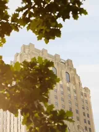
- Condo built in 1927
- Converted in 2015
- 7 apartments currently for sale ($3.15M to $5.995M)
- Located in Tribeca
- 158 total apartments 158 total apartments
- 10 recent sales ($2.7M to $5.6M)
- Doorman
- Pets Allowed
 6sqft delivers the latest on real estate, architecture, and design, straight from New York City.
