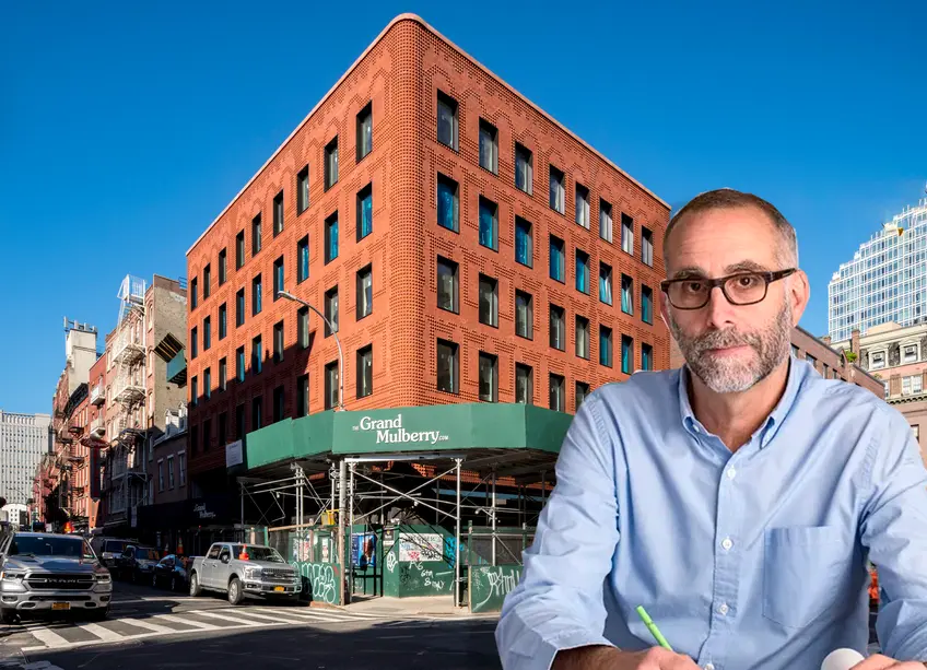
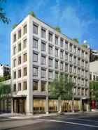
 Photo of the Morris Adjmi Architects-designed Grand Mulberry condo approaching completion in Little Italy (Photo credit: Jimi Billingsley)
Young architects often wax on about the endless potential of concrete — its malleability and color options seem idyllic and endless. Morris Adjmi feels the same way about brick. With his firm’s motto “standing out while fitting in,” Adjmi uses brick to challenge perceptions of depth, light, and lines through extremely innovative, exciting, and modern uses of the ancient building material.
Most recently through his show-stopping Braille-esque brick facade of The Grand Mulberry and sexy curved facade inspired by the quirky lot of 87 Grand Street, Adjmi has been quietly (in a whisper-yelling sort of way) using brick to detail building narratives that weave a building and neighborhood's history like a magical fountain of youth. From Sterling Mason's
photo negative addition to the recessed frames on 116 University Place, Adjmi’s use of brick continues to evolve and never ceases to wow.
In this article:
We spoke to the architect about why and how his brick fascination began and what he sees in his future of brick.
Michelle Colman: What inspired your innovative use of brick?
Morris Adjmi: I have always admired brick. Hand-pressed brick was one of the first man-made building materials dating back to the Romans. Similarly, there are amazing brick and mud structures from Africa, as well as Lewerentz’s exceptional use of rough brick in Sweden. Its past and potential are extremely vast and exciting.
Brick also works for me because it is a human scale in the way that it relates to context and history. These considerations are very important to our design approach. Not only that but it’s a sustainable and practical choice. It comes from the earth or can be created from recycled materials.
Nowadays, we are hand-laying our brick buildings, in the traditional way, but we’re also panelizing it. That gives you other options. Not everyone knows that the Theory Building was designed with its brick pilasters on precast panels with a metal surround. If you organize the facade in a certain way, you can use a panelized system that looks hand laid.
There is a lot of brick in the history of New York, and your work is very contextual, so I assume that plays into it?
Yes. That plays into color and many other variables. When I think of New York, I think of a red-brick city. Some areas, like the Ladies Mile Historic District, were affected by the Columbian Exposition when everything started to go into more of an ivory or off-white brick. The materials are the same but the color can play into how you perceive it.The Sterling Mason addition, No. 45 E 7, and 116 University Place were lighter in color too. What drove that?
The Sterling Mason is an example of a panelized system but our approach on that project was actually the opposite of the way we normally design a building---it’s a literal copy of the building next door. I always say I don’t want to mimic historic architecture but, in that case, it made sense for a couple of reasons. Primarily, that’s the way Tribeca’s large warehouses were enlarged or added onto over the course of the development of that historic district in that each addition would use the most current material and/or technology.For the Sterling Mason, we used a metallic resin and aluminum with a thermal finish at the base but we copied the exact form of the existing building next door. The metallic material also referenced the way cast-iron buildings copied masonry classical buildings using the latest technology. There was also the idea that you would see the one building as frozen in time, the other progressing in age as masonry buildings do.
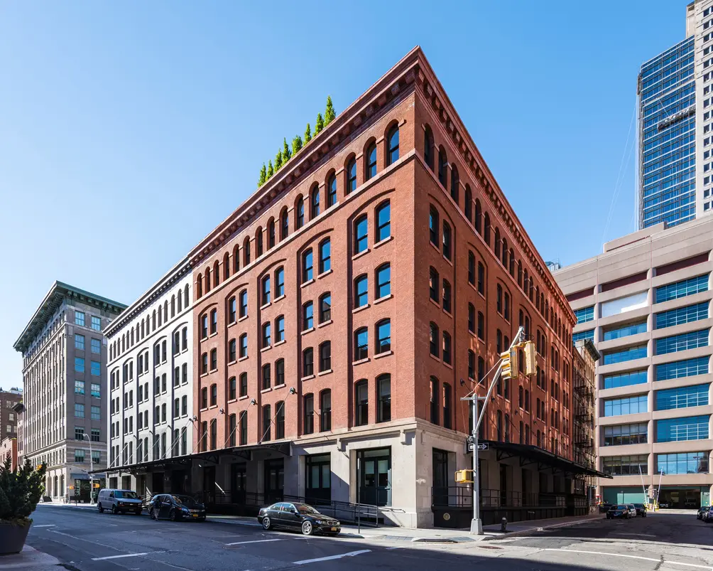 The Sterling Mason in Tribeca (Photo credit: Jimi Billingsley)
"Brick lends to creating that kind of detail that makes a building feel alive and feel contextual that it has substance, it’s not just a thin veil" - Morris Adjmi
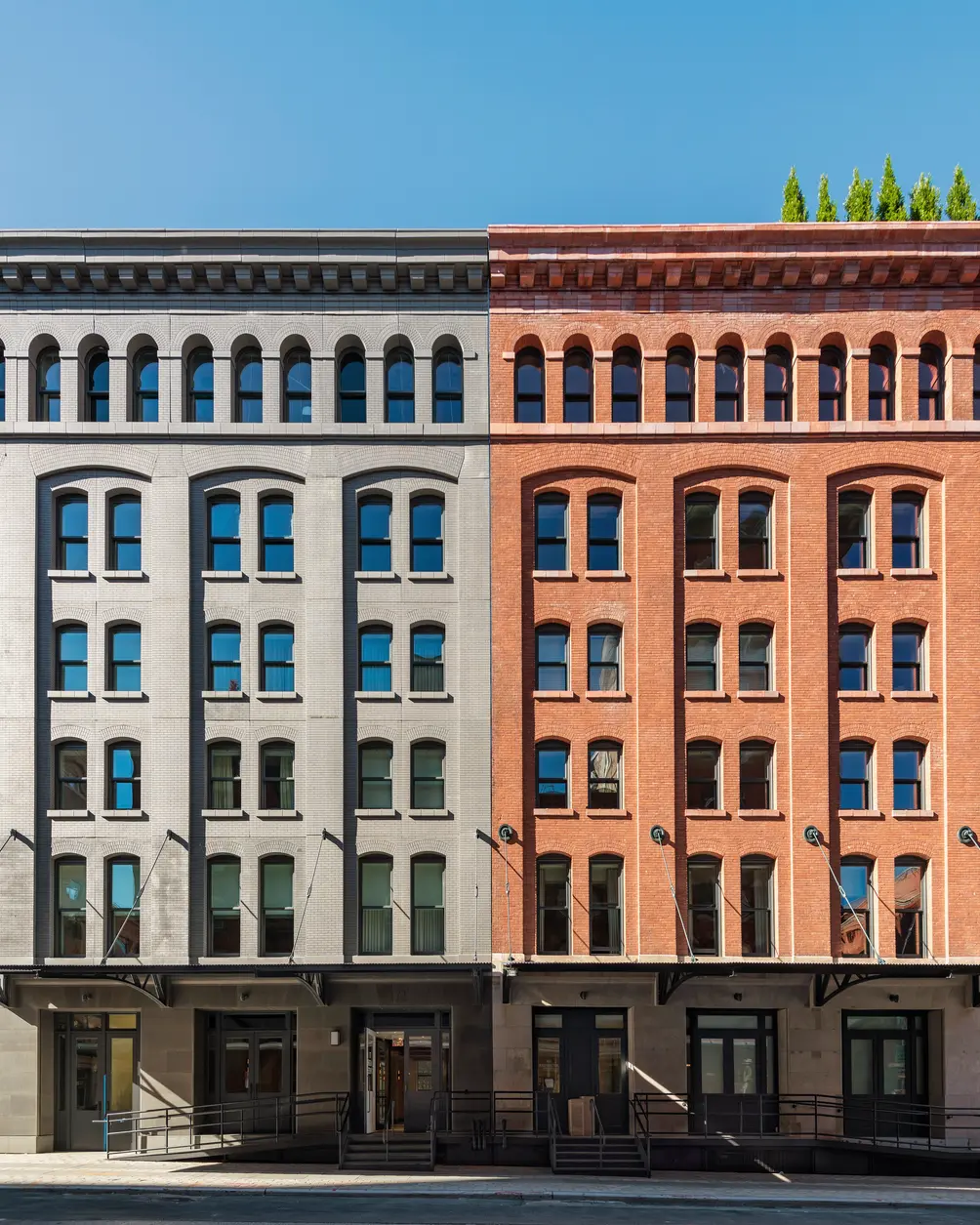 The slightly fraternal pair of buildings that comprise the Sterling Mason. The lighter colored building on the left is a new building that copies the historic red brick one next door (Photo credit: Jimi Billingsley)
How much of your decision of using brick comes down to how you can shape a facade?
The thing about bricks is that you can do so much with them in terms of size, texture, color, shape, and depth. One thing we see in a lot of architecture now is the depth of the facades has been squished so flat that the buildings lose their architectonic qualities. One of the things I always try to do is create a building animated by shadow and light. Brick lends to creating that kind of detail that makes a building feel alive and feel contextual that it has substance, it’s not just a thin veil.
Would you like to tour any of these properties?
Just complete the info below.
Or call us at (212) 755-5544
How does brick interact with other materials, like metal or wood?
Brick has always functioned together with other materials. For example, it works well with stone for lintels, sills, detailing around window openings or at the base of the building. But it also works well with metal. Metal was used in a similar way to frame or expand openings so I like the combination of brick with those other materials to accentuate the details of a facade.In the case of The Grand Mulberry, did you come up with the brick design and have it made to your specifications, or was this a design you’d seen somewhere else?
There are a number of brick makers around the world. We had seen a similar brick in Europe and decided to use that in an innovative way. Instead of just trim or a decorative element, we used it to tell a story. We used a custom, profiled brick to create the image of what a tenement would’ve looked like with framed openings, cornices, and other traditional details, then punctuated that façade with a more modern, regular grid of windows. The result is a juxtaposition of the historical tenement building with its classical detailing and then a very modern building with a more austere rhythm overlaid on top of it.Why are the patterns offset on the facade?
The brick pattern is organized like a tenement building with a hierarchy of fenestration and detailing or articulation around those openings. The juxtaposition and tension of the regularity of windows that are there and the shadow of the previous building that was there or could’ve been there accentuate the interest of dialogue in that facade.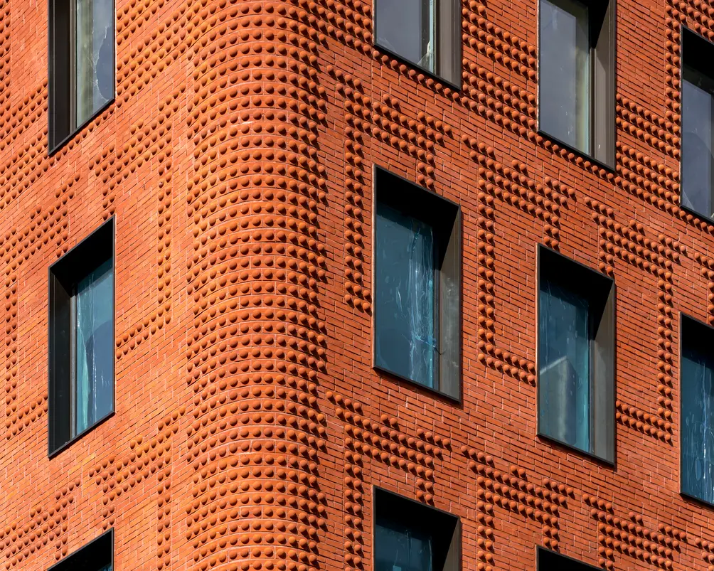 Detail of The Grand Mulberry's facade
Is using brick on interiors as appealing to you?
About seven years ago, we did a project in DC called Atlantic Plumbing. The site was originally a materials yard for a plumbing supply company and there were four little brick buildings that were slated to be demolished. We carefully palletized and categorized all of the bricks on the site, including an old, hand-painted brick “Atlantic Plumbing Supply Company” sign to be reused in the new development as a vestige to the legacy of that site. That’s where the name of the development comes from.In The Schumacher, the barrel-vaulted ceilings were existing ceilings that were in pretty good shape, but some more than others. We had the mason test in a couple of areas. I asked him what he thought and he said, “It’s not really right. It’s got to look a little scrappier. It was too perfect. Being able to keep the spirit of that rough texture and the way it was built originally was a little bit of a challenge. But once he got it, he understood, “Oh, so you want it to look like that?” Because you can’t have a perfect clean patch that looks surgical next to the original patina. The brick softens the overall effect.
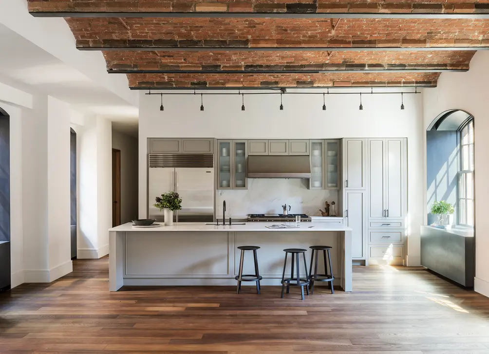 Apartment interior at The Schumacher condo conversion in NoHo (Photo credit: Jimi Billingsley)
With the recessed stepped brick windows, like 116 University, and the stepped brick door of 87 Grand, is this something you create because you’re using brick or vice versa?
The corbelling plays into the idea of creating depth and solidity.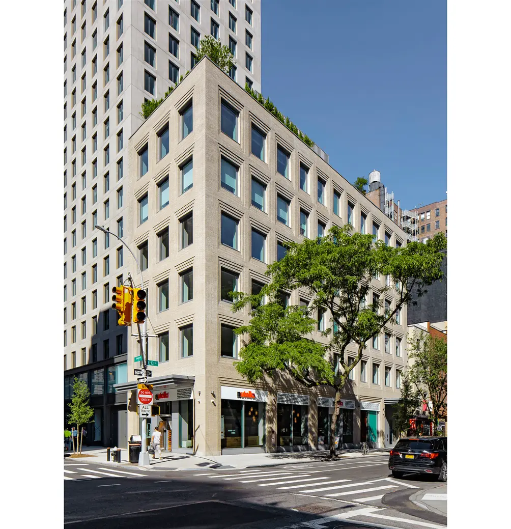 116 University Place in Greenwich Village (Photo credit: Jimi Billingsley)
87 Grand’s curved facade…swoon! Tell me more!
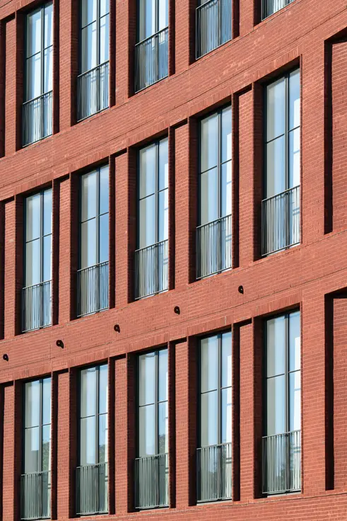
That is such an interesting story because it’s the lot that actually curves. The zoning was really complicated and everybody was having such a hard time trying to figure out what to do. So I just said, “Let’s just follow the curve.” And there is a double curve. It curves in plan and curves in section. That whole facade really has an elegance about it that came about in response to the quirky lot.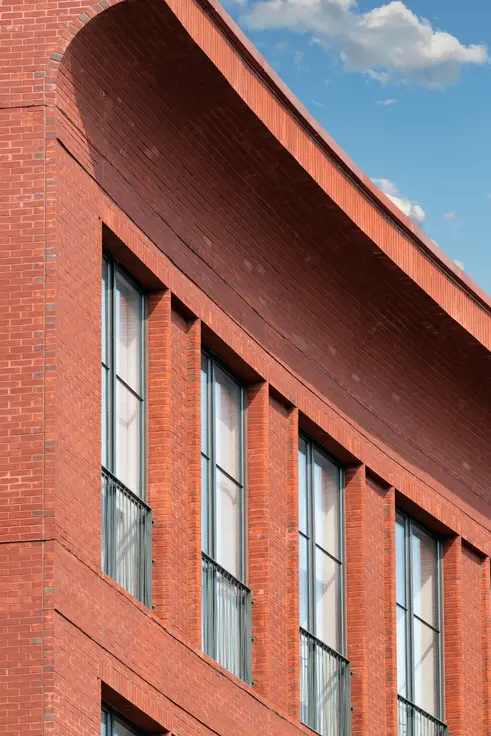 (Photo credit: Jimi Billingsley)
What can we see from you in the future of bricks?
I want to design a line of bricks and come up with some special textures and colors. I also want to revisit a technique that we used for the NYU Wilf Hall project that we did a number of years ago where we collaborated with a company called Greenleaf Bricks that makes products from industrial waste. Architects have a responsibility to look at ways to design more sustainability. I would love to follow that lead and make a sustainable brick that keeps waste out of landfills and creates beautiful color and design options.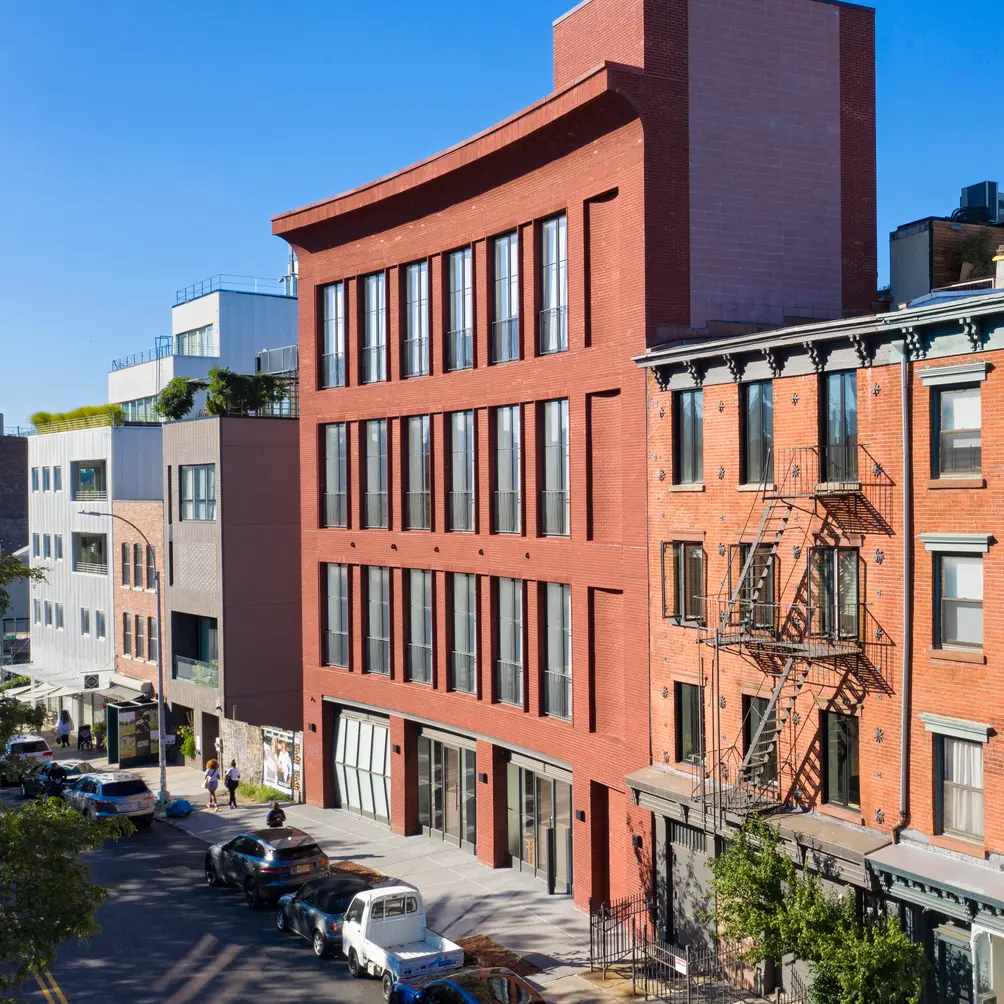 87 Grand Street, a recent residential project near the Williamsburg waterfront (Photo credit: Jimi Billingsley)
Would you like to tour any of these properties?
Just complete the info below.
Or call us at (212) 755-5544
Would you like to tour any of these properties?

Contributing Writer
Michelle Sinclair Colman
Michelle writes children's books and also writes articles about architecture, design and real estate. Those two passions came together in Michelle's first children's book, "Urban Babies Wear Black." Michelle has a Master's degree in Sociology from the University of Minnesota and a Master's degree in the Cities Program from the London School of Economics.


 6sqft delivers the latest on real estate, architecture, and design, straight from New York City.
