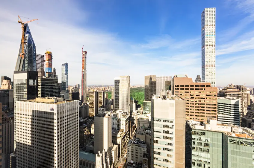
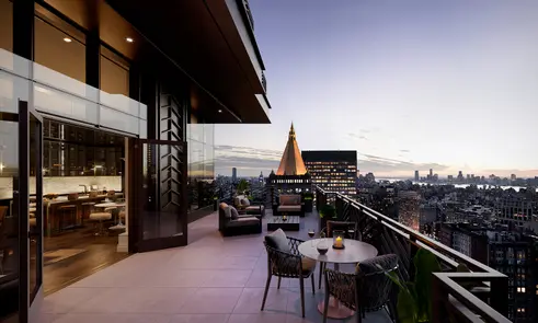
 View of the Central Park South skyline from Olympic Tower's #46/47C (Compass)
In this era of supertall buildings, New York City is no longer the world's leading skyline metropolis. According to the Council on Tall Buildings and Urban Habitat, of the 22 buildings that were erected in 2019 that were at least 1,000 feet tall, only three were in New York.
But if you look around, it might seem that famous neighborhoods in the city, and not just Midtown and Lower Manhattan, are getting bigger yardsticks. Architects and developers are challenging planners and some community activists with new, tall projects.
If you have not visited the city in recent years, you'll be astounded by the dramatic changes, especially in Brooklyn and Queens.
The Billionaires' Row corridor south of Central Park has seen the topping out of several major skyline projects.
Height alone is not the only important criterion and the quality of design has increased substantially across the board as developers look for marketing advantages. Certainly any list of the "top" buildings of the year is going to be populated by some blockbusters as can be found at Hudson Yards, but there are many surprising signs of superior design in more accessible areas.
In this article:
Despite being outrageously stunted by Amanda Burden when she was chairperson of the City Planning Commission in deference to the historic prominence of the Empire State Building about a mile to the south, the aesthetics of this rakishly angled skyscraper designed by Jean Nouvel as a major mixed-use addition to the Museum of Modern Art remained relatively intact.
Ms. Burden's unconscious decapitation of the top 200 feet or so of the tower did not significantly diminish its bold geometries although it dropped significantly in the "supertall" standings in the city and especially in the world.
A mid-block tower not on a major thoroughfare almost gets "lost" in the ever-expanding forest of high-rise structures that have begun to flourish across the New York metropolitan region.
Its asymmetry and bold diagonal framing assure its prominence in the city's skyscraper history.
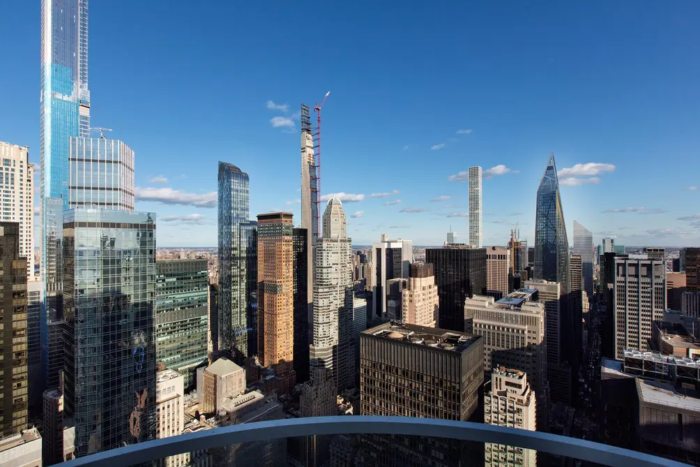 View from the penthouse of ARO in Midtown West (Triumph Property Group)
Almost ungainly, its very forceful and irregular vertical thrust of the building manifests its brazen form like a wounded but unbowed warrior in the clash of urban titans.
At 1,050 feet, it is not insignificant and its "true" stylistic sister is the beloved and more visible stainless spire of the Chrysler Building.
Manhattan is mostly a rectilinear city, which makes it easier to navigate and comprehend. On a vertical plane, however, angles can work but are better when they are fully visible on avenues or major intersections. This building clashes with its context, throwing down its gauntlet in promoting its brash bravura.
Not surprisingly, it pulls its punches at street level, just as did the more curvaceous sloping tower at 9 West 57th Street a generation ago.
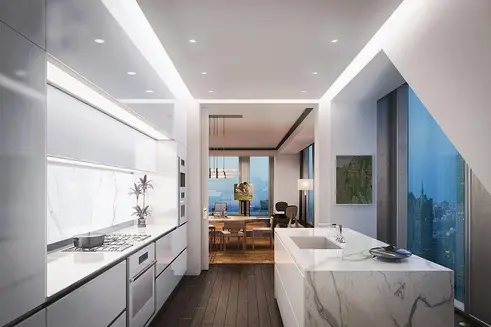 All images of 53W53 via The Corcoran Group
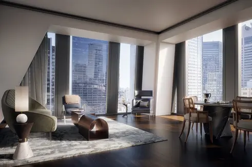
Its museum interiors, designed by Diller Scofidio + Renfro and Gensler, offer significant expansion space for the Museum of Modern Art, although most visitors are very discombobulated by its vastness and lack of visual clarity. Thierry W. Despont did the apartment interiors.
In his review for the Financial Times, Edwin Heathcote observed that the "diagrid" of diagonal bracing on the facades "is a visible reminder of the forces acting on the building, manifesting gravity and wind loads," adding that "there is something shadowy and expressionist about the struts, which intrude on the rooms like dark shadows, disrupting the space just a little, just enough."
The building reminds one of the great, jagged movie poster for "The Man With The Golden Arm."
The building's large and conventional lobby is not inspirational, but from outside, however, the zigs and zags dance wildly, jubilantly and defiantly.
It used to be that Rosario Candela and J. E. R. Carpenter long ruled the roosts of high-rise residential splendor, but Robert A. M. Stern has taken up their reins and created a stunning herd of palatial towers of regal grandeur, led by 220 Central Park South that has been stealing residents from his other nearby and older trend-setter, 15 Central Park West. Like 15 Central Park West, 220 Central Park South is a two-building development with a traditional, "baby" mid-rise building fronting on Central Park and a much taller high-rise looming behind it.
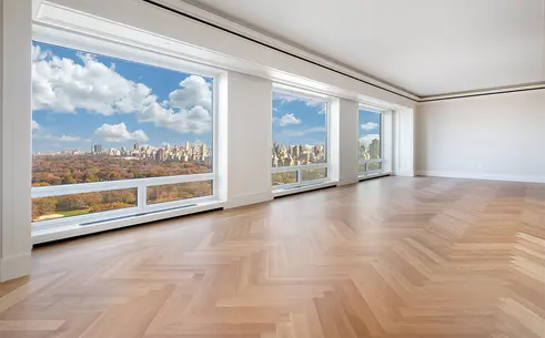 220 Central Park South #31A via The Corcoran Group
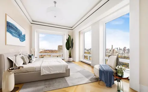 220 Central Park South #28B via Douglas Elliman
Stern's current crop also includes two similar but smaller towers such as 30 Park Place and 520 Park Avenue, all with very satisfying quirks, such as asymmetric designs, some balconies, some loggias and some night-time illumination. Stern has mastered the architectural touch of arrogant flourish, finesse and exclamation.
The fabled "pre-war" classics of sedate elegance and grand interiors have been reborn with extravagant amenities, glorious vistas and notches-higher details.
Although "Post-Modern" became a bit of a negative adjective in recent years, Stern's towers have restored its luster.
The fabled "pre-war" classics of sedate elegance and grand interiors have been reborn with extravagant amenities, glorious vistas and notches-higher details.
Although "Post-Modern" became a bit of a negative adjective in recent years, Stern's towers have restored its luster.
Two of the city's leading high-rise developers, Extell Development led by Gary Barnett and a Shanghai investment concern, and JDS, led by Michael Stern, have been jockeying for the title of most flamboyant and awesome builders.
The former's flagship is 217 West 57th Street between Broadway and Seventh Avenue, known as Central Park Tower, and it is across the street from, and towers over, 220 Central Park South (see above). Designed by Adrian Smith + Gordon Gill Architecture, the designers of the Burj Kalifa, once the world's tallest building at 2,799 feet in Abu Dhabi, This spindly tower has a slight cantilever and a rather slender profile whose main stunning attribute is its height, the tallest in the nation for a mixed-use building.
Its seven-story base on 57th Street contains a Nordstrom store with a large glass facade.
The development reached an agreement with the building of the tall, but considerably shorter, luxury apartment tower across 58th Street known was 220 Central Park South, to shift its site a bit so as not to block many of this tower's views to the north.
During construction, many of this tower's windows were a rather garish pale blue, but eventually, that covering was removed to reveal a clear, untinted glass.
The very skinny tower at 111 West 57th sprouts right next to the Steinway Building with its very ornate and handsome piano showroom and neo-Classical top.
There is nothing classical, however, about this "super-tall," which at 1,432 feet high is the second-tallest residential tower in the city after Central Park Tower at 217 West 57th Street (see above).
When it was first announced, this building was notable for its curvaceous, thin and tall gold-colored terracotta windows on its east and west facades sinuously climbing upwards like gilded snakes in an Arabian Nights dream.
In reality, however, the "snakes" lost their cosmic touch in the reality of the cityscape - they simply were made minuscule by the tower's immense height. As its construction was about to end, its peak resembled a short open stairway to heaven before its final, mysterious enclosure.
The gaunt and ungainly tower has more than a dozen small setbacks on its south side but none on its north side.
There are three towers at Waterline Square at the southern base of Riverside Boulevard fronting on the Hudson River, all centered around a large park.
Three Waterline Square, which was erected by GID Development Group, is the most modest in size of this group, but the most interesting with its bird's nest framework and roof and general asymmetry.
The architect was Rafael Vinoly, whose other major projects in the city include the mid-block 432 Park Avenue between 56th and 57th Streets, the perforated rectangular column that for a while was the city's tallest purely residential tower. It has a flat roof and several double-height spaces that are mostly indented to permit the city's winds to flow through and not cause residents to panic or get airsick.
As it slowly became to reveal itself, its ventilation aspects were not immediately apparent and the tower's design seemed, to some, simplistic. With its every large, square, single-pane windows, the tower is deceptive in its detailing but not in its enormous height and mass. At the most easterly super-tall along Billionaire's Row along the 56th-Central Park South corridor, this one-trick building gained a lot of momentum by being one of the first in midtown.
Three Waterline Square, on the other hand, is a far cry from 432 Park Avenue's minimalism. It is a domed bird's nest and while its sides assume vertical emphasis they also slip and slide a bit in their alignments, adding some derring-do to their visual impact as if some party-goers couldn't resist swiping their fingers at such a tempting "cake." It also has some slants and setbacks.
Interiors were handled by Groves & Co. The building stands 391 feet tall and contains approximately 443,000 square feet and 244 apartments.
Would you like to tour any of these properties?
Just complete the info below.
Or call us at (212) 755-5544
Clustered about Thomas Heatherwick's gleaming bronze-colored, inverted pine cone-like "Vessel" that is the centerpiece of the sprawling Hudson Yards development, two of these three large towers are surprisingly subtle while the third and largest, 10 Hudson Yards is the boldest with its large, angular observatory that juts out with a largely transparent floor near its top.
10 Hudson Yards is an office building and the other two, 15 Hudson Yards and 35 Hudson Yards are mixed-use structures with a lot of residential.
Unlike the sharp angularity of 10 Hudson Yards, 15 and 35 Hudson Yards have curved tops, the former that melds together four cylindrical masses and the latter that turns its curved top inside out while the tower's base sucks in its plaza entrance.
15 Hudson Yards was designed by Diller, Scofidio & Renfro, which also shaved away the major Broadway facade of one of the city's finest Brutalist buildings at Lincoln Center.
15 Hudson Yards is not subtle at its base where it has a very large and bulbous, multi-level performance space on tracks so its "Shed" can be opened in good weather. The Shed adjoins the tower's base that has a different, more detailed, base than the tower. The $475 million Shed is the major culture facility at Hudson Yards and it opened with a full program of diverse performances.
This building, which has 285 market-rate condominium apartments and 106 "affordable" rentals, was developed by Related Companies and Oxford Properties Group. It is 910 feet tall.
35 Hudson Yards is about 100 feet taller and is notable for its handsome base with a "tucked-in" base with a large curved entrance marquee, and an asymmetrical profile. It was designed by David Childs of Skidmore, Owings & Merrill who also designed 1 World Trade Center. It has 137 apartments, and an Equinox-branded, 200-room hotel and fitness club, office space and ground-floor retail.
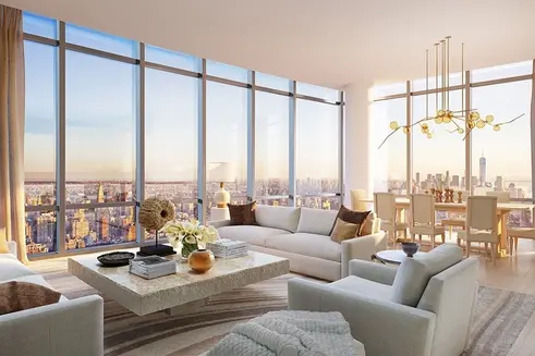 All images of Hudson Yards via Related Companies
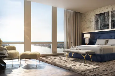
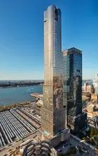
The largest building at the complex is 30 Hudson Yards and its angled form dances with the smaller but similar 10 Hudson Yards that tilts in a different direction. These commercial buildings were both designed by William Pedersen of Kohn Pedersen Fox.
Mr. Pedersen told ArchDaily that “We sculpted 10 and 30 Hudson Yards to have the strength of a force of nature,” adding that “Almost geological, the towers ascend in crystalline form, gesturing to each other in a type of spatial, urban dance.” Both buildings have "shingle" glass facades and the 1,296-foot-tall 30 Hudson Yards has a large, triangular observation platform that juts out very dramatically at the 1,009-foot level with a large transparent floor at its center.
Its major tenants include Wells Fargo, WarnerMedia, and Kohlberg, Kravis Roberts and it shares a luxury retail base with 10 Hudson Yards.
These buildings are part of the eastern part of the redevelopment of the immense rail yards at Penn Station. The western section has not yet been finally designed and will include several smaller but not insignificant residential towers clustered around a park facing the Hudson River.
 Credit: Two Trees Development
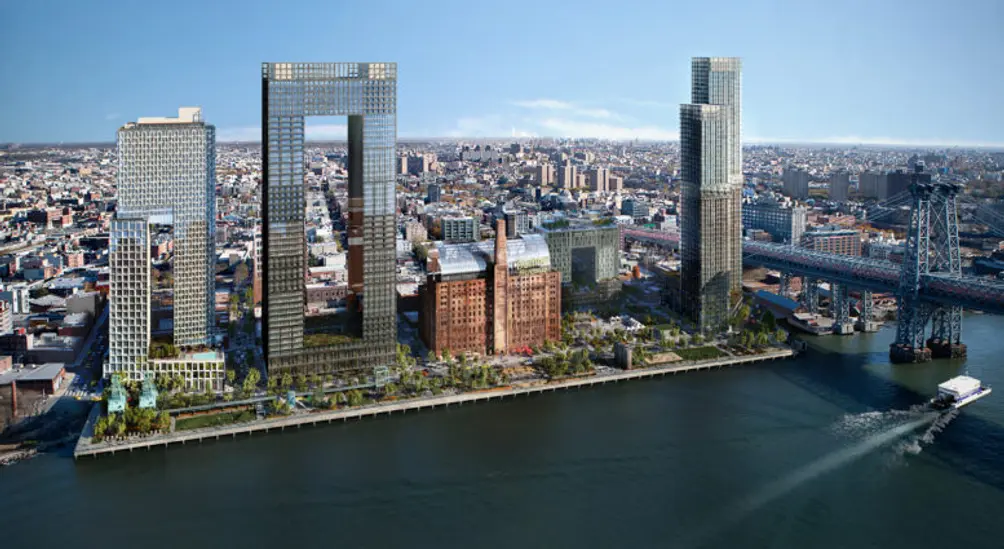
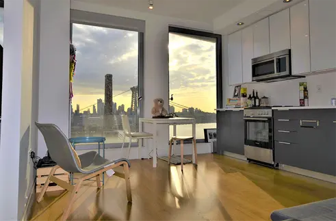
The Domino Sugar Factory on the East River in North Williamsburg closed in 2004, and eventually the city approved a residential rezoning in 2010. The site was acquired by Two Trees Management in 2013. Two years later, plans were adopted for the adaptive re-use of the landmarked Refinery Building for offices, four new buildings with a total of 700 units of "affordable" housing, and a five-acre waterfront park designed by James Corner Field Operations, which had been the lead designer of the High Line in West Chelsea in Manhattan.
The park is notable for containing about 30 industrial artifacts from the sugar factory although sadly not its Rube Goldberg-ish oven with dozens of pipes bursting from it leading everywhere. Some of the preserved artifacts include screw and bucket conveyors, hoists, gantry cranes and tall cylindrical syrup tanks.
The park is notable for containing about 30 industrial artifacts from the sugar factory although sadly not its Rube Goldberg-ish oven with dozens of pipes bursting from it leading everywhere. Some of the preserved artifacts include screw and bucket conveyors, hoists, gantry cranes and tall cylindrical syrup tanks.
 All images via Two Trees Management
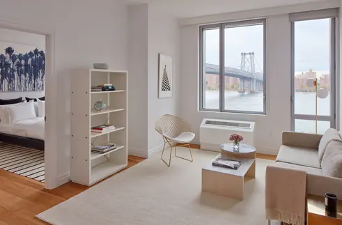
The park is the latest superb reinvention of the Brooklyn and Queens riverfronts.
Most of the others are in front of stylistically related new high-rise towers, but at Domino the towers are eclectic, to say the least, with one a large, recessed arch mid-rise and another a high-kicking torso. The developer has just announced an expansion to the north that will include two swooping high-rises with a circular pond by Bjarke Ingels Group (BIG).
Mr. Ingels, BIG’s founding partner & creative director, has described the two towers as such: "Rather than stopping at the hard edge of the old dock, Metropolitan Avenue is split into a pedestrian loop extending all the way into the river, connecting the dots of the concrete caissons to form an urban archipelago of recreative islands while protecting a beach and body of water for water sports and wetlands. The radical transformation of Copenhagen’s port into a swimmable extension of the public space that we helped pioneer two decades ago, now seems to be knocking at the door in Williamsburg and the entire East River. The river loop will be the first of many invitations for New Yorkers to dip their toes in the water."
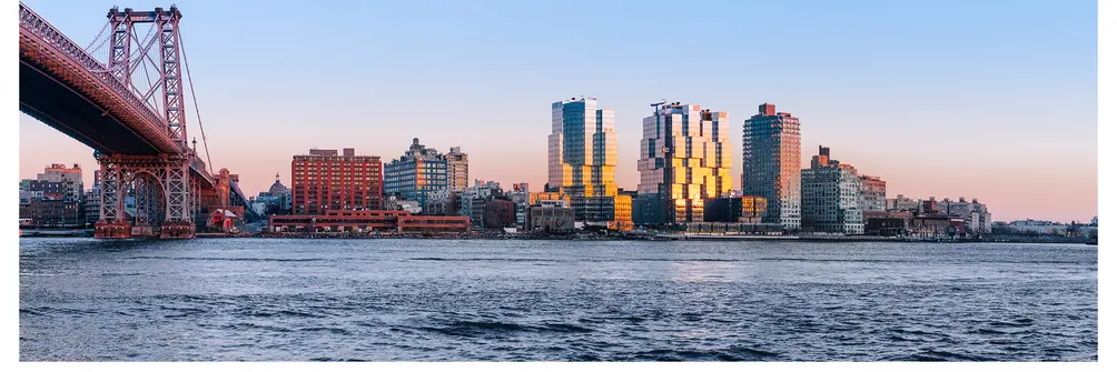 Photo via ODA New York
The year's most active architectural firm, ODA, is headed by Eran Chen and has several striking projects: 420 Kent Avenue along the East River and two projects on the former site of the Rheingold Brewery: 10 Montieth Street and Denizen Bushwick.
The most visible of its current crop of projects is 420 Kent Avenue for a development group headed by former New York State Governor Eliot Spitzer.
420 Kent Avenue consists of three, dark glass, stacked-box towers on two sites in the architectural firm's style of push-pull rectangles.
The three 22-story towers contain 857 apartments, 20 percent of which are "affordable" and 80 percent of the total have some corner windows.
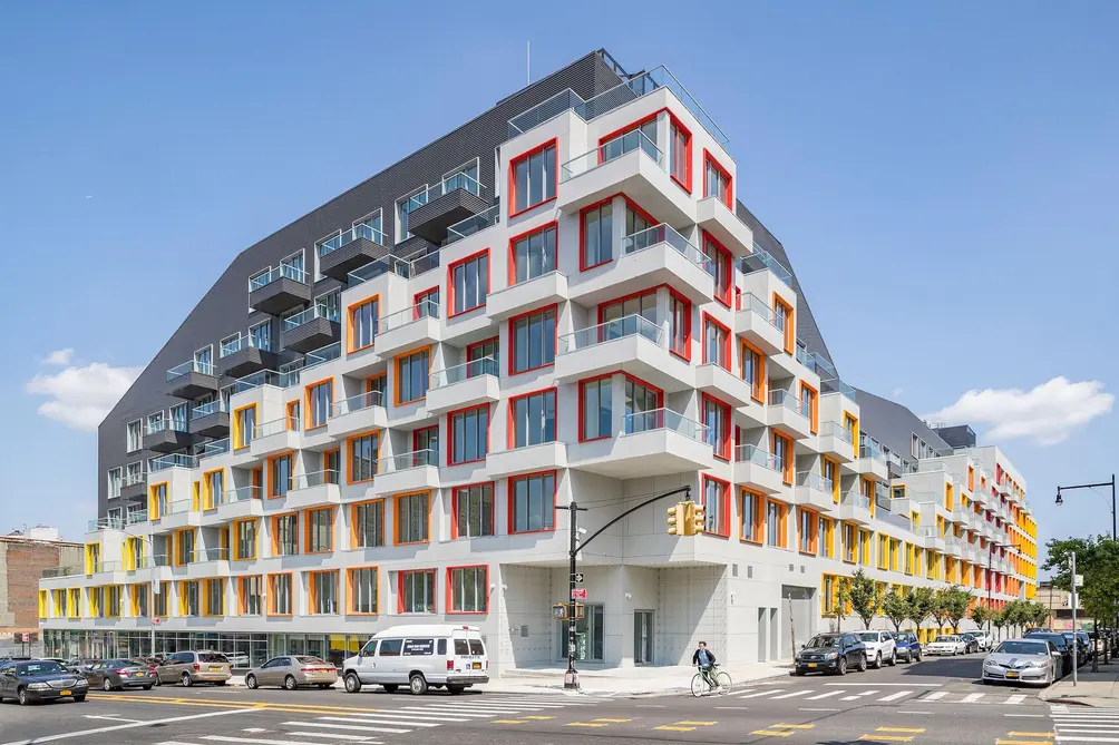 The Rheingold (Pavel Bendov )
At 10 Montieth Street, the seven-story building known as The Rheingold is oriented around an interior courtyard and topped with an expansive rooftop designed to evoke the natural terrain with a sloping topography allowing for direct horizontal access from the top four floors. The roof also has a running and hiking course, an urban farm and various eating areas and the building's other amenities include a cafe, a media room, a library, a climbing wall, a gym, and a playroom.
The building was developed by the Rabsky Group, which is headed by Simon Dubinsky. Its handsome facade has indented windows framed thinly in orange, red and yellow.
It has 392 units of which 100 are "affordable."
It is one of two nearby developments on the former site of Brooklyn’s Rheingold Brewery that are independent of each other and are backed by two different development firms.
The other Rheingold project is known as Denizen Bushwick, a 911-unit rental development by All Year Management. It spans two city blocks and is articulated around a meandering system of interconnected courtyards with landscaped walkways and corridors and some publicly accessible amenities, and, notably, multi-story murals in its single-loaded glass-enclosed hallways.
A smaller but much more visible ODA project is 10 Jay Street, a warehouse conversion long the East River with a very faceted and jewelry west facade.
A smaller but much more visible ODA project is 10 Jay Street, a warehouse conversion long the East River with a very faceted and jewelry west facade.
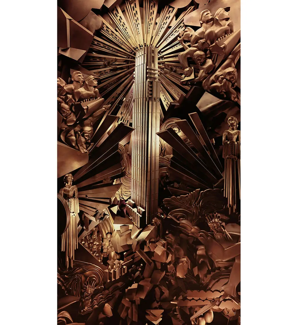 Rose Hill rendered in a bronz-colored collage by Marco Bramila
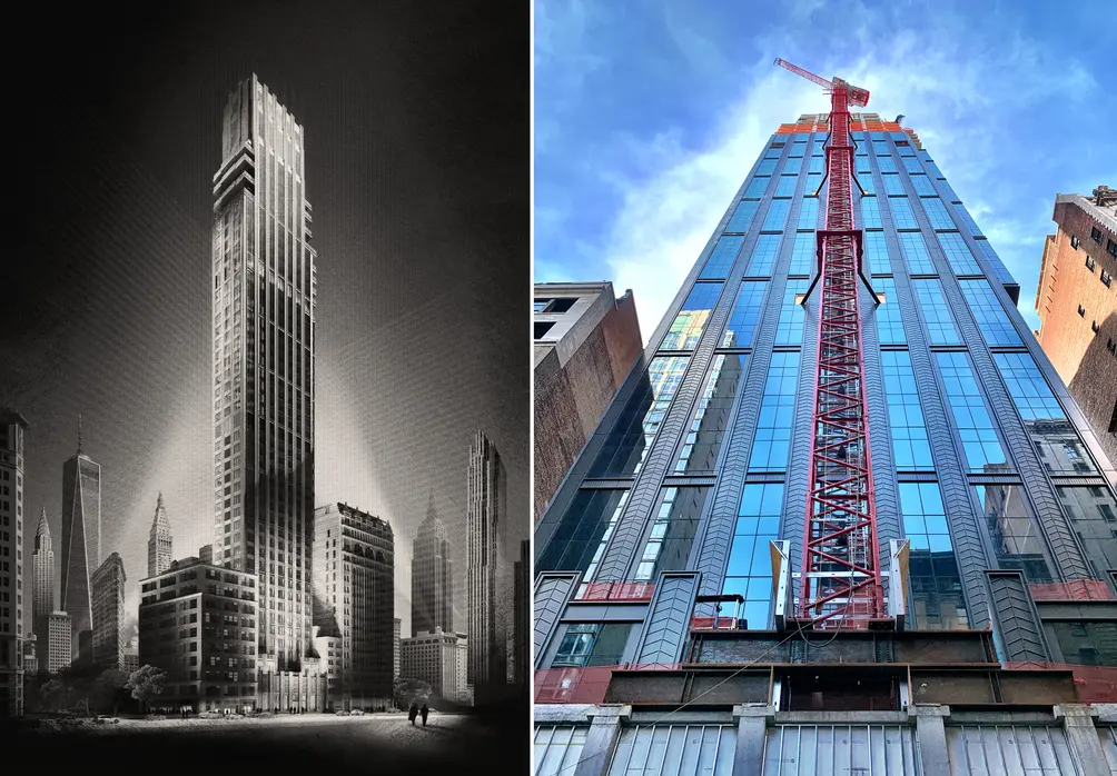 Left: Hugh Ferris-inspired rendering of Rose Hill (Credit: Rockefeller Group and Recent Spaces); Right: Construction progress as of January 2020 (CityRealty)
Rose Hill is a 46-story tower with handsome metal chevron piers developed at 30 East 29th Street in NoMad by The Rockefeller Group, a subsidiary of Mitsubishi Estate. The post-modern, retro-inspired design of the 639-foot-high tower by Cetra Ruddy is the handsomest of the many new towers in this neighborhood, even if it pales by comparison with a spectacular Art Deco-style illustration of the building in a bronze-colored collage by Marco Bramila.
The mid-block building has 123 condominium apartments.
The mid-block building has 123 condominium apartments.
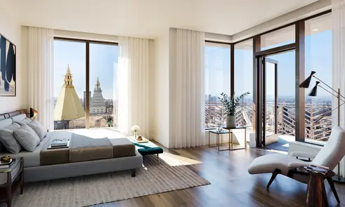 All images of Rose Hill via Core Group
11 Hoyt Street is a 51-story tower with 490 condominium apartments in a prefabricated concrete facade with a rhythmic facade of lapping windows designed by Jeanne Gang of Studio Gang of Chicago. The developer was Tishman Speyer, who also erected the three-tower Jackson Park complex in Long Island City designed by Mack Scogin Merrill Elam Architects.
Jackson Park has slick and shiny facades and its buildings contain 1,800 apartments. It is not as attractive at Extell Development's Lower East Side development, One Manhattan Square, a Z-plan, 80-story glass tower just to the north of the Brooklyn Bridge designed by Adamson Associates Architects but Jackson Park's mass and profusion of small windows is almost hypnotic, if not magnetic.
11 Hoyt, on the other hand, is handsomely sculptural, a less chaotic and more orderly stepchild in downtown Brooklyn of Frank O. Gehry's mesmerizing 8 Spruce Street, the 76-story tower with rippling facades that is known as New York by Gehry, a little south of the Brooklyn Bridge in Lower Manhattan.
Would you like to tour any of these properties?
Just complete the info below.
Or call us at (212) 755-5544
Would you like to tour any of these properties?

Architecture Critic
Carter Horsley
Since 1997, Carter B. Horsley has been the editorial director of CityRealty. He began his journalistic career at The New York Times in 1961 where he spent 26 years as a reporter specializing in real estate & architectural news. In 1987, he became the architecture critic and real estate editor of The New York Post.

 6sqft delivers the latest on real estate, architecture, and design, straight from New York City.
