Subway Signs: Remembering a Designer's Vision
FEBRUARY 2, 2010
A designer’s bold, modernist vision still guides city life.
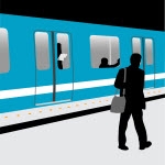
The recent passing of graphic designer Bob Noorda, 82, (via NY Times) brought recognition to a bit of New York City life that we see every day, reminding us of the origin of the clean graphics and clear lettering that mark the city’s subway stations. Noorda was instrumental to the introduction of a new, modern look to the New York City subway system signage in the 1960s.
With his design firm, Unimark International, the designer made a case for a cleaner font family (Helvetica) and a more unified, logical system of identification for the system’s current hodgepodge of lettering and design on signs indicating stations and train lines. Though his designs weren’t adopted immediately (Helvetica, still a favorite of font geeks and designers, was slow to catch on), the easy-on-the-eyes station signs and circular subway line symbols are the direct descendants of his vision.
ALSO IN NEW YORK CITY INSIDER
- 30 Park Place Vs. The Baccarat Hotel and Residences - JUL 8, 2014
- This Week in NYC Living - JUL 1, 2014
- Notable NYC Neighbors - JUN 26, 2014
- Great NYC Buildings: New in the Heights - JUN 23, 2014
- Notable NYC Neighbors - JUN 20, 2014
- Notable NYC Neighbors - JUN 17, 2014
- Building Vs. Building - JUN 9, 2014
- Notable NYC Neighbors - JUN 6, 2014
- Notable NYC Neighbors - MAY 23, 2014
- Notable NYC Neighbors - MAY 15, 2014
- Great NYC Apartment Buildings: 12 East 13th Street vs. 22 Central Park South - MAY 13, 2014
- Notable NYC Neighbors - MAY 7, 2014
- Notable NYC Neighbors - MAY 1, 2014
- Upping the Architectural Ante in NoHo - APR 22, 2014
- Great NYC Buildings: Brooklyn's Gold Coast Living - APR 15, 2014
- Notable NYC Neighbors - APR 11, 2014
- Building vs. Building - APR 10, 2014
- Notable NYC Neighbors - APR 2, 2014
- This Week in NYC Living - APR 1, 2014
- Notable NYC Neighbors - MAR 26, 2014
- View Articles By Date


 6sqft delivers the latest on real estate, architecture, and design, straight from New York City.
